0%
A name that means powerful. A logo built for authority. The complete identity for a lab grown diamond jewellery brand entering one of India's most competitive markets.
The client came to Indiibot with one ask: build us a logo. But within the first conversation, a larger problem emerged. They were entering the lab grown diamond jewellery market with no brand name: and this market was already crowded with competitors who had a head start.
Generic names would be forgotten. Weak names would get lost. They needed something that looked powerful on paper, sounded different when spoken aloud, and carried real meaning behind it. Not a name for the sake of a name. A name built to command.
Lab grown diamonds had taken off. Every second brand was competing on price or technology. The owner knew the product was strong. What they needed was an identity that positioned them above the noise: something that felt old, established, and authoritative before they had even earned it.
The brief had three clear requirements: the name must feel powerful, the brand must look like it has been around for decades, and every visual element must signal authority to the customer the moment they see it.
The naming process was deep. Indiibot explored names rooted in Sanskrit, Latin, Old English, and Greek mythology: each evaluated for pronunciation, uniqueness in the jewellery space, visual impact when set in type, and the meaning behind the word. The shortlist grew long before it grew short.
Competitors leaned predictable: words meaning shine, gold, radiance, and gem. So Indiibot went in a different direction. The target was a name that felt ancient, powerful, and impossible to ignore. Something that sounded like it had authority the moment you said it.
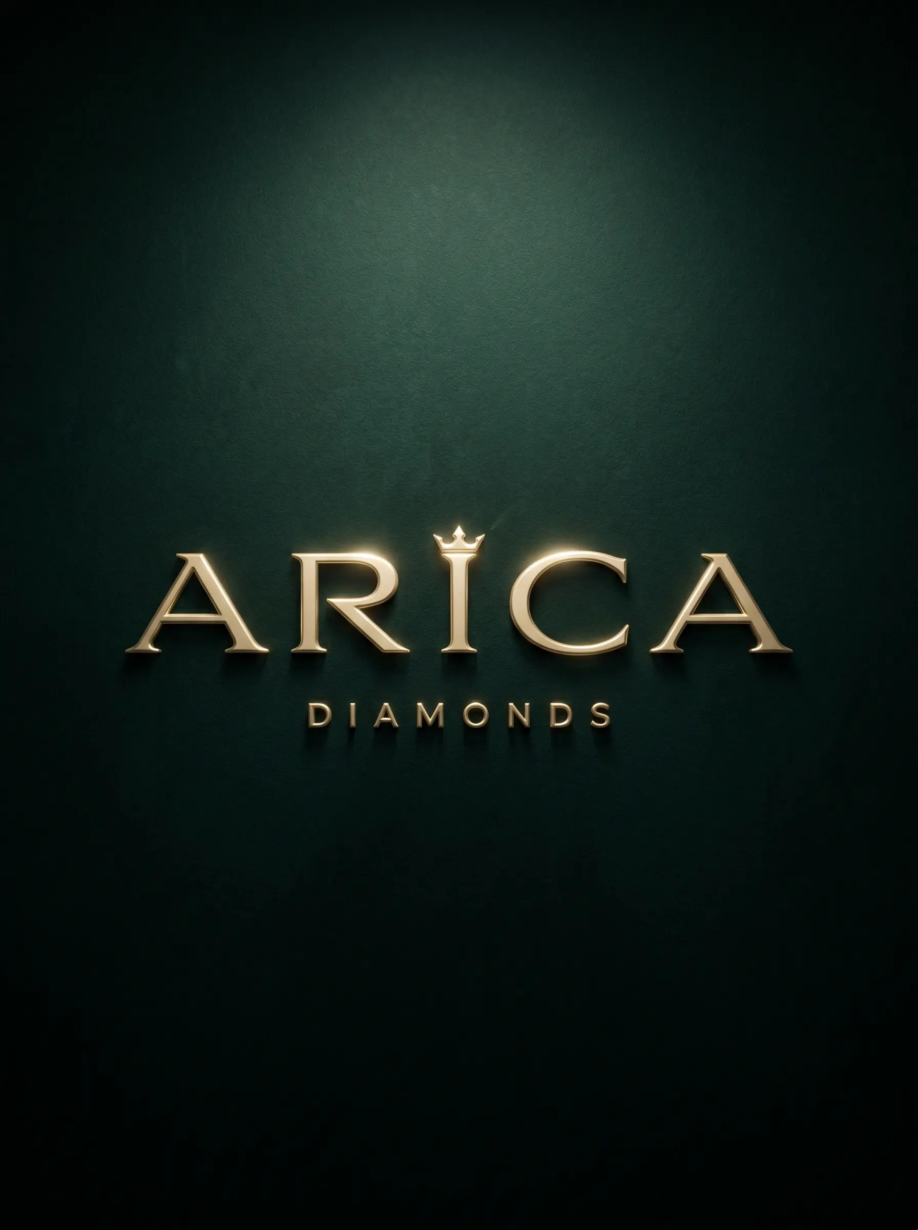
The name passed every test. It was short, easy to pronounce in any language, looked strong in serif type, and carried meaning that directly aligned with what the brand needed to project. Arica Diamonds was born.
Before touching a logo, Indiibot went into color psychology research. The question was not "what looks nice" but "what colors make a customer feel power, luxury, and age the moment they see them?"
The answer was emerald. Deep teal greens have been historically associated with royalty, wealth, and prestige: used in ancient empires, aristocratic seals, and high-authority institutions. Paired with warm stone and camel gold tones, the palette communicates old-money luxury without the coldness of black-and-silver brands that dominate the lab grown diamond space.
The goal was a brand that looked like it had been around for a hundred years, even on its first day.
Four colors. Each chosen deliberately. Together they form a system that signals authority, warmth, and timeless luxury across every brand touchpoint.
Typography was not a small decision. Indiibot reviewed over 50 typefaces: from classic Garamond to contemporary display serifs: evaluating each against three criteria: does it feel old, does it feel authoritative, and does it carry weight without screaming for attention?
Serif fonts communicate luxury. Bold weight communicates authority. Old-style construction communicates age. The chosen font needed all three. After the full review, one stood out above every other option.
A full wordmark is a name. A logomark is a symbol. The brief called for something standalone: an icon that could live on a card, a stamp, a pendant, a seal: and immediately connect back to Arica without needing the name beside it.
The answer came from within the brand name itself.
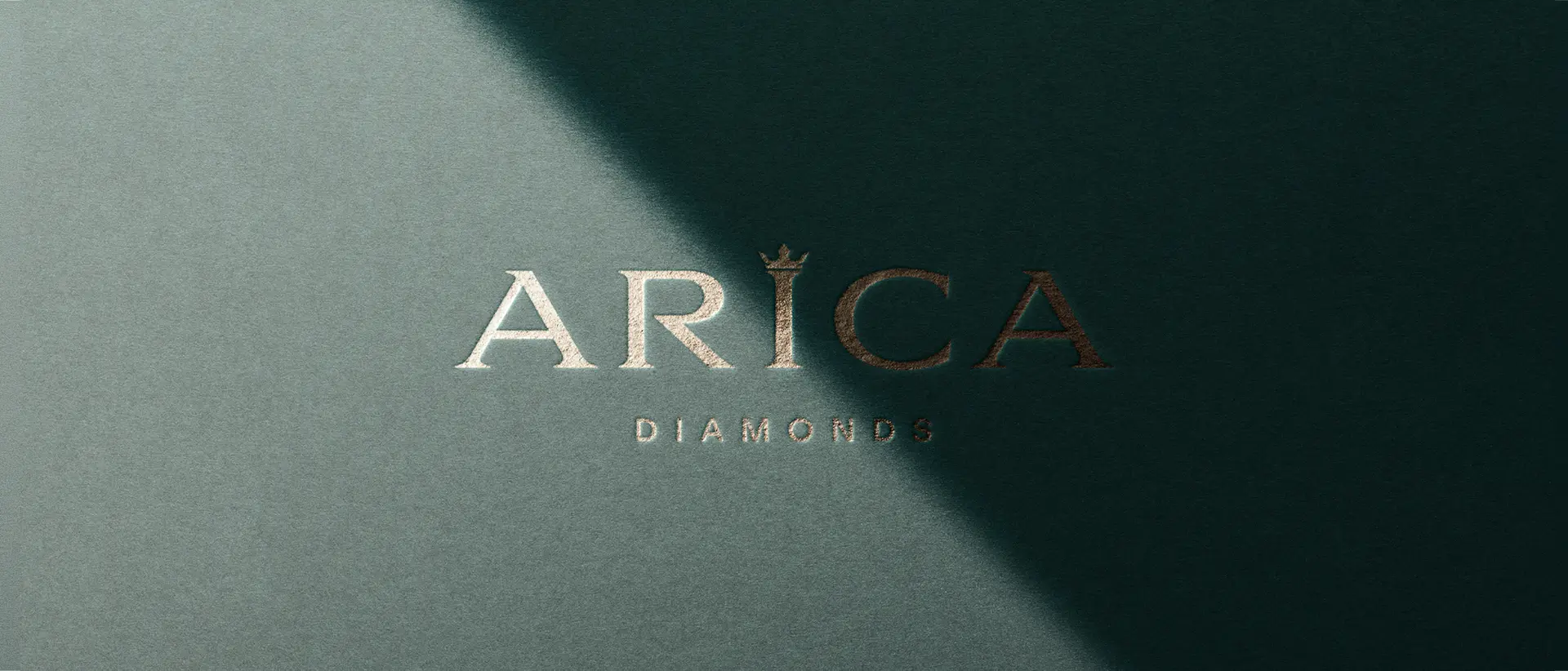
The complete Arica Diamonds identity: the wordmark in Aviano Serif, the scepter logomark, and the full brand system applied across contexts: dark backgrounds, light backgrounds, and print collateral.
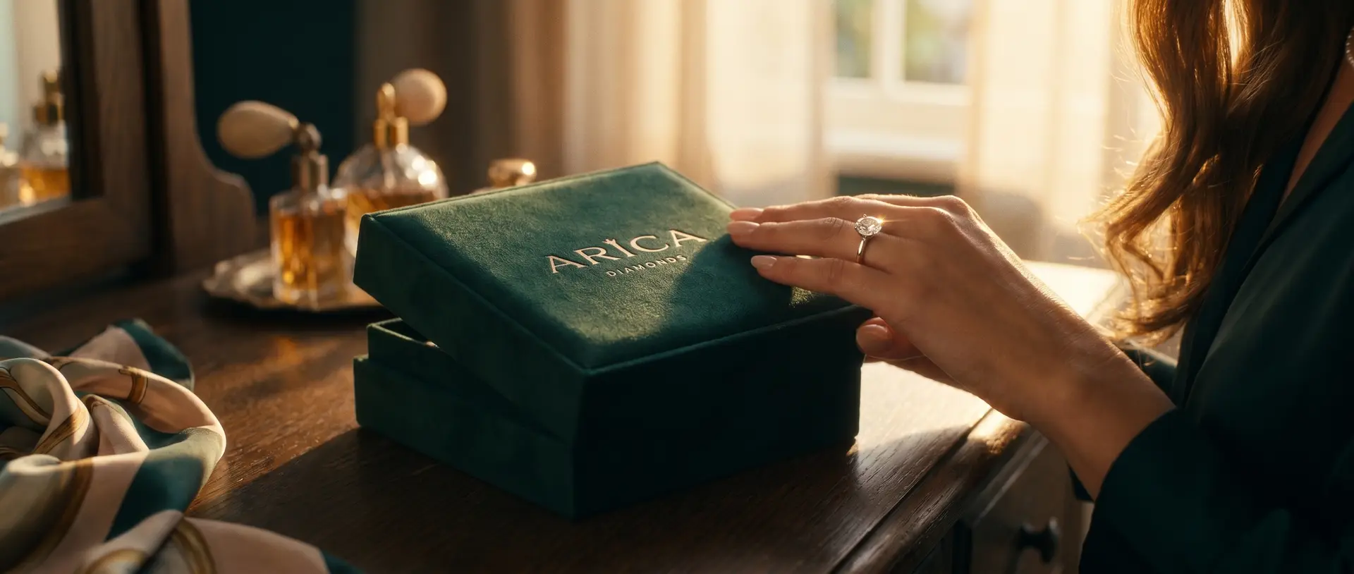
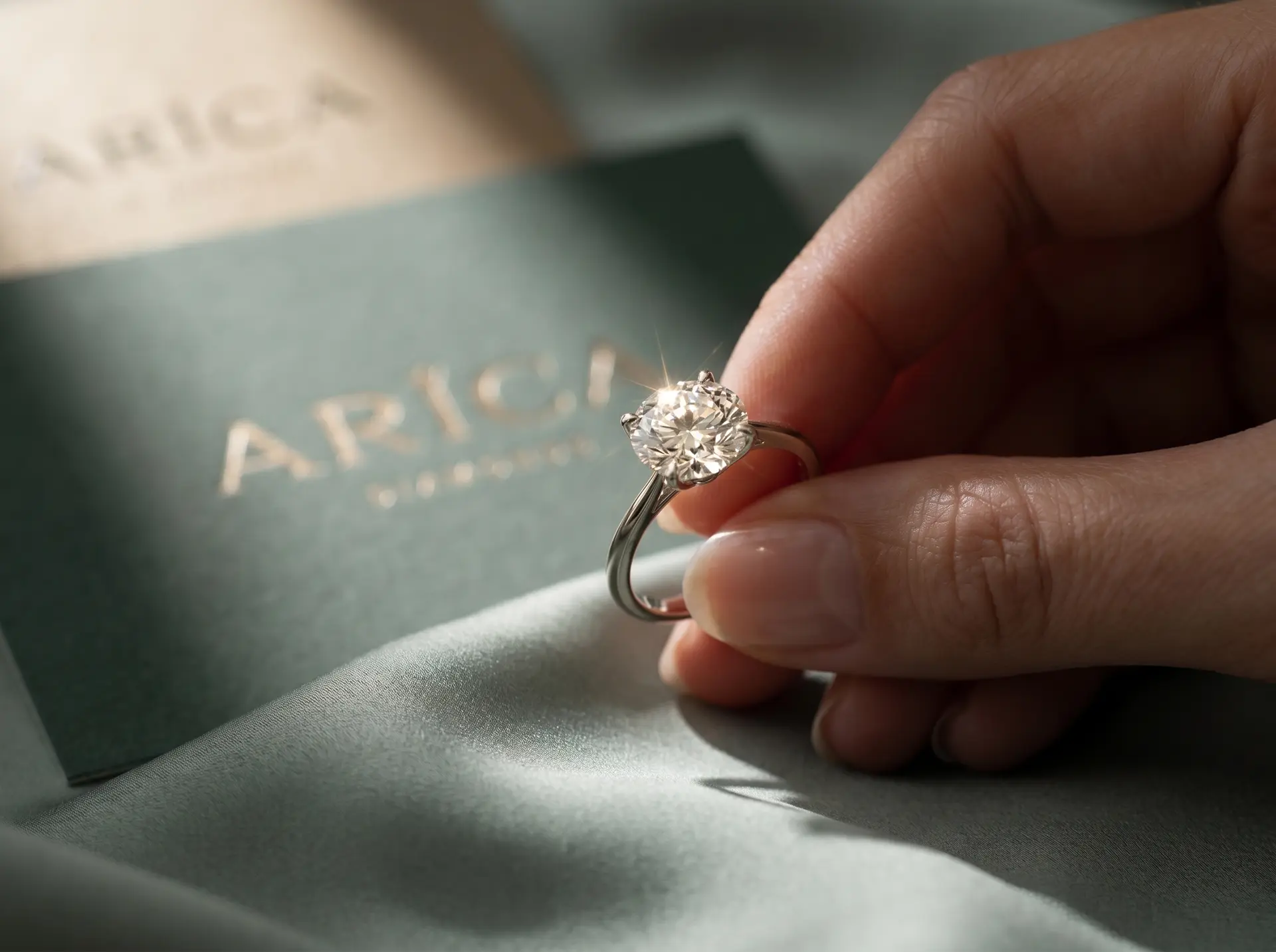

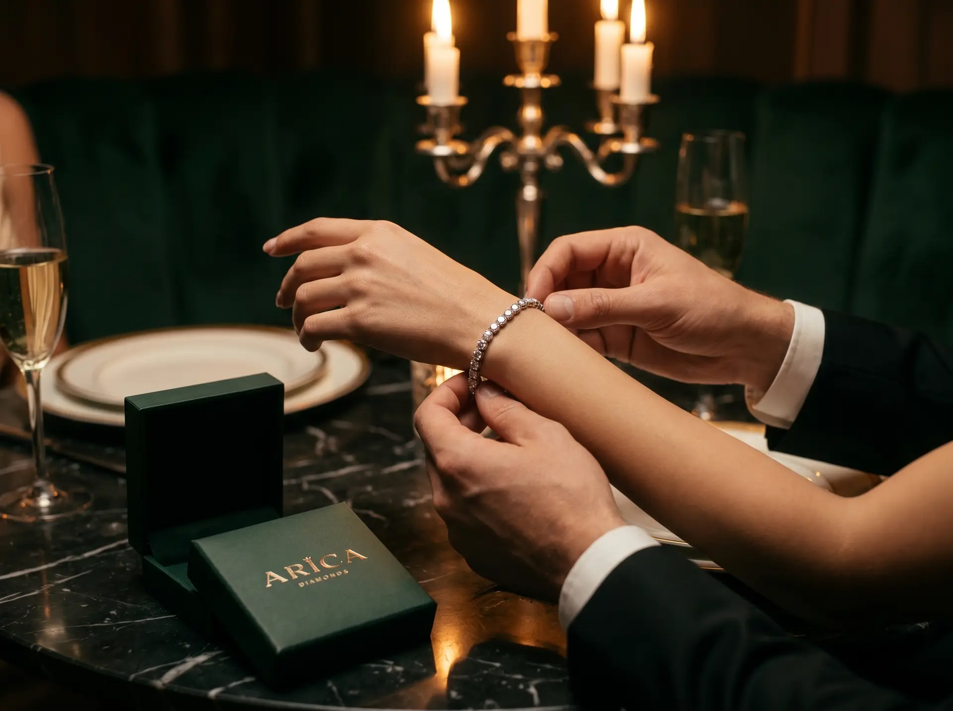

From a business card to a storefront, a logo earns its strength in real environments. Every application of the Arica identity confirms the same quality: authority that does not need to announce itself.
What started as a logo project became a complete brand-building exercise. Every element was created to serve a singular purpose: make Arica Diamonds look like it has always been the authority in the room.
Arica Diamonds launched with an identity built to outlast trends. The name carries meaning. The palette signals authority. The typography commands respect. And the logomark tells the whole story in a single mark. This is what happens when a logo brief becomes a brand brief.