0%
Three letters. One diamond. A rupee-inspired mark that gave an Indian diamond company a logo with luxury, identity, and hidden meaning: all in a single symbol.
The client had a clear vision: and four specific requirements that had to coexist in a single mark. Each one alone is straightforward. All four together is a design problem that most would have solved by compromising on one. That was not an option.
Rare Carat Diamond is an Indian diamond trading company. The logo had to communicate luxury, show the brand initials, look like a diamond, and carry an unmistakable Indian identity: all without becoming cluttered, complex, or generic. Over ten attempts were made before the solution became clear.
After ten attempts, the answer arrived not from simplifying the brief but from finding a single form that could carry all four requirements simultaneously. The diamond icon at the top of the mark is built from the letterforms R, C, and D: each one present in the geometry if you know to look. The R is drawn with a stroke that echoes the Indian Rupee symbol, giving the mark its Indian character without announcing it loudly. The result is a logo with layers: it reads immediately as a luxury diamond brand, and rewards closer attention with the craft hidden inside it.
Each rejected version taught something. Some hid the letters but lost the diamond. Some showed the diamond but dropped the Indian identity. Some achieved three of the four requirements and failed the fourth. The tenth attempt was not a lucky guess: it was the result of understanding exactly why every previous version fell short. That process is what makes the final mark correct rather than just finished.
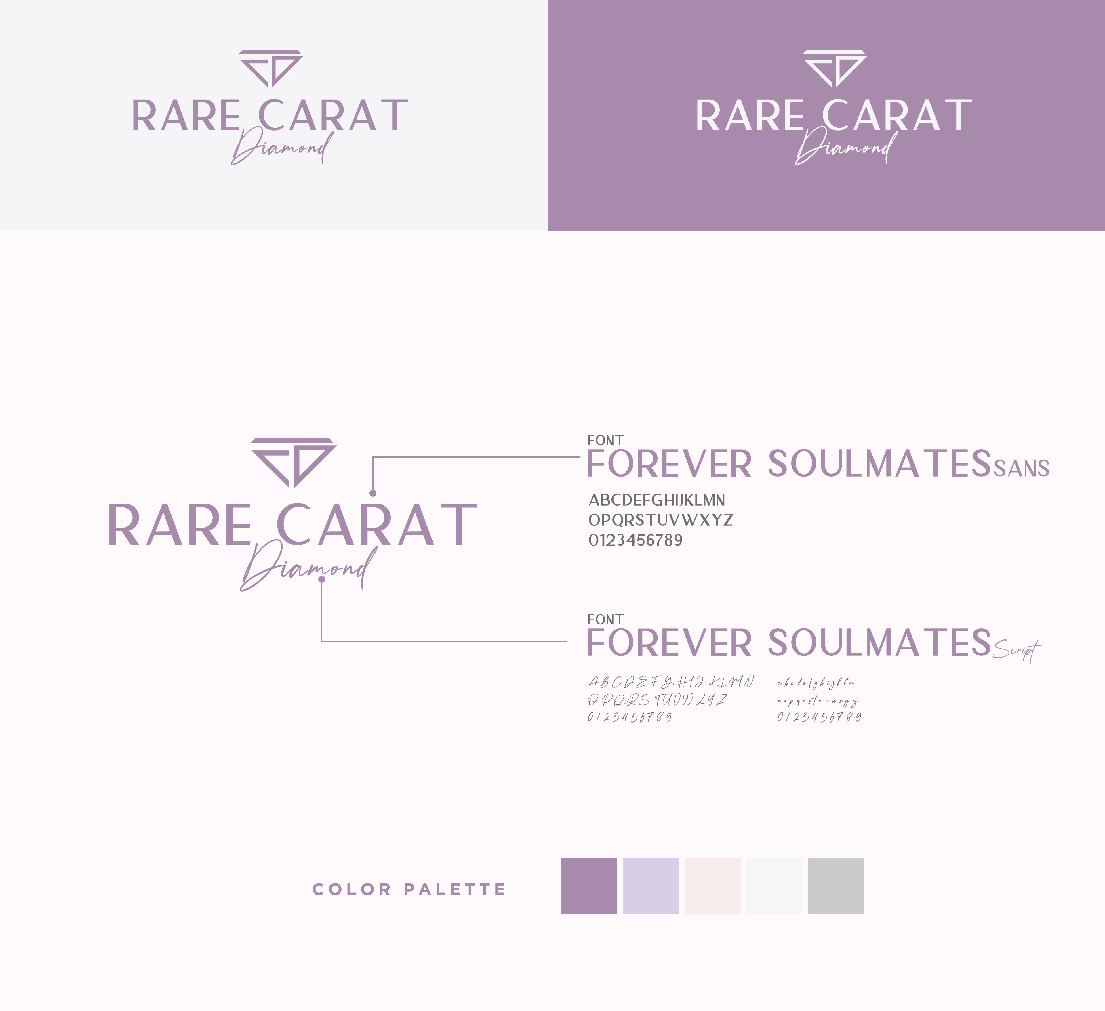
The typography was chosen to mirror the dual nature of the brand: structured authority paired with feminine elegance. A luxury diamond brand needs to feel precise and desirable at the same time. No single typeface carries both qualities: so two were chosen, each doing its specific job.
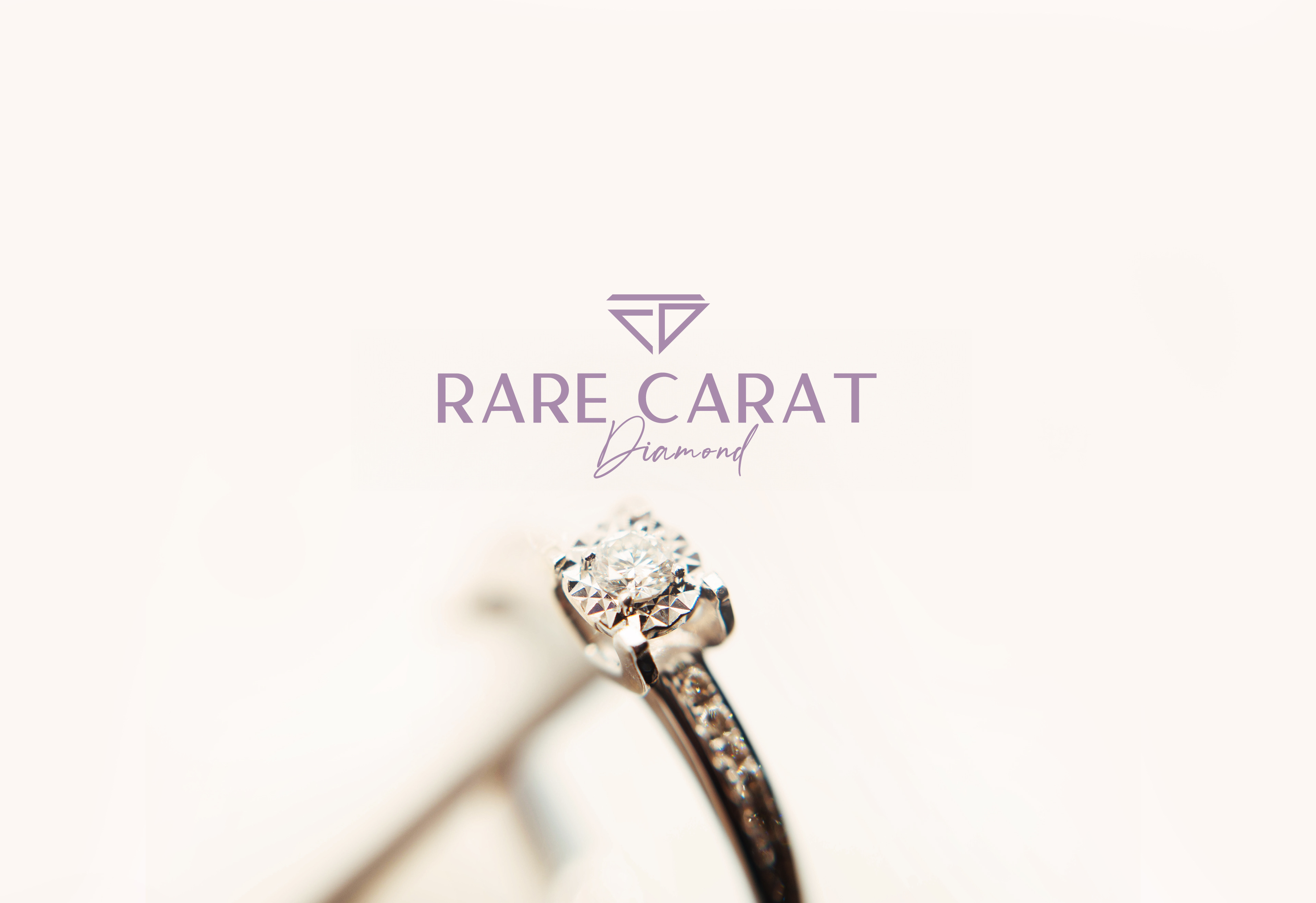
A refined serif with generous spacing and geometric precision. Used for the wordmark "RARE CARAT": projects authority, permanence, and luxury in all caps. The kind of typography that belongs on a jewelry box or a boutique window.
A flowing script used for the word "Diamond" beneath the wordmark. Brings warmth, femininity, and handcrafted feel to balance the structured sans. The contrast between the two typefaces creates the tension that makes luxury brands feel alive.
The palette was built around one central insight: diamonds are associated with white and clear light, but the emotional experience of receiving or wearing one is warm, romantic, and intimate. The colors reflect that emotion. Mauve purple as the brand anchor, softened by lavender and blush, grounded with silver: the palette of a jewelry brand built for the person who gives and the person who receives.
A logo earns its quality in real environments: dark and light surfaces, brand guidelines, and application. These are the three frames that define what Rare Carat Diamond looks like outside a design file.
Every element in this mark earns its place. Nothing is decorative. Nothing is added for effect. Each line, curve, and spacing decision serves one of the four original requirements: and the whole is more than the sum of its parts.
A logo is not finished when it looks good. It is finished when nothing can be removed without losing something essential. Rare Carat Diamond is that kind of mark. Four requirements, one solution, zero compromises.