0%

A lab grown jewellery brand that looked ordinary. One logo redesign later, it looked like it belonged in a high-end boutique.
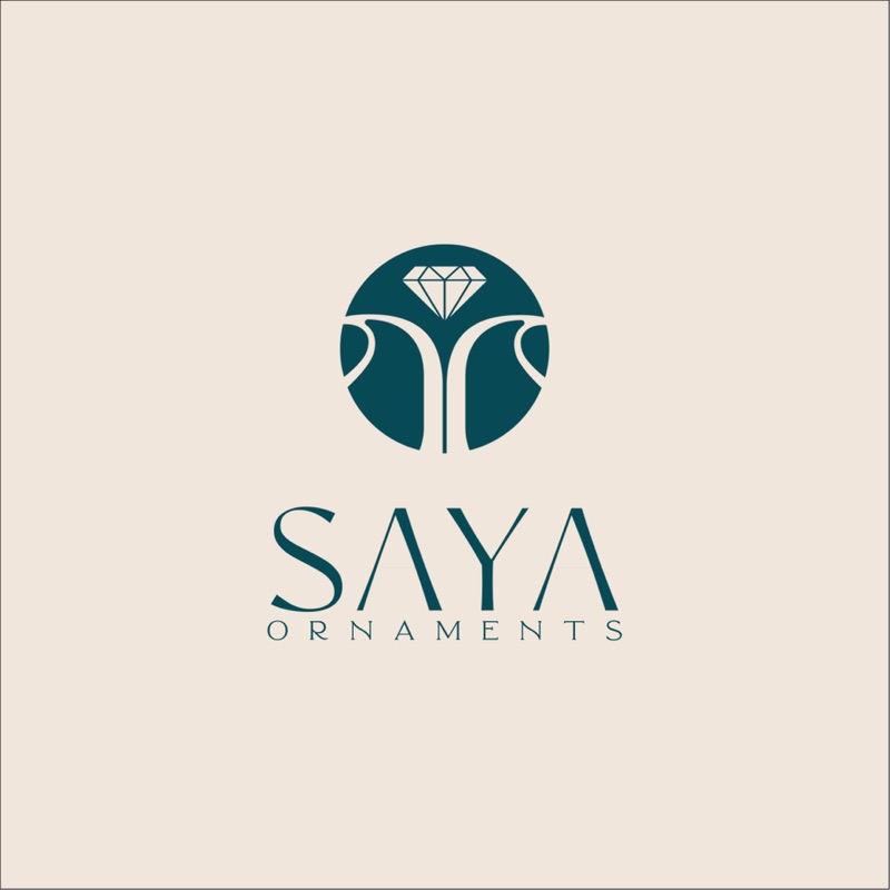
Saya Ornaments had a product worth wearing and a name worth remembering. The logo was neither. It looked like every other generic jewellery brand in the market: flat, forgettable, and without any sense of luxury or refinement. The brief was focused: fix the logo. Make it feel expensive before the customer even touches the jewellery.
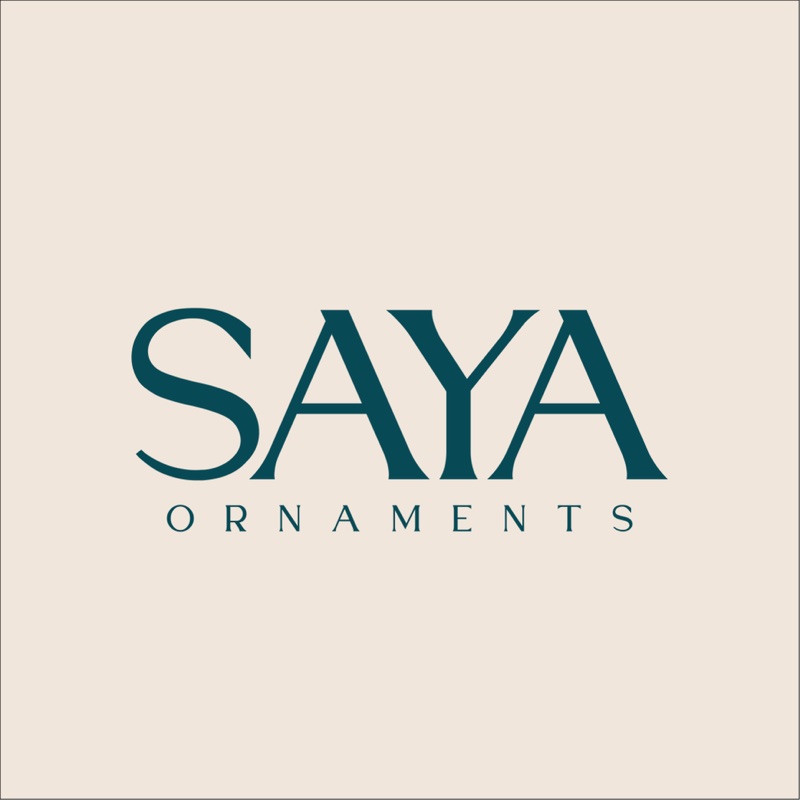
The old logo had the right name but the wrong feeling. The redesign kept the elegance of the word "Saya" and built a visual language around it: refined serif letterforms, considered spacing, and a palette that communicates quiet luxury rather than loud decoration.
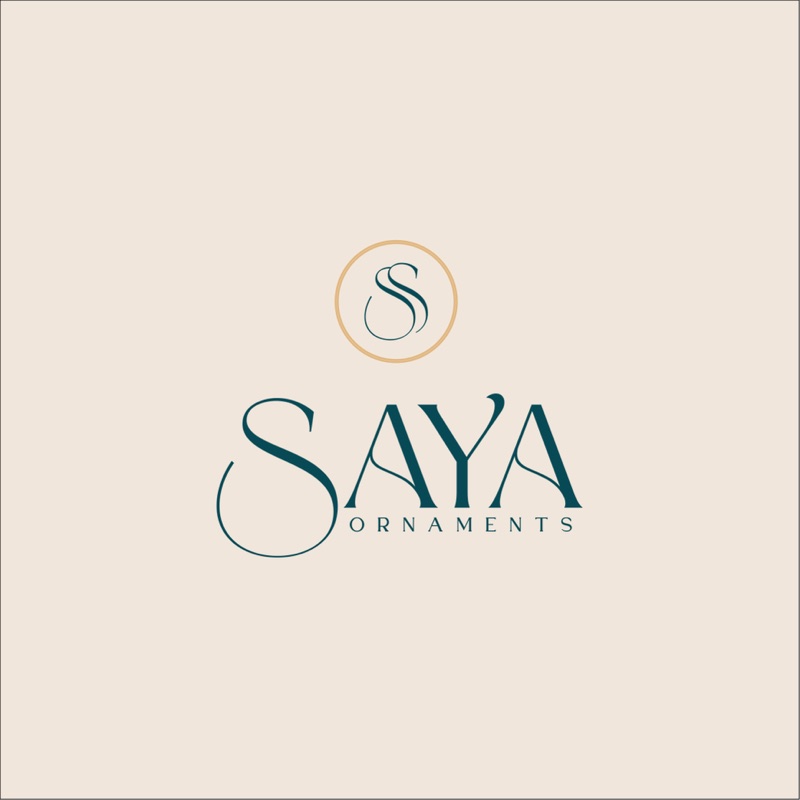
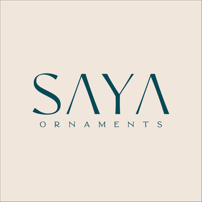
The right logo doesn't arrive on the first try. These are the iterations that led to the final mark: each one refining the direction, testing different weights, spacing, and character combinations until the right balance of elegance and clarity emerged.

The palette was drawn directly from the brand's refined positioning. Deep teal as the anchor: calm, authoritative, and distinctly premium. Warm cream and sand tones that feel tactile and high-end, never clinical. Together they communicate the feeling of jewellery that doesn't need to shout.
A refined identity doesn't exist in isolation. It carries through every surface, every application, and every context. These are the moments where the Saya Ornaments mark proves itself.
The Saya Ornaments redesign was a focused brief executed without compromise. A single deliverable that changed how the entire brand is perceived.
Saya Ornaments deserved a mark that felt as refined as the jewellery it represents. The redesign delivered exactly that: a logo that communicates luxury before a single piece is seen.