0%

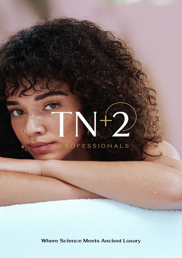
A professional skincare and haircare brand built from the ground up. From a mismatched logo to a complete premium identity with 13 products, a live Shopify store, and an Instagram presence that looks as good as the product.
The founder runs Skinnovative, a skin and hair treatment center. For years she worked with professional-grade products: the kind used in high-end salons and clinics. But something kept bothering her. Many of these products were extremely expensive. And some of them, despite the price, were not delivering consistent results on her clients.
She had something most brand founders do not: years of hands-on experience with professional formulas, and direct feedback from real clients about what works and what does not. She decided to use that knowledge to build something better. A brand with professional-quality formulas, made accessible. Products that actually deliver results, at a price that respects the customer.
TN+2 Professionals was the answer. Skincare and haircare under one roof, built by a practitioner who had seen what the industry was missing.
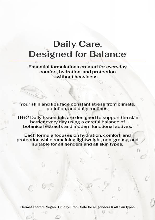
Most professional-grade formulas are locked behind high price tags and clinic doors. TN+2 was built on a different belief: effective skincare belongs to everyone. The same quality a professional trusts, at a price real customers can afford.
She came to Indiibot with a name, a clear vision, and a logo made by another agency. The logo was the problem. It communicated nothing about skincare, haircare, professionals, or trust. A customer seeing it for the first time would not know what the brand did. It did not look premium. It did not look credible. It did not fit the brand's long-term vision of being a trusted name in its customers' routines.
The brief was simple but demanding: build a brand that a professional would be proud to put her name on, that customers would trust instinctively, and that could scale alongside the business.
The redesign kept the brand name and stripped everything else. The new logo communicates premium, clinical precision, and trust: exactly what a professional skincare brand needs. Clean, considered, and built to work across packaging, digital, and print without losing its strength.
I wanted every person who picks up a TN+2 product to feel like they are investing in themselves. Not just buying a cream. The brand had to feel authoritative, trusted, and premium without being cold. It had to look like it belongs on a shelf next to the best in the world, because the formulas inside already do.
Founder, TN+2 Professionals
See the Full Brand Vision →


The palette process was the longest part of the identity work. The founder had a clear instinct: she believes in astrology, and she wanted the brand to carry gold or silver: elements of cosmic trust and abundance. But it also had to feel current, premium, and clean. Not costume jewellery. Not a corporate bank. Something that felt like a skincare brand worth trusting.
After rejecting more than ten options, the team landed on a five-color system that solved every constraint at once.
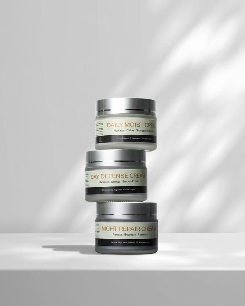
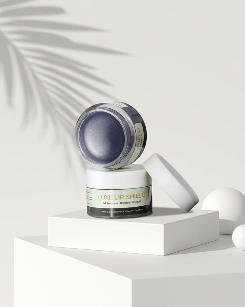
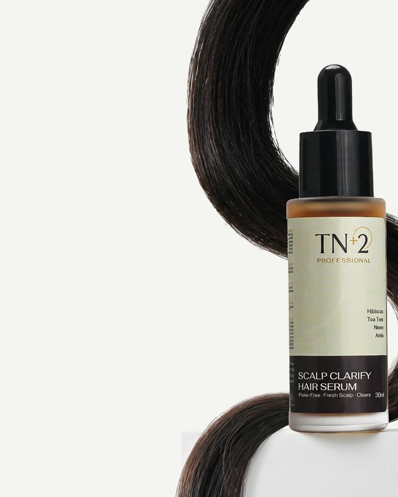
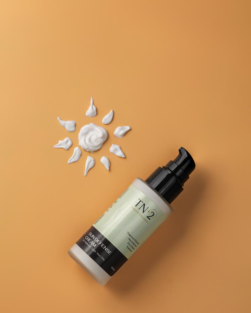
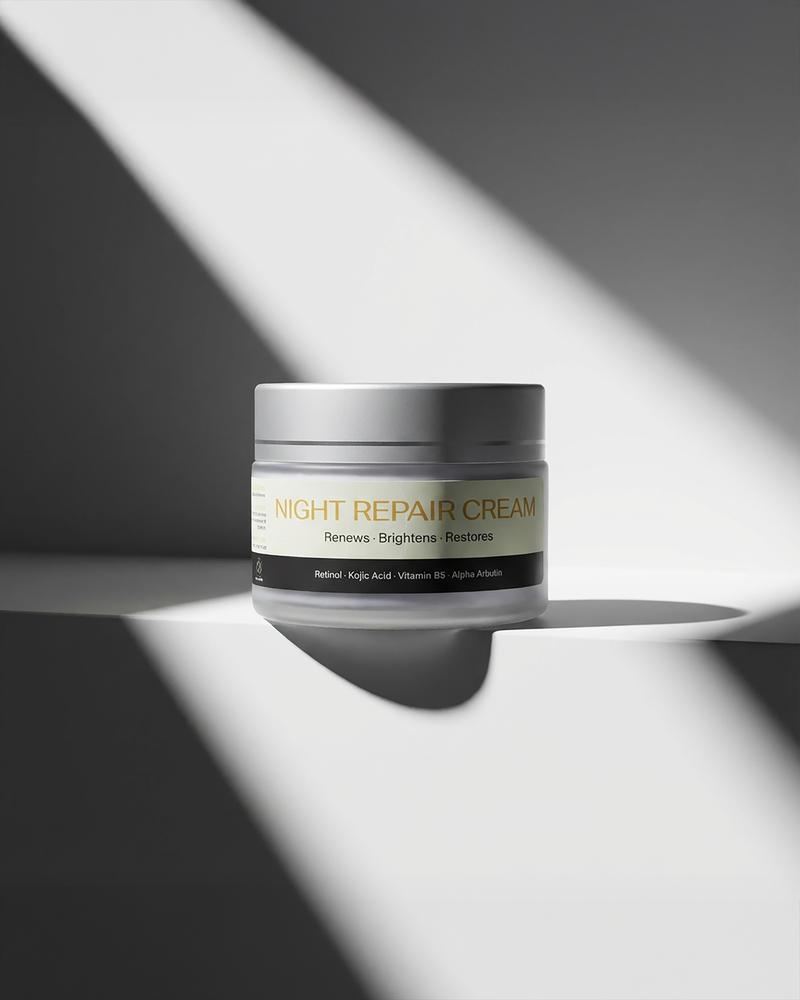
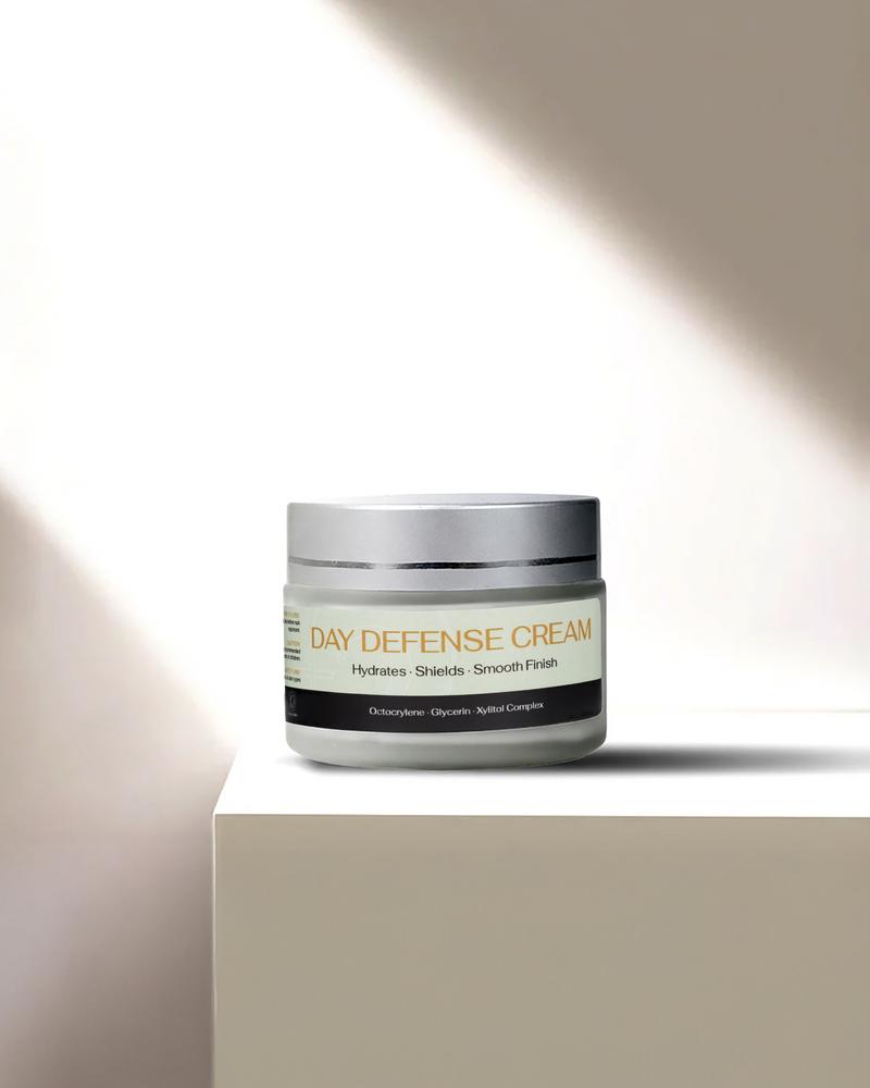
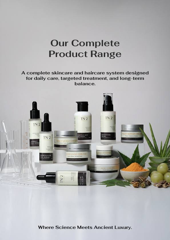
With the identity locked, the next step was packaging: the first physical touchpoint between the brand and its customer. The packaging design uses the full color system across all 13 products, creating a cohesive range that communicates premium quality from the first glance. Clean layouts, gold accents, and a consistent visual language that makes the entire product line feel like a single, considered collection.
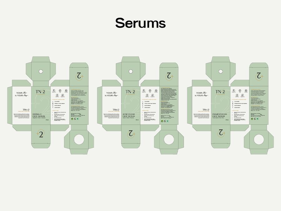
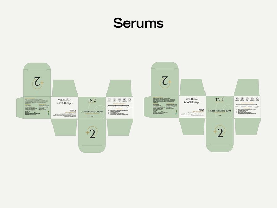
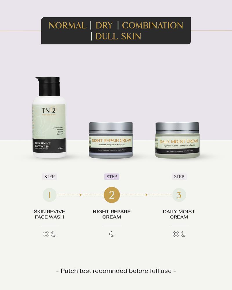
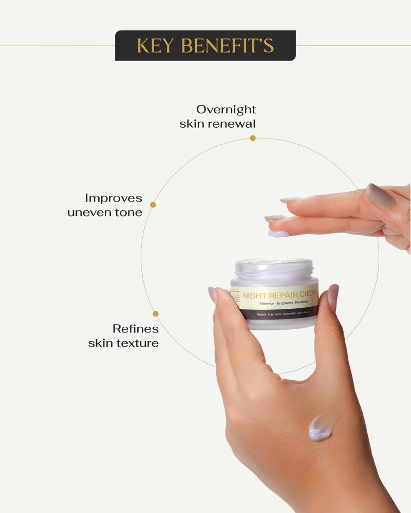
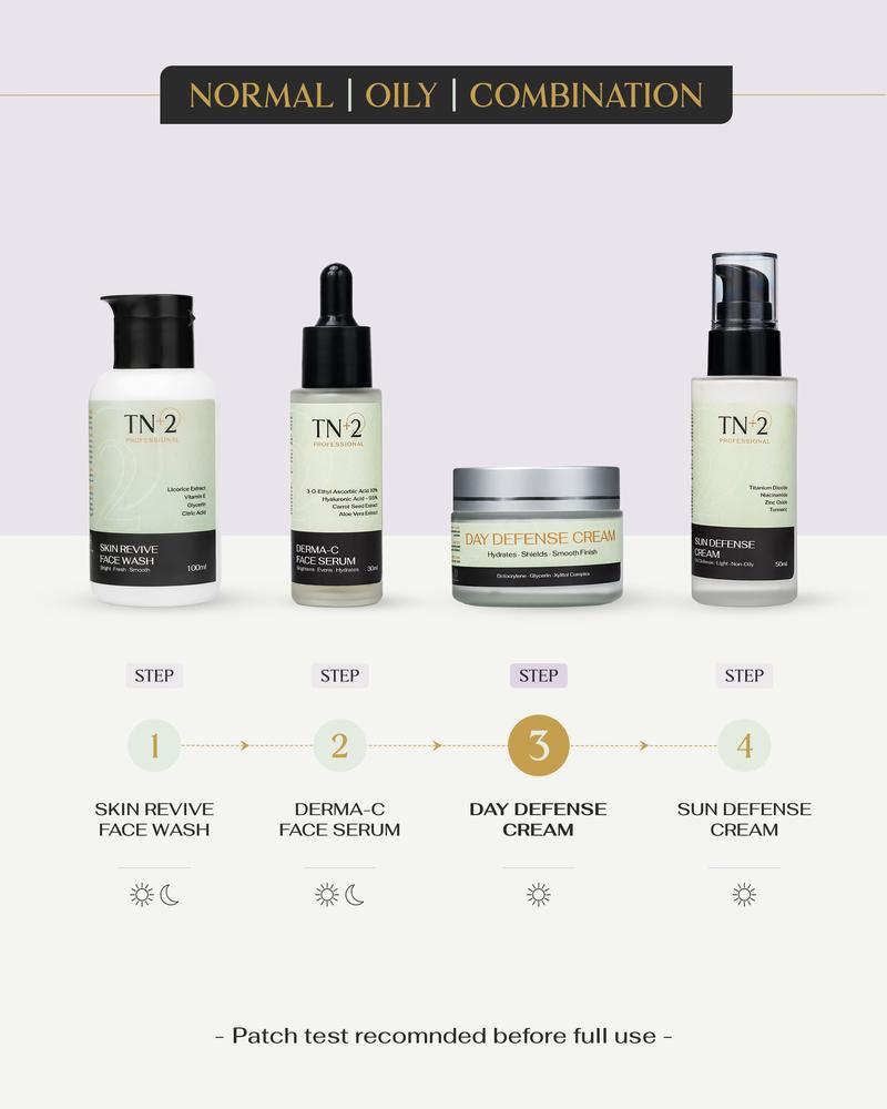
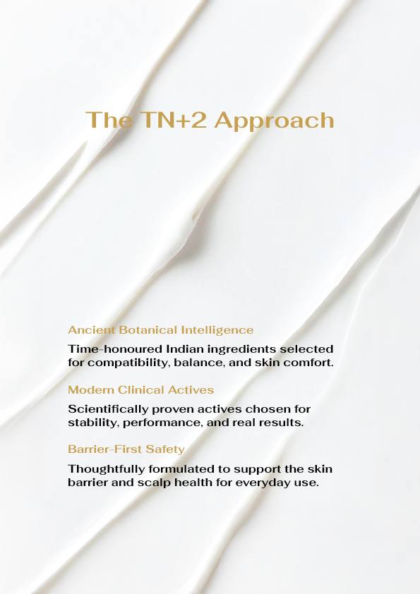
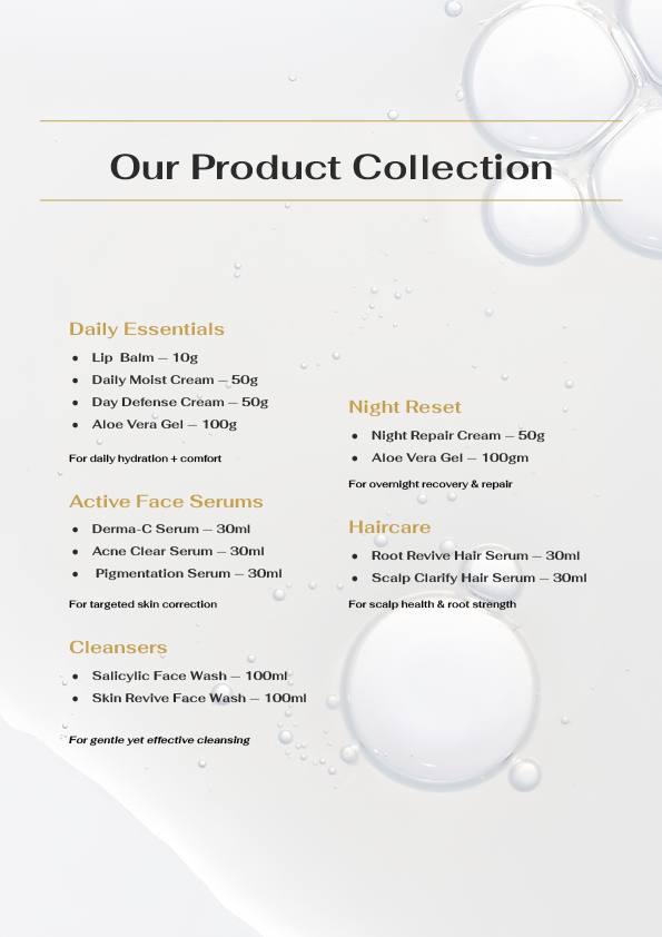
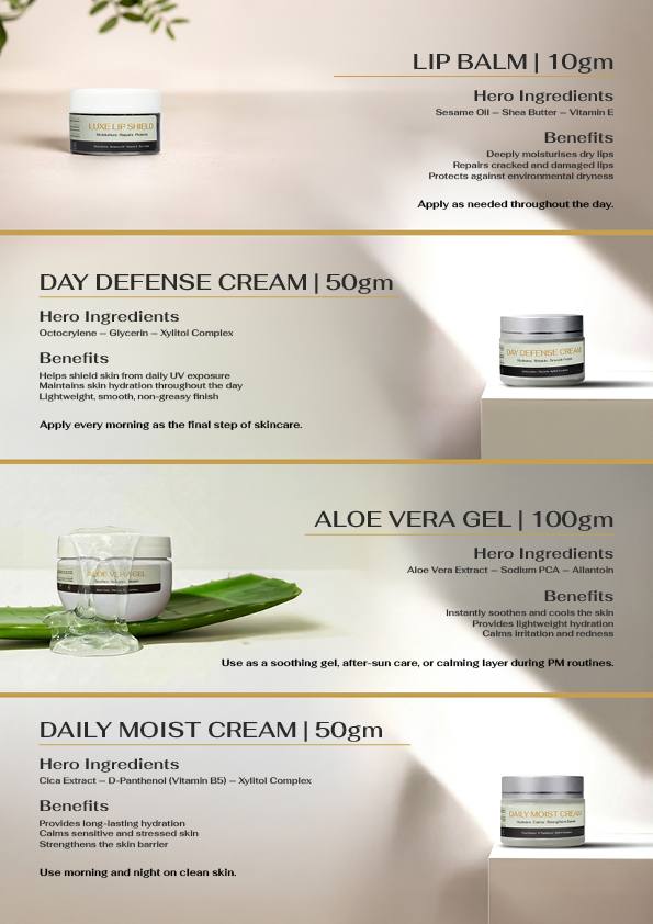
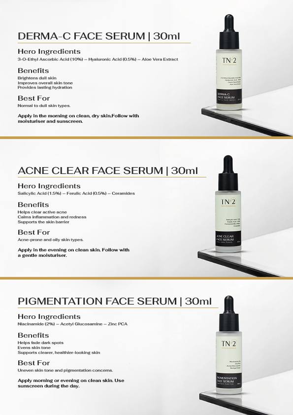
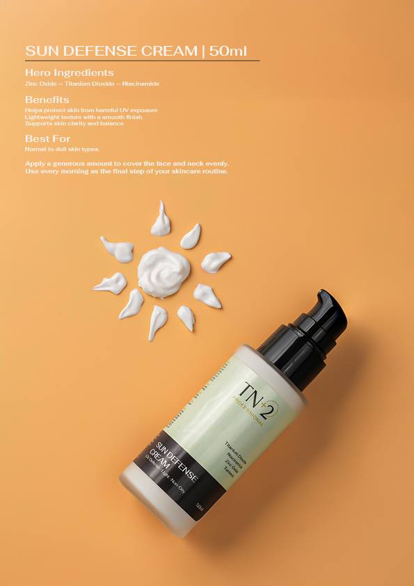
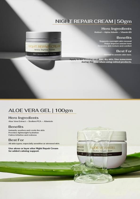
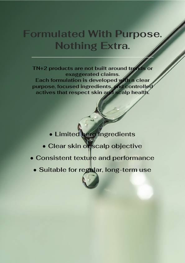
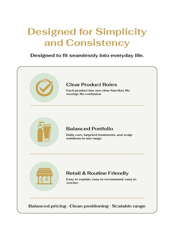
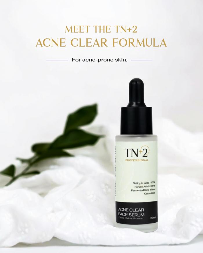
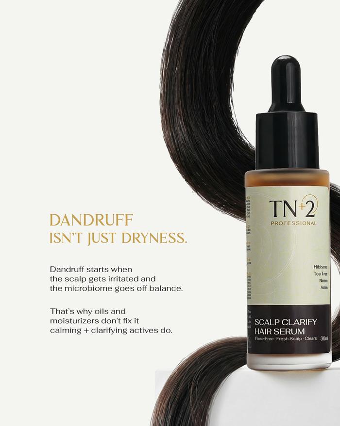
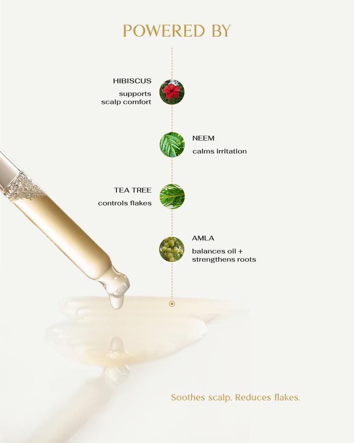
Every product has a clear role. No random launches. From daily cleansers to targeted serums, every formula in the range answers a real skin or hair concern that the founder has seen in her clinic.
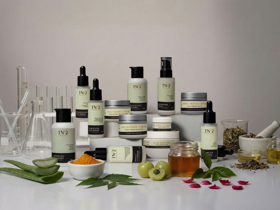
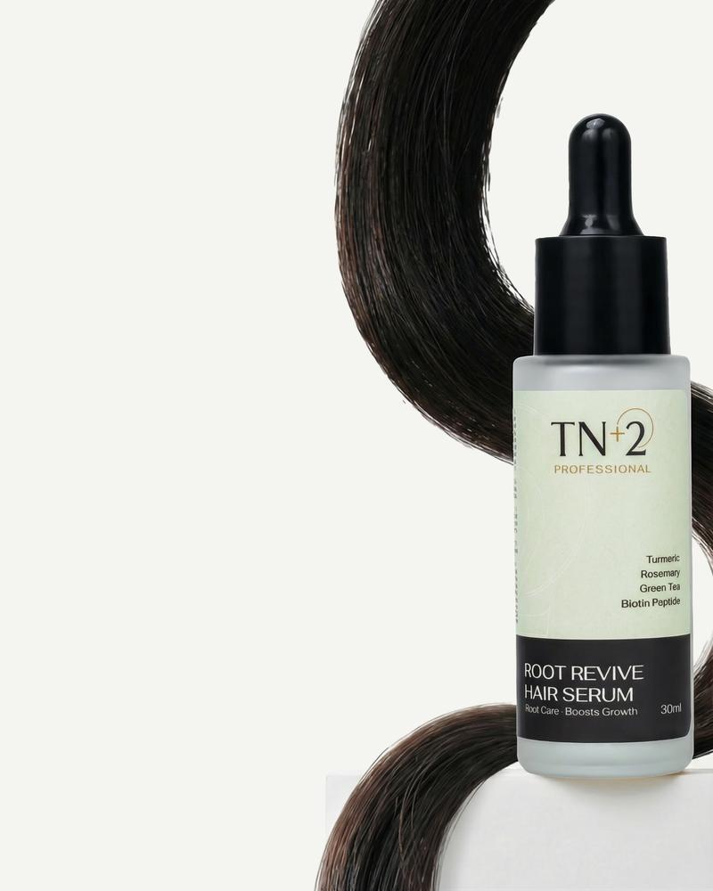
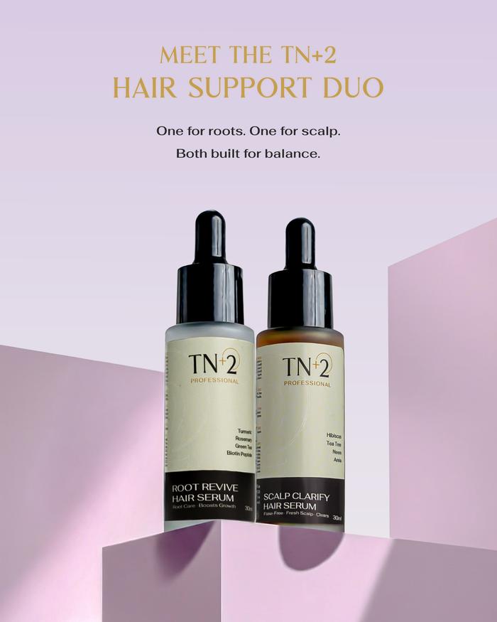
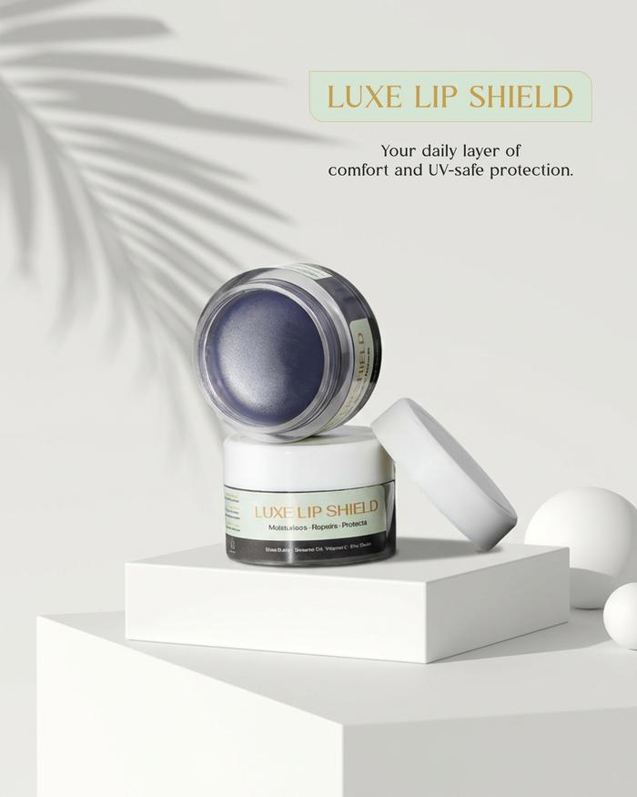
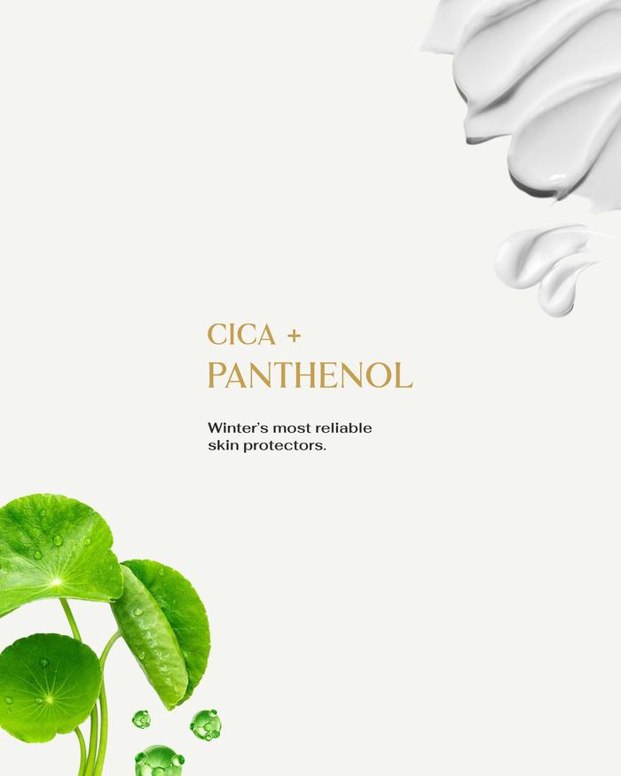
Creative product photography that brings the TN+2 brand to life: editorial compositions, the brand's soft-tone palette, and a visual language consistent enough to work across every touchpoint from packaging to social media to the Shopify store.

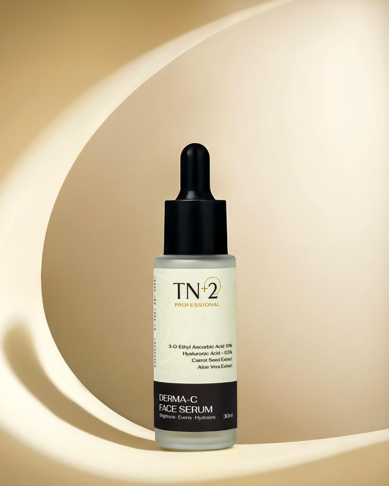
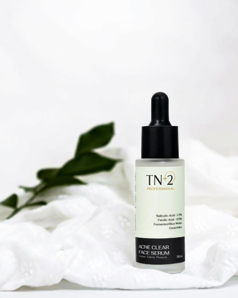
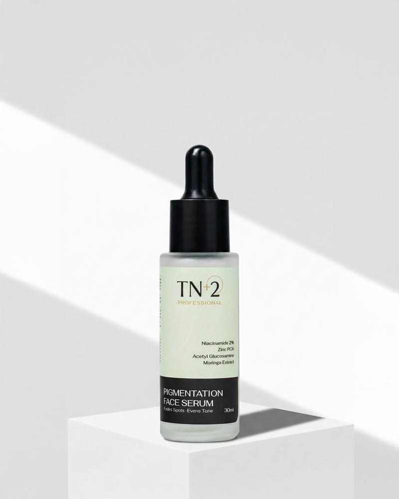
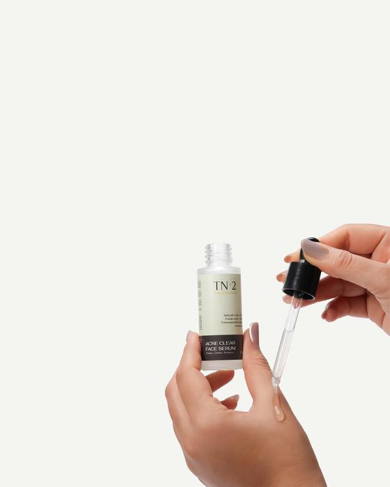
Clean, premium product photography for the Shopify store: every image designed to build trust the moment a customer lands on the page and drive them toward the cart.
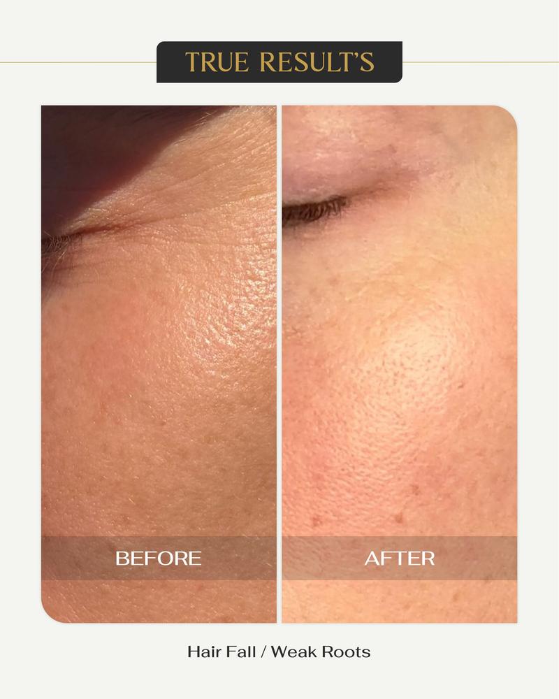

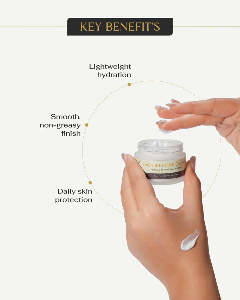
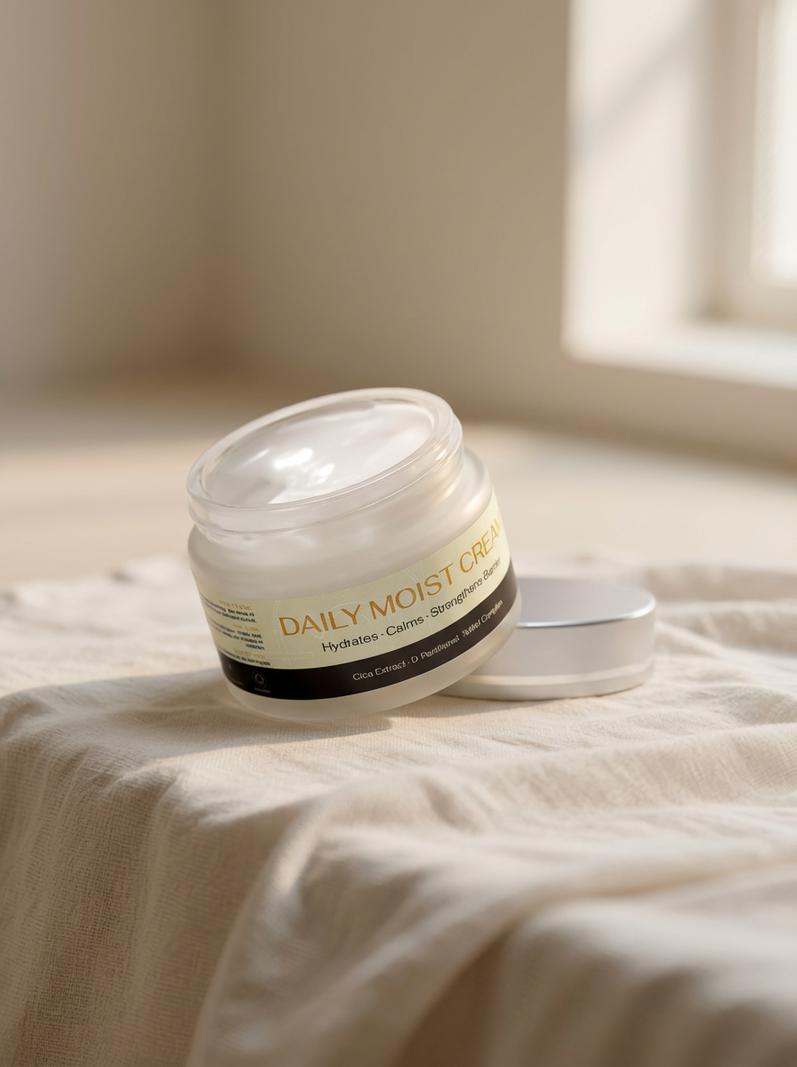
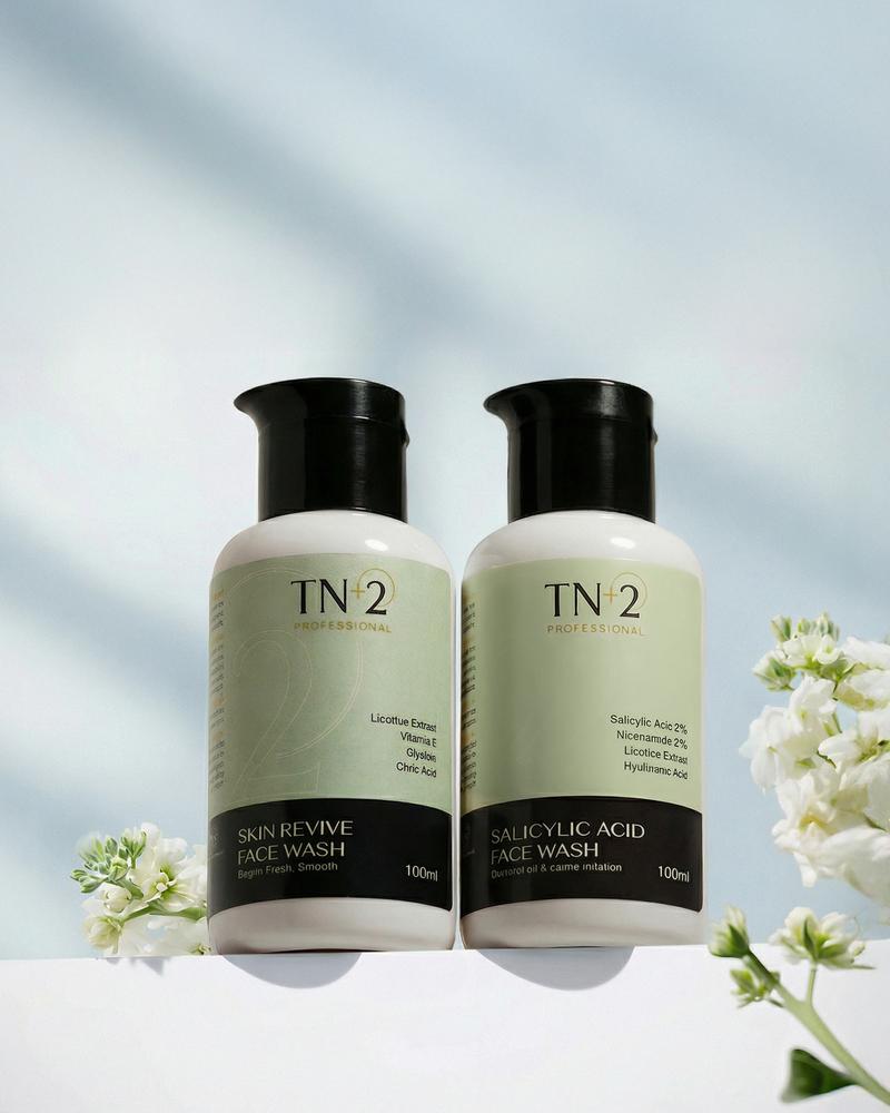
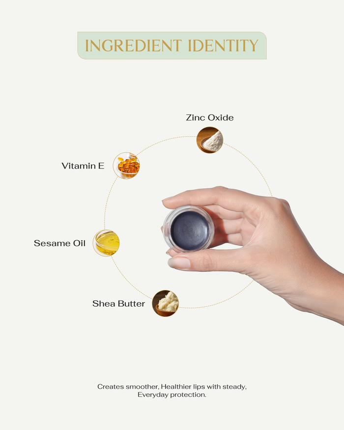
Every product photographed on skin so customers can see exactly how the texture looks and feels in real life. Trust is built at this level: not just in the packaging, but in the product itself.
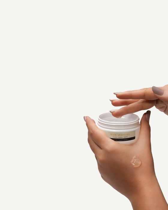
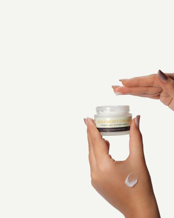
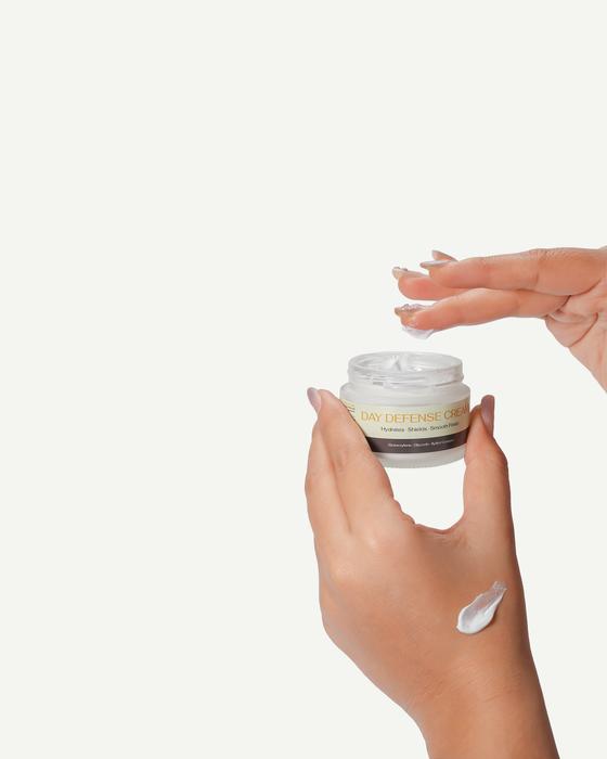
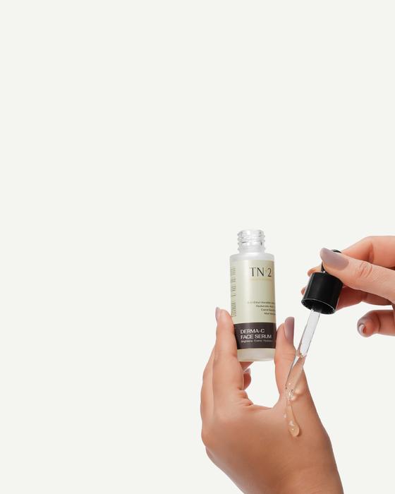
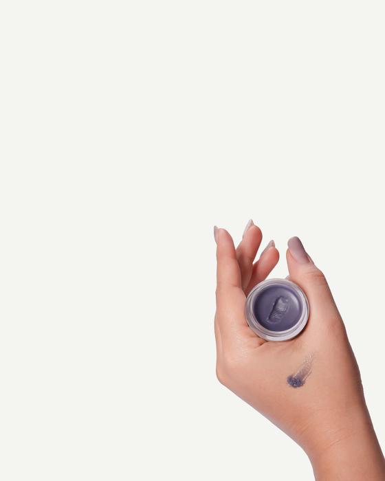
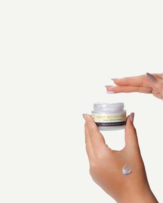
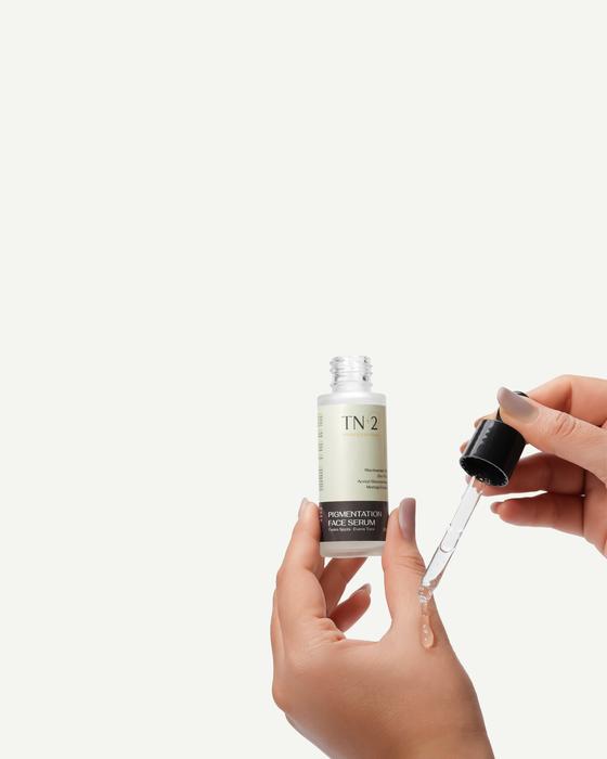

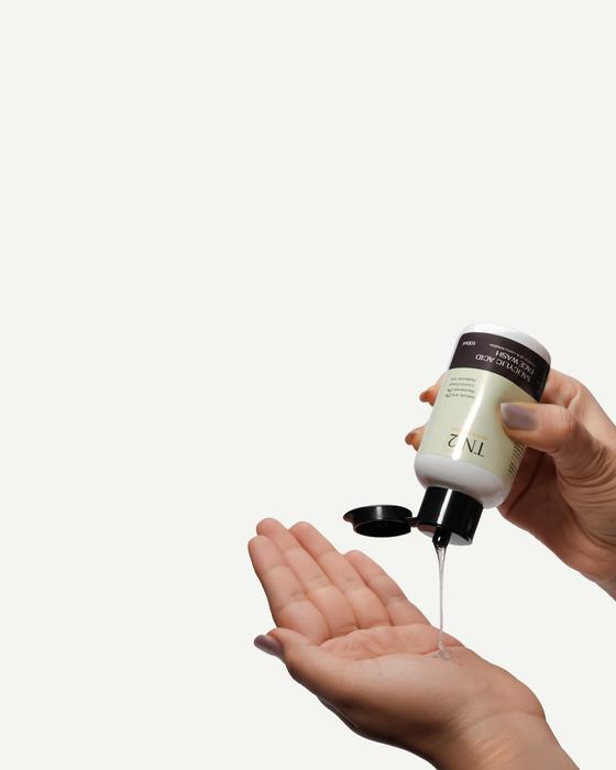
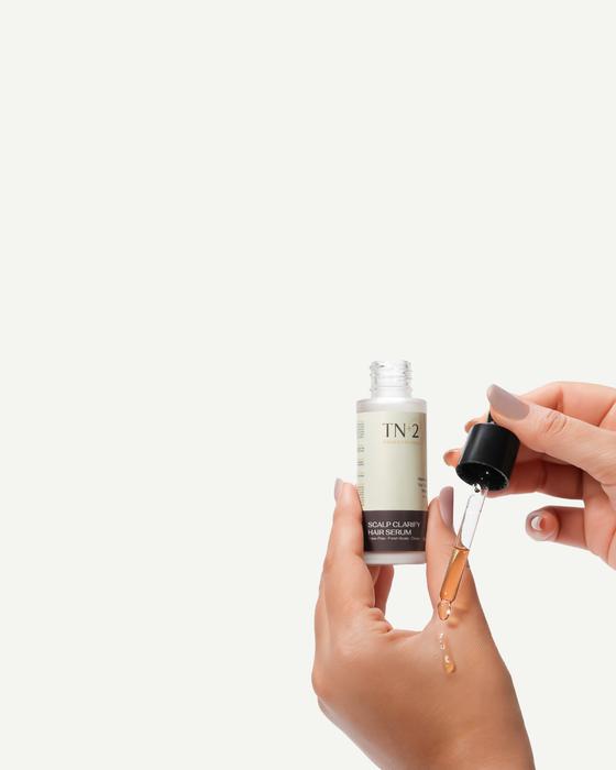
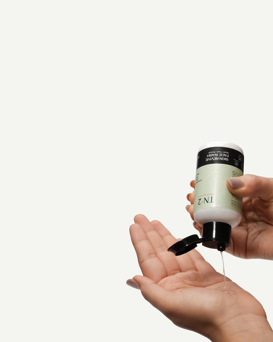
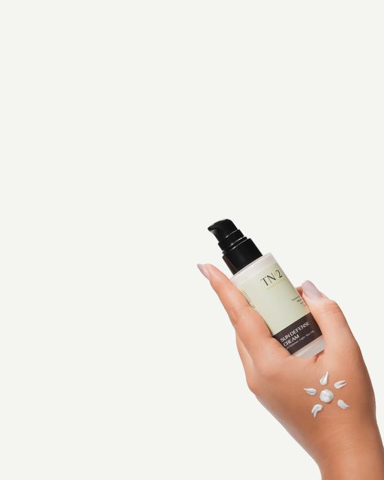
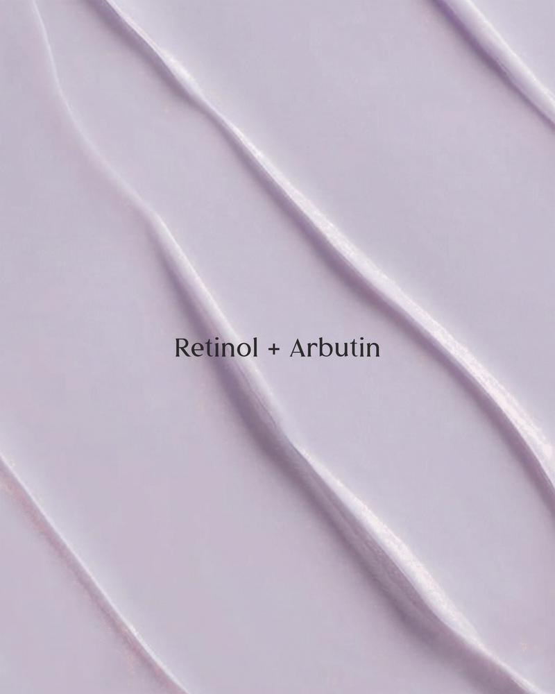
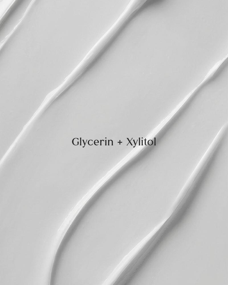
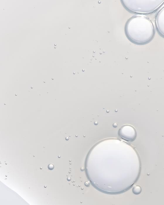
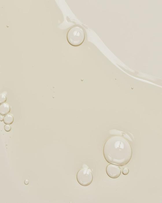
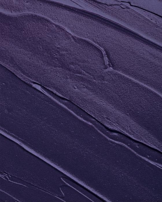
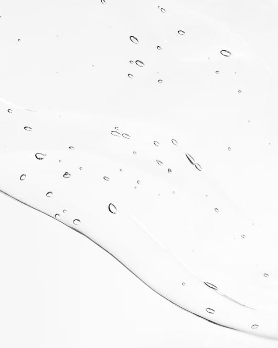
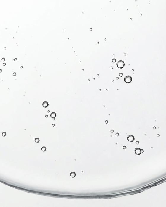
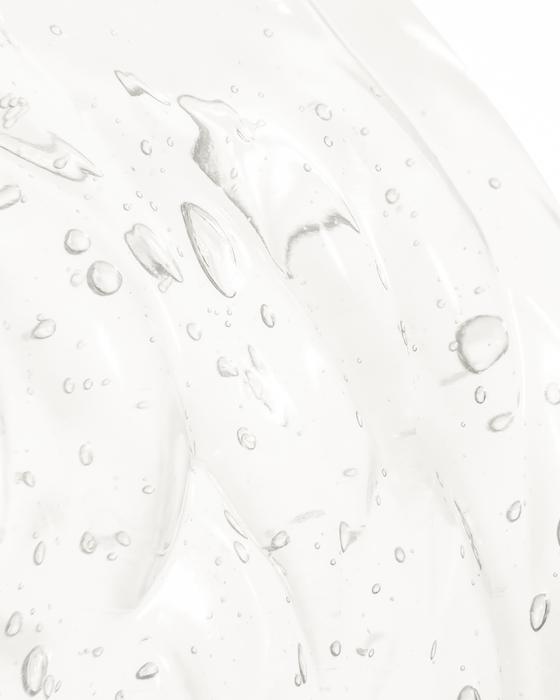
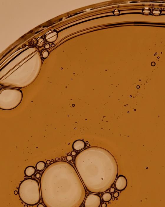
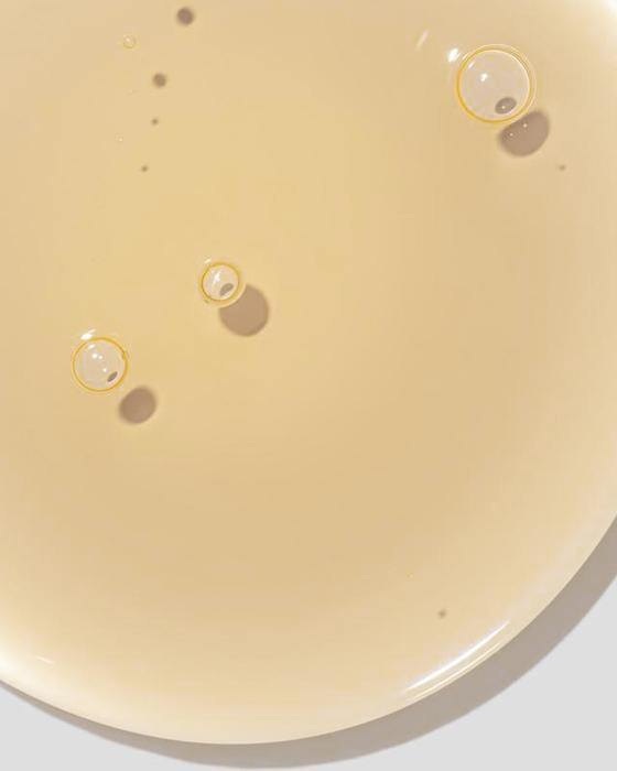
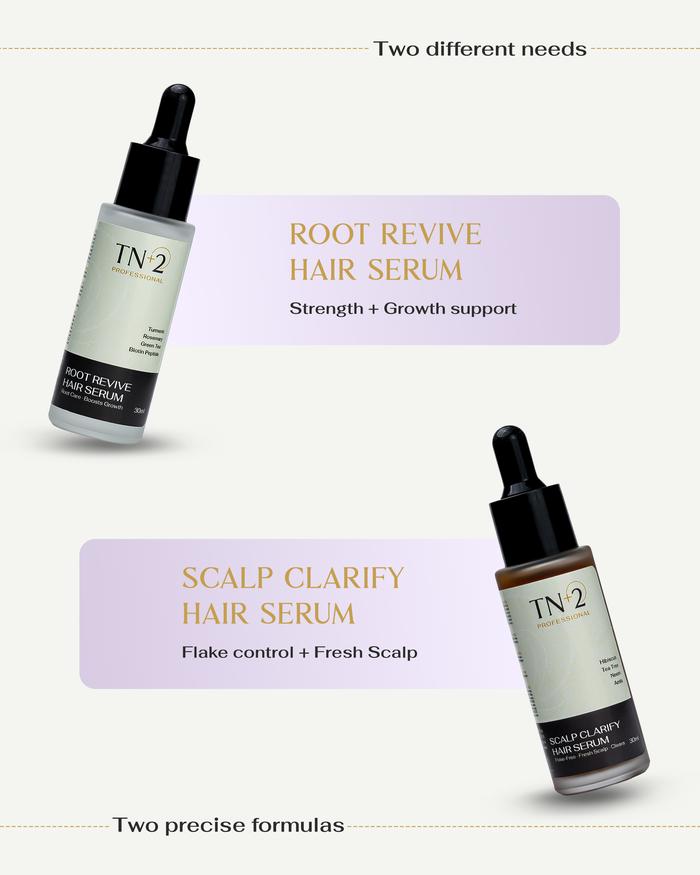
Close-up texture shots for every product: the kind of detail that closes the gap between seeing and buying. Customers can read the formula in the finish before they even read the label.


The website was built on Shopify with 13 products across two collections: skincare and haircare. The product photography and concept visuals flow directly into the website, giving it a premium, editorial feel that matches the packaging. The site communicates brand trust, showcases the product range, and converts.


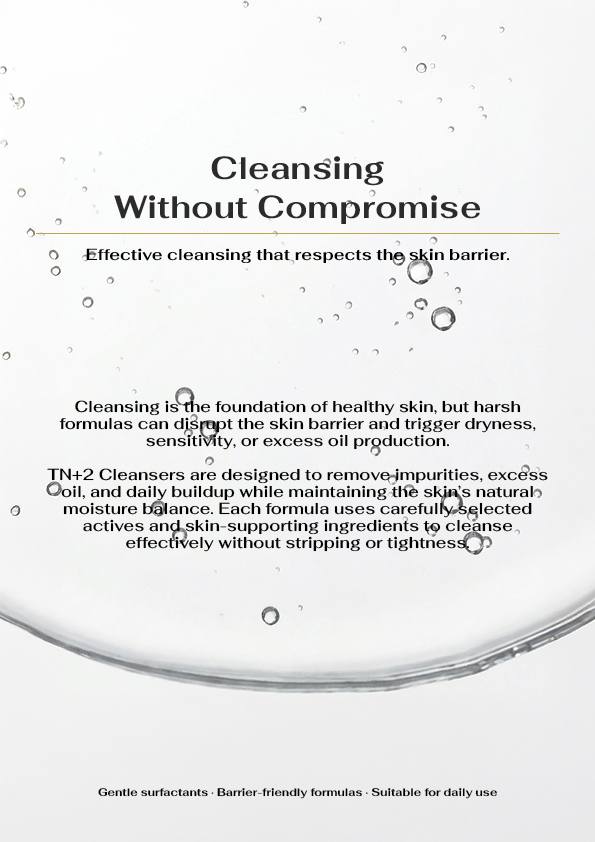
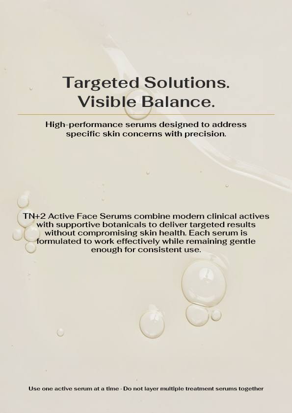
The complete TN+2 Professionals product catalogue: all 20 pages, brand-consistent design throughout. Click the page edges or drag to turn. Swipe on mobile.


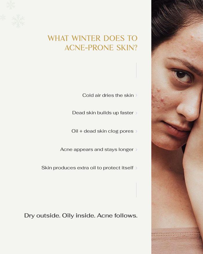
Graphics, reels, and a content system were built for Instagram: designed to communicate the brand's premiumness, showcase product benefits, and build trust with an audience that judges a skincare brand entirely by how it shows up visually. Every post, every reel, every Story was designed to feel like it belongs to a brand that knows what it is doing.
Short-form video content shot and edited by Indiibot for TN+2 Professionals. Every reel was designed to stop the scroll, communicate product benefits, and build brand trust in under 15 seconds.
A short pre-launch video produced to establish the brand's credibility before the store went live. Shot and edited to feel premium, trustworthy, and aspirational: giving the audience a reason to wait.
From the first brief to the live store, every single piece of TN+2 Professionals was built by Indiibot.
TN+2 Professionals was a full brand built from the ground up. Logo, palette, guidelines, packaging, photography, website, and social media: every single piece created and launched by Indiibot. The result is a brand that looks as professional as the formulas inside every product.