0%
Indiibot's boldest chapter. A brand built for the streets, the wrists, and the western world.
Indiibot had spent years building clean, refined brands, jewellery, food, education. Then a client walked in with a completely different brief: streetwear. Hip-hop jewelry. Western audience. Bold enough to stop a scroll on the other side of the world.
Our first instinct was to say no. Not because we lacked skill, but because we lacked knowledge. In branding, confidence without understanding produces work that rings false. We told the client honestly: we have never done this before. He told us back: that is exactly why I want you to do it.
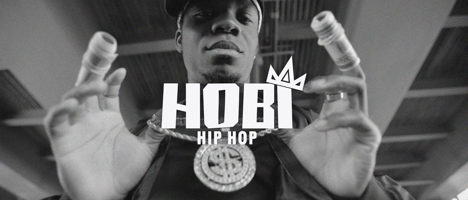
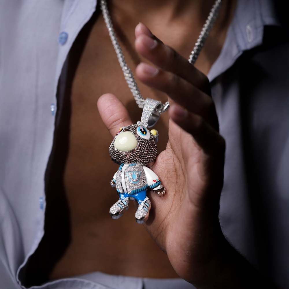
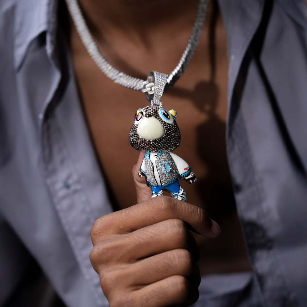
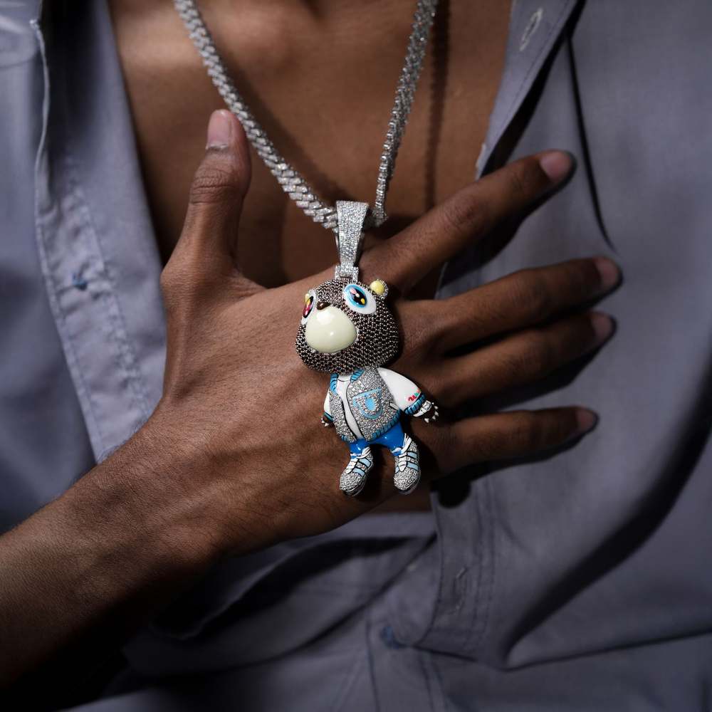
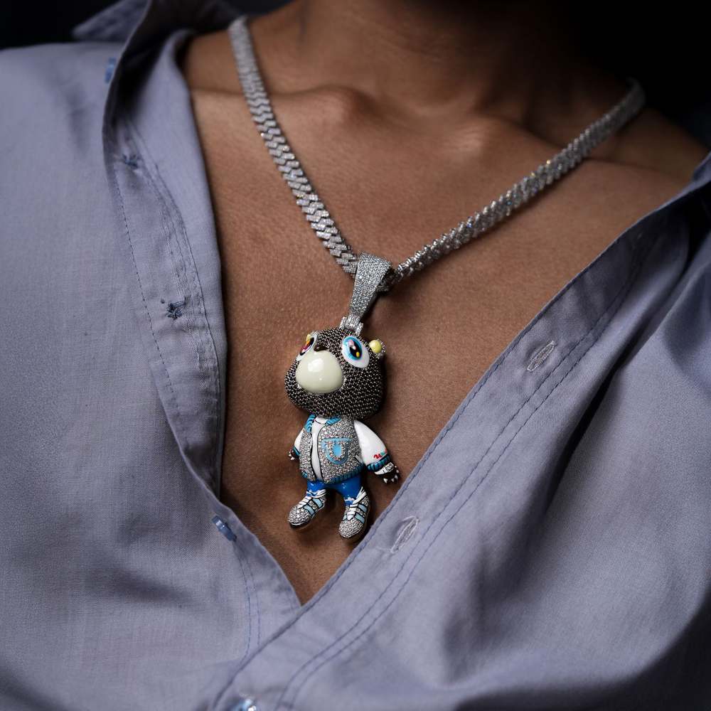
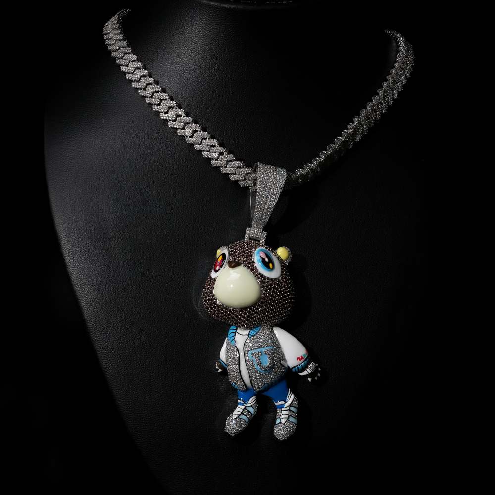
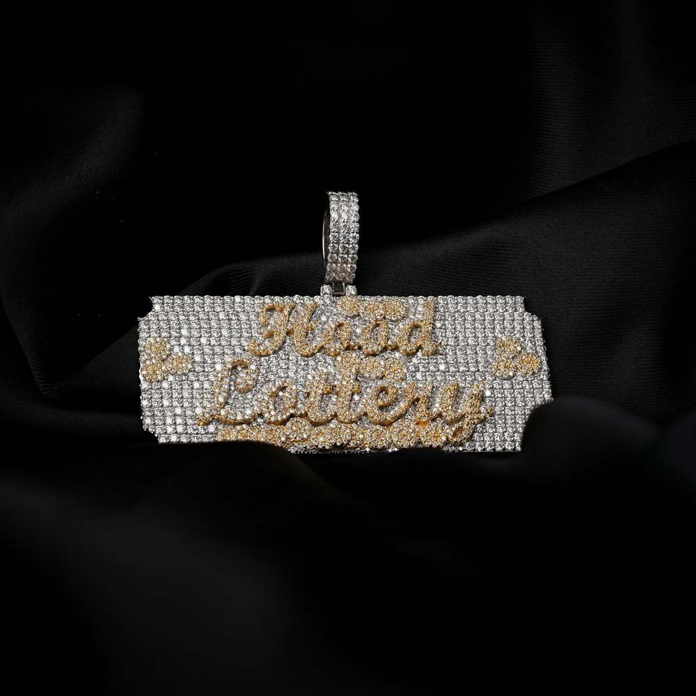
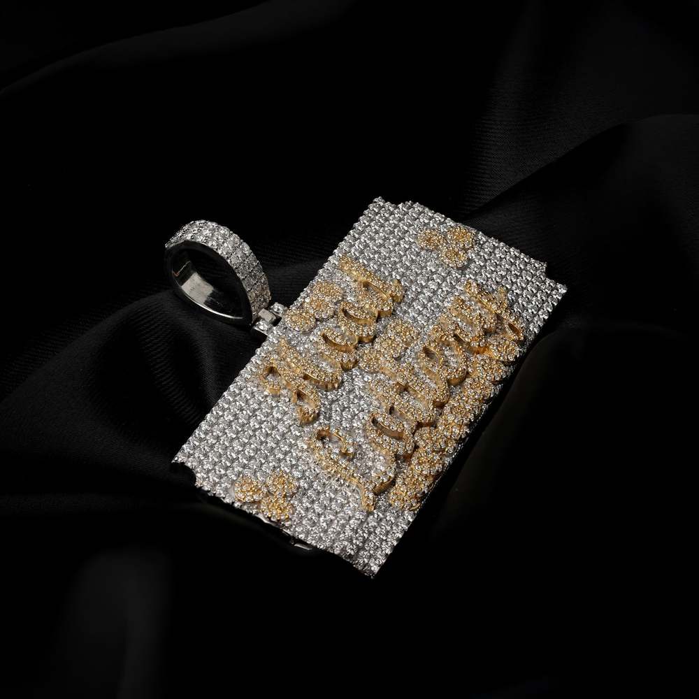
In hip-hop, jewelry is not decoration. It is a statement of arrival. A signal to the world that you made it, and you are not hiding it. HOBI was built to speak that language, fluently, boldly, and without apology.
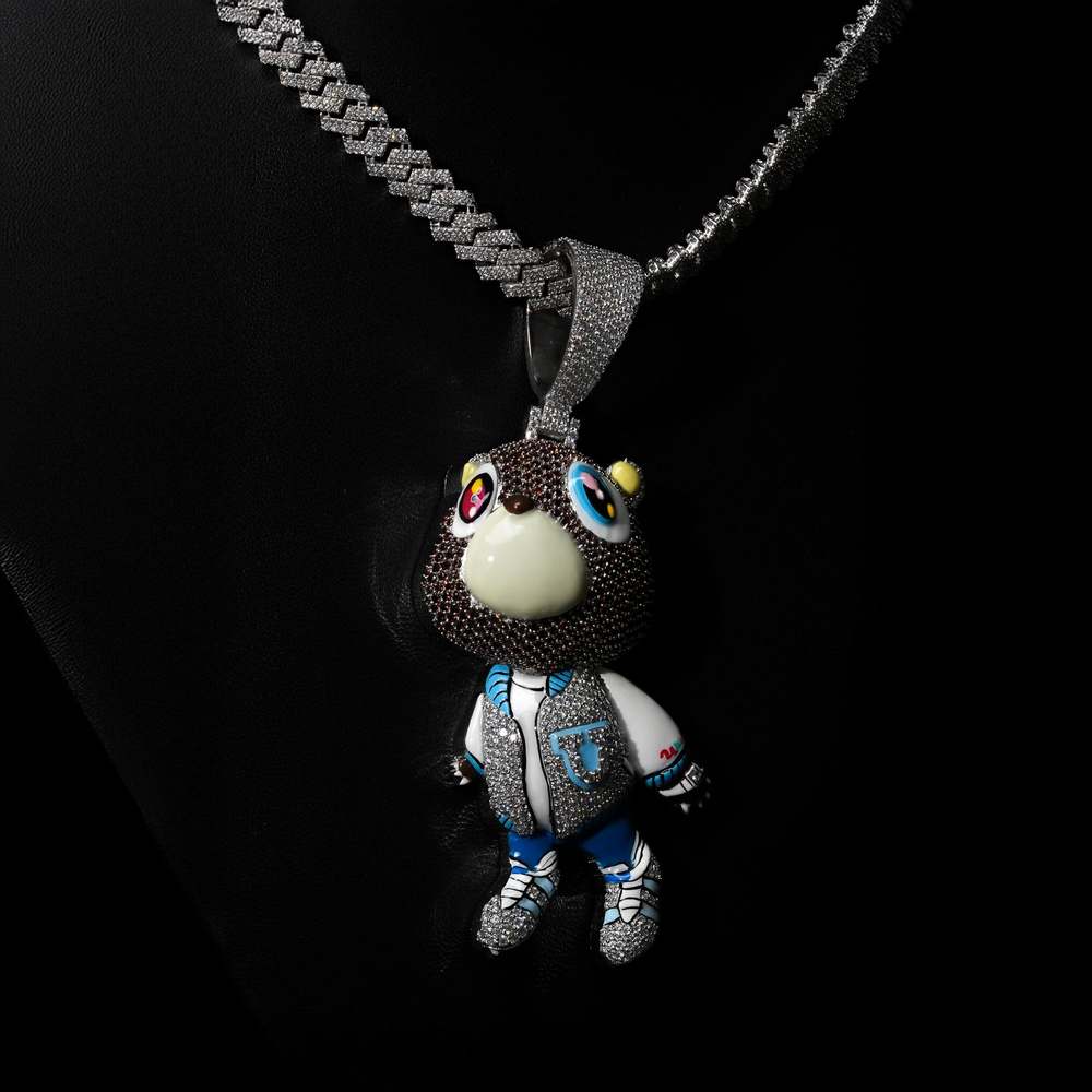
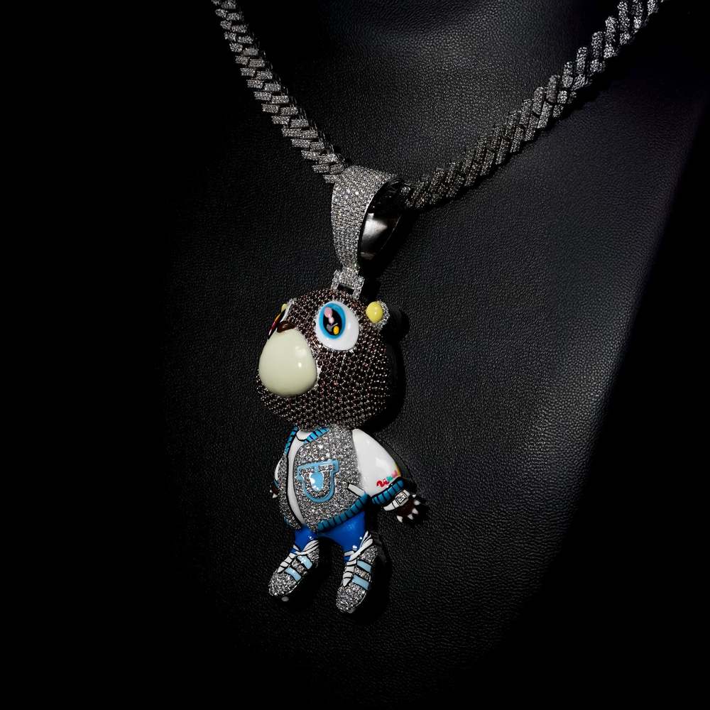
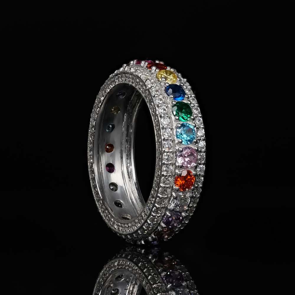
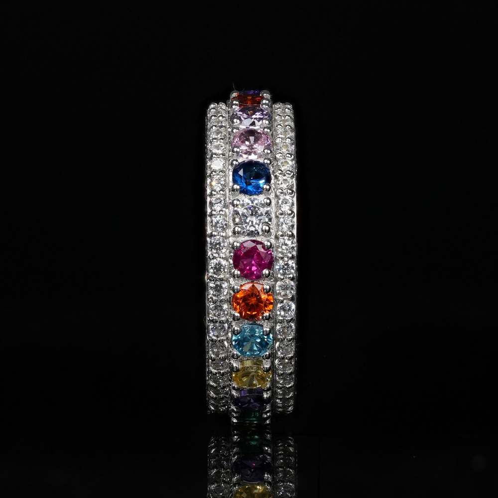
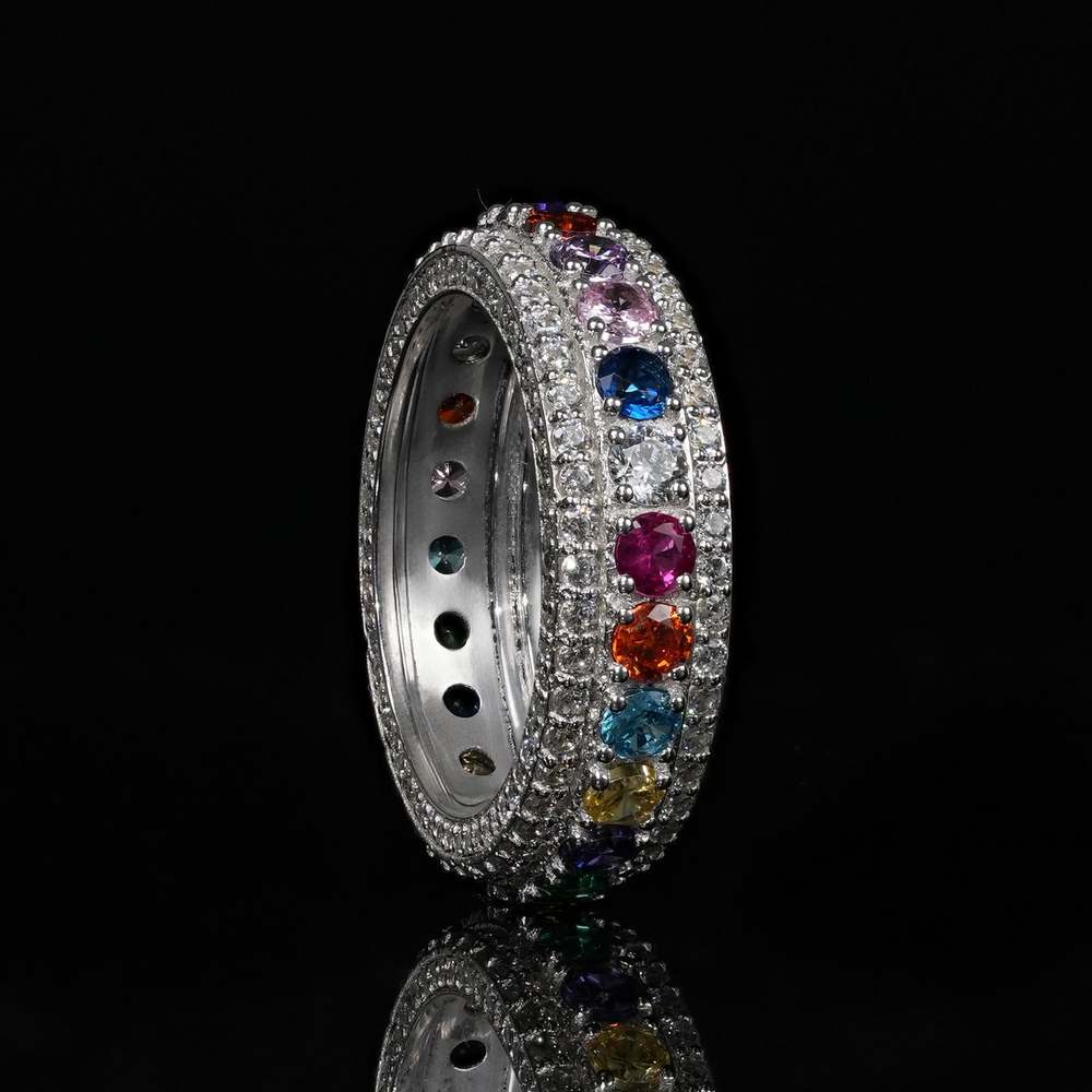
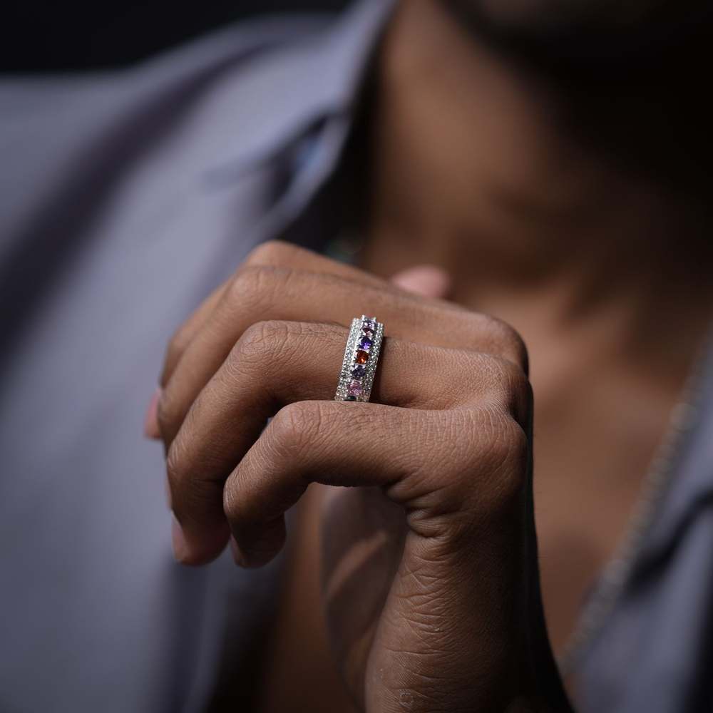
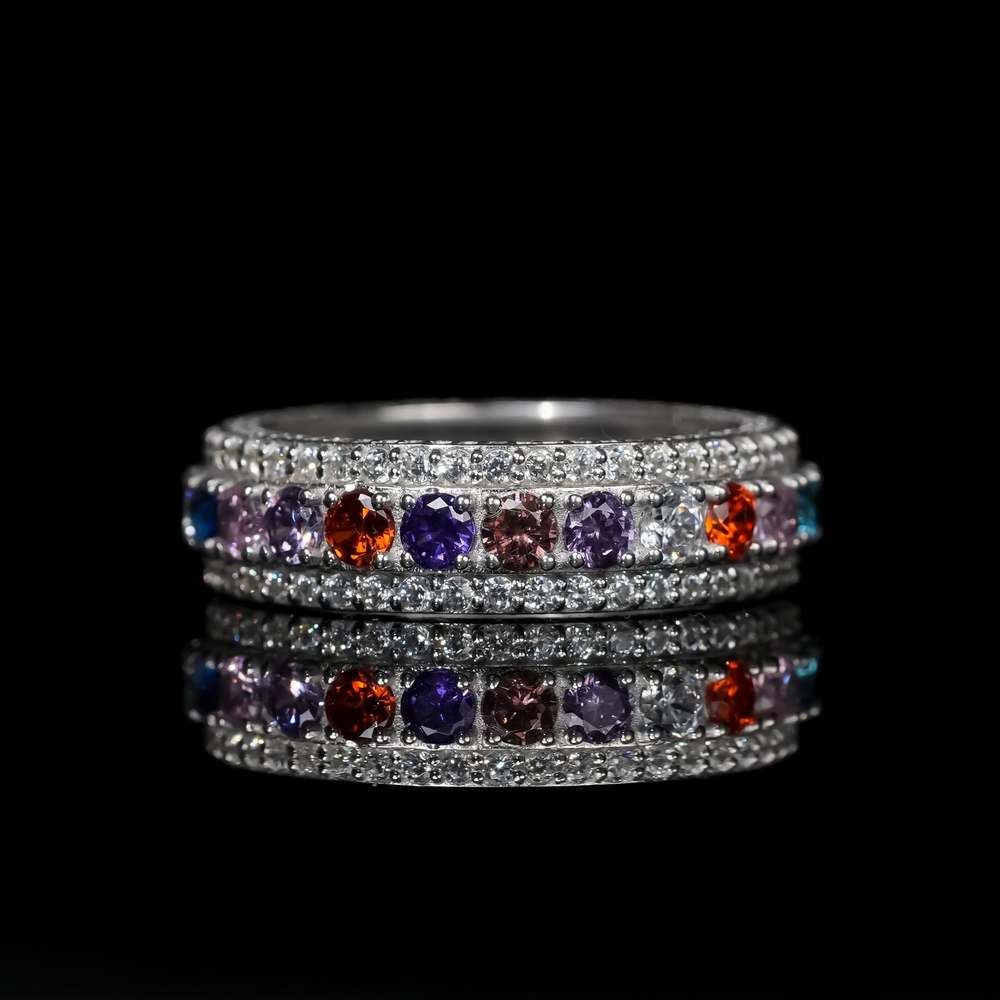
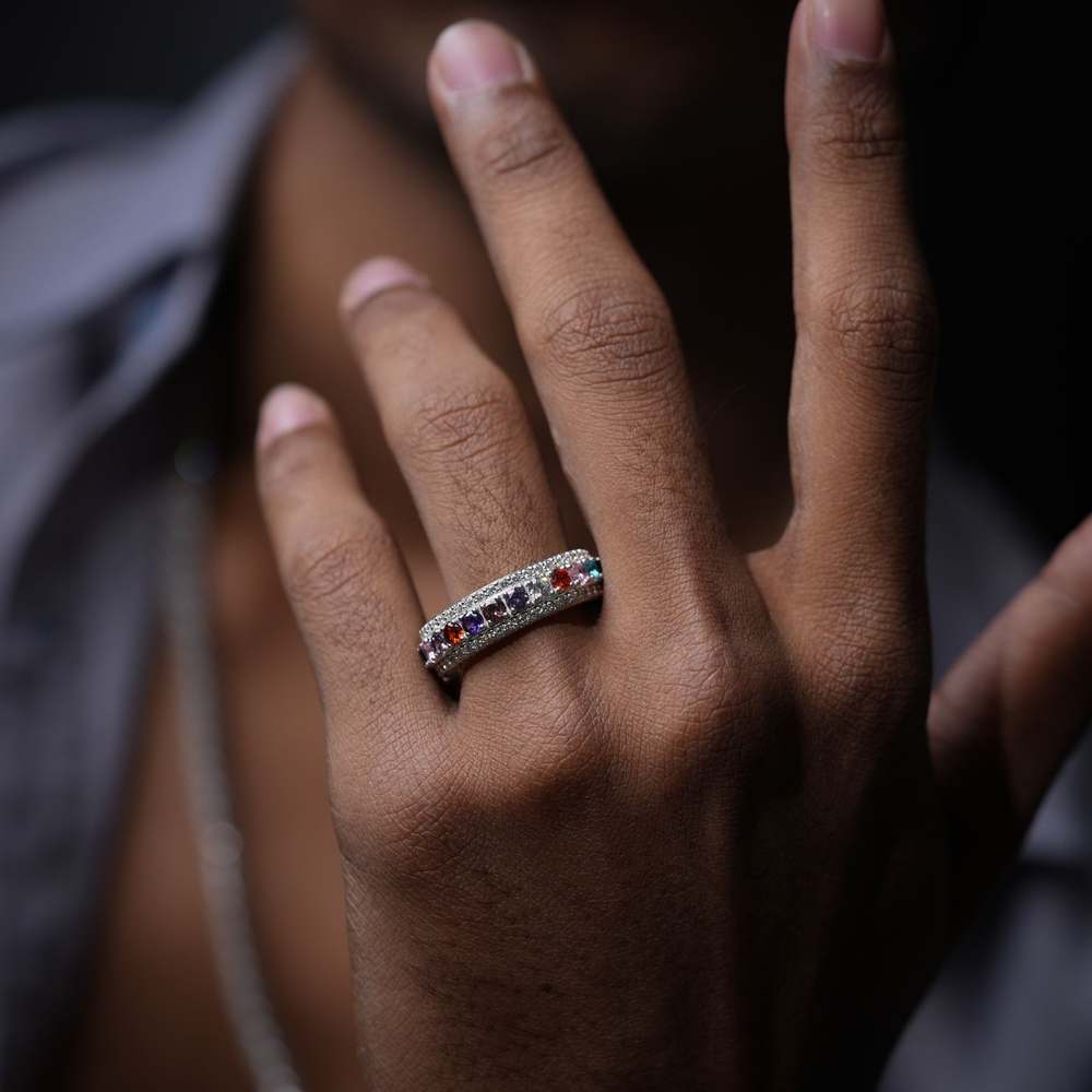
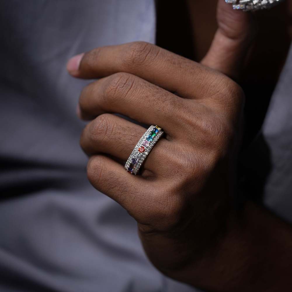
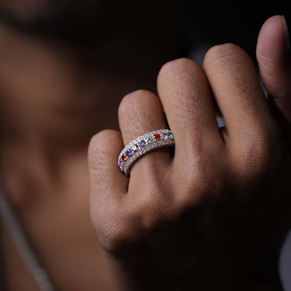
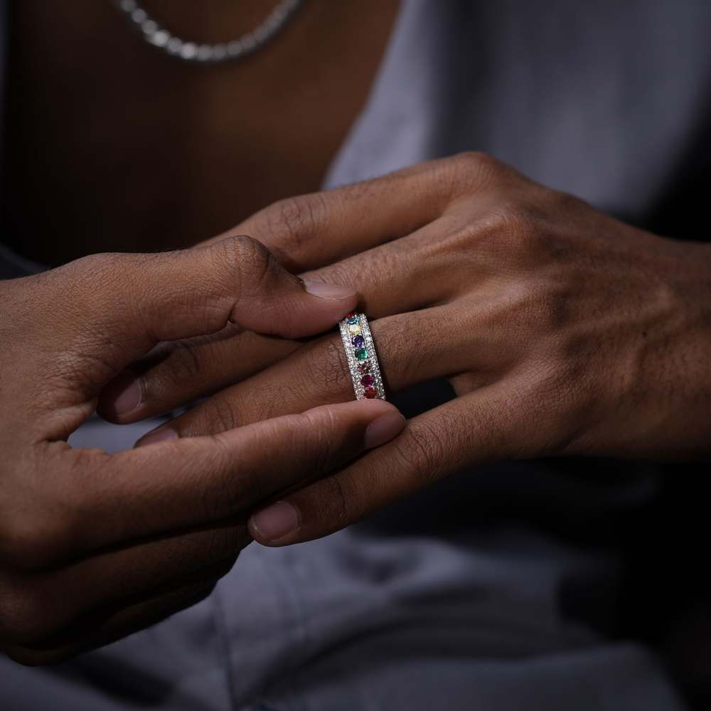
Every chain, every pendant, every piece in the HOBI collection is designed for movement, on camera, on stage, and on the wrist of someone who refuses to be ignored. Lab-crafted ice. Street-tested confidence.
Indiibot had never designed for the hip-hop market. We did not know the culture from the inside, and we refused to fake it. If we were going to build something authentic for this audience, we had to understand what that audience actually responds to, the visual codes, the attitude, the hierarchy of status symbols, the language of ice and bling.
The entire Indiibot team spent one month in deep research. Studying the biggest hip-hop jewelry brands worldwide. Understanding what bold really means in this space: not just loud, but weighted with intention. Before a single sketch was drawn, we made sure we knew what we were drawing for.
After weeks of research and rounds of naming, we landed on HOBI. Four letters built from four words. Short, punchy, easy to say in any market, impossible to forget. The kind of name that feels like it was always there, waiting to be discovered.
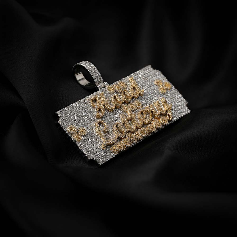
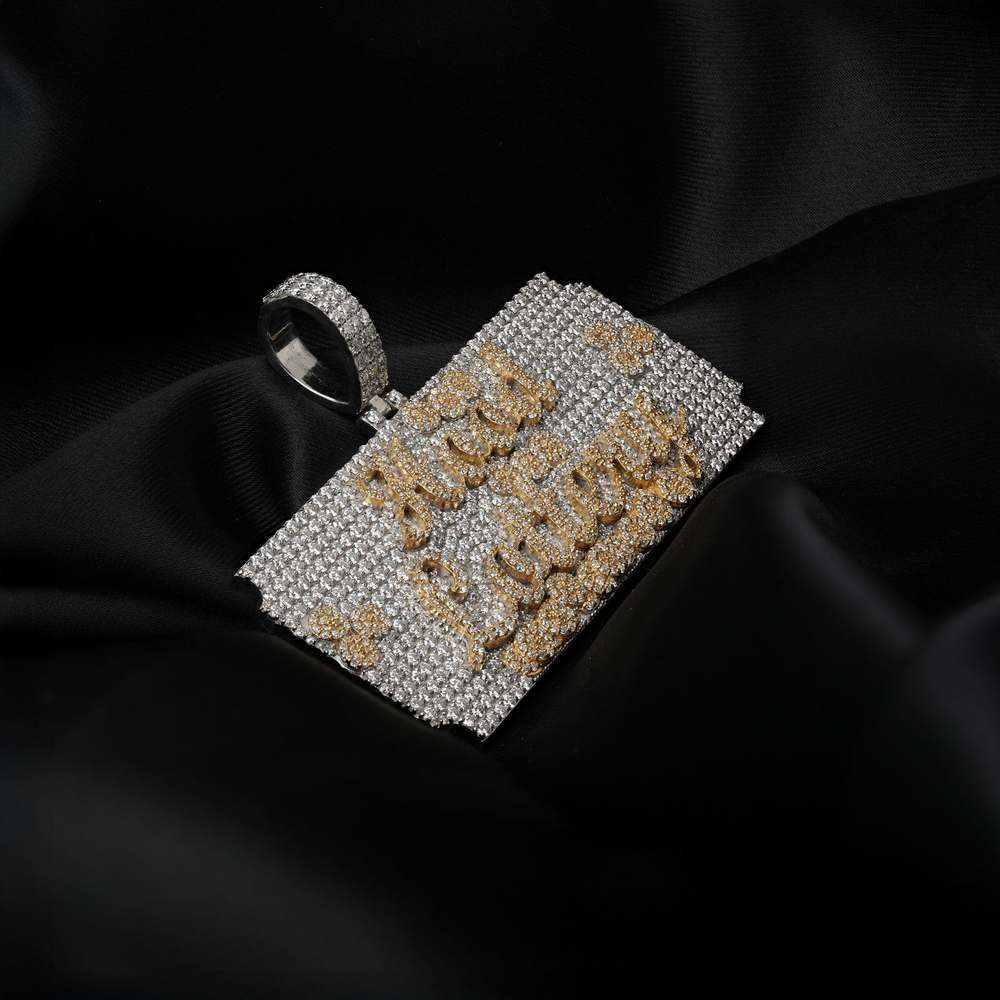
The brief had one unusual requirement: the logo had to work as a jewelry pendant. Not just look bold on screen, but be physically manufacturable as a piece of iced-out jewelry. That constraint became the greatest design instruction we received. It forced the logo to be geometric, weighty, and structurally clean, which, coincidentally, is exactly what great hip-hop branding looks like.
We chose a bold decorative typeface that communicates the culture immediately. Something with mass. Something that feels heavy to hold even on a screen. The letterforms were refined until they balanced perfectly both as a logotype and as a physical form a jeweler could cast in metal and set with stones.
Every color choice in branding is a statement. We could have gone gold, red, electric blue, all common in jewelry branding. Instead, we stripped everything back to black and white. Because in the hip-hop space, the boldest thing you can do is refuse to shout. Let the jewelry do the talking. The brand steps back and lets the product step forward.
Typography in hip-hop branding is not subtle. We evaluated dozens of display fonts specifically looking for letterforms that communicated the culture: bold, decorative, with personality built into every curve and corner. The chosen typeface carries the brand's attitude before a single product is seen, and its geometry translates directly into the pendant design.
Iced hip-hop jewelry is a product that lives or dies by how it is photographed. Light, reflection, surface texture, a mediocre photo makes a thousand-dollar chain look like a costume. We shot the full product photography lineup for HOBI: close-up detail work, flat lays, and campaign-style shots that communicate the brand's attitude alongside the product's quality. The result impressed the client and became the foundation for every piece of marketing that followed.
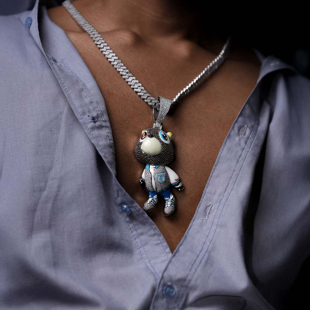
Hip-hop culture lives on video. Product alone is not enough, you need motion, energy, the feeling of the lifestyle the jewelry represents. Indiibot created the full social media reel library for HOBI: close-up product films, lifestyle content, and brand campaign videos engineered specifically for Instagram and TikTok audiences in western markets. Sales followed.
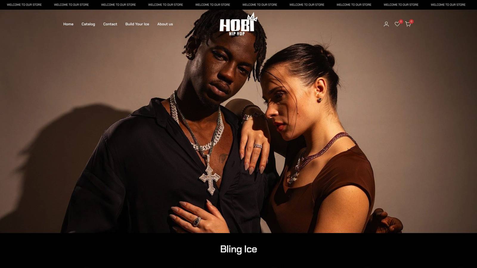
The HOBI website was built to convert western buyers who were discovering the brand for the first time. Dark, heavy, uncompromising, the site puts the product and the brand personality front and center. Every page was designed to feel like you stepped into a flagship store on a high-end street somewhere between New York and London. Visit it at hobihiphop.com.
One month of research. One team that had never touched this market. One client who refused to take no for an answer. The result: a complete brand that now drives real sales from western markets worldwide.
We said no because we were honest about what we did not know. We said yes because we were willing to learn. That one month of research changed everything, not just for HOBI, but for Indiibot. We proved something to ourselves: when you understand a culture deeply, you can build for it authentically. The brand now sells to western markets worldwide. The client who refused our refusal was right from the start.