0%
Shine Like the Sea. A lab grown diamond company with an identity rooted in the ocean, conflict-free, nature-friendly, and built to last.
The client came in with a product and no identity. The previous working name was purely descriptive: "Lab Grown Diamond." Functional. Forgettable. In a market where every buyer knows what lab grown diamonds are, the name alone cannot be the brand. The name has to make someone feel something before they ever see the product.
The brief was to build a complete identity, starting from naming, for a lab grown diamond trading company that wanted to stand apart from every generic jewelry brand using the same white-and-gold aesthetic. Something with depth. Something rooted in a meaning the owner could be proud to put on a signboard.
Naming a diamond company is not a creative exercise, it is a trust exercise. The name will go on every piece of packaging, every signboard, every customer invoice, and every first impression. It has to feel right the moment an owner says it out loud. Ten names were not wrong. They just were not right enough. When the owner heard Richie Diam, the decision was immediate.
"Richie" carries aspiration, the feeling of abundance, richness, and success that fine jewelry is supposed to represent. "Diam" is a distillation of Diamond: shorter, sharper, and more ownable than the full word. Together they are confident without being arrogant. Premium without being cold.
Derived from "rich" but softened into a name, personal, warm, and aspirational. It speaks to the buyer who wants to feel elevated, not lectured. A diamond should feel like a reward. "Richie" carries that energy without the stiffness of a corporate title.
Diamond compressed. "Diam" is used in European fine jewelry vocabulary, it reads internationally, sounds modern, and immediately communicates the product without stating it plainly. A shorthand that signals expertise to anyone who knows the industry, and sounds effortlessly premium to anyone who does not.
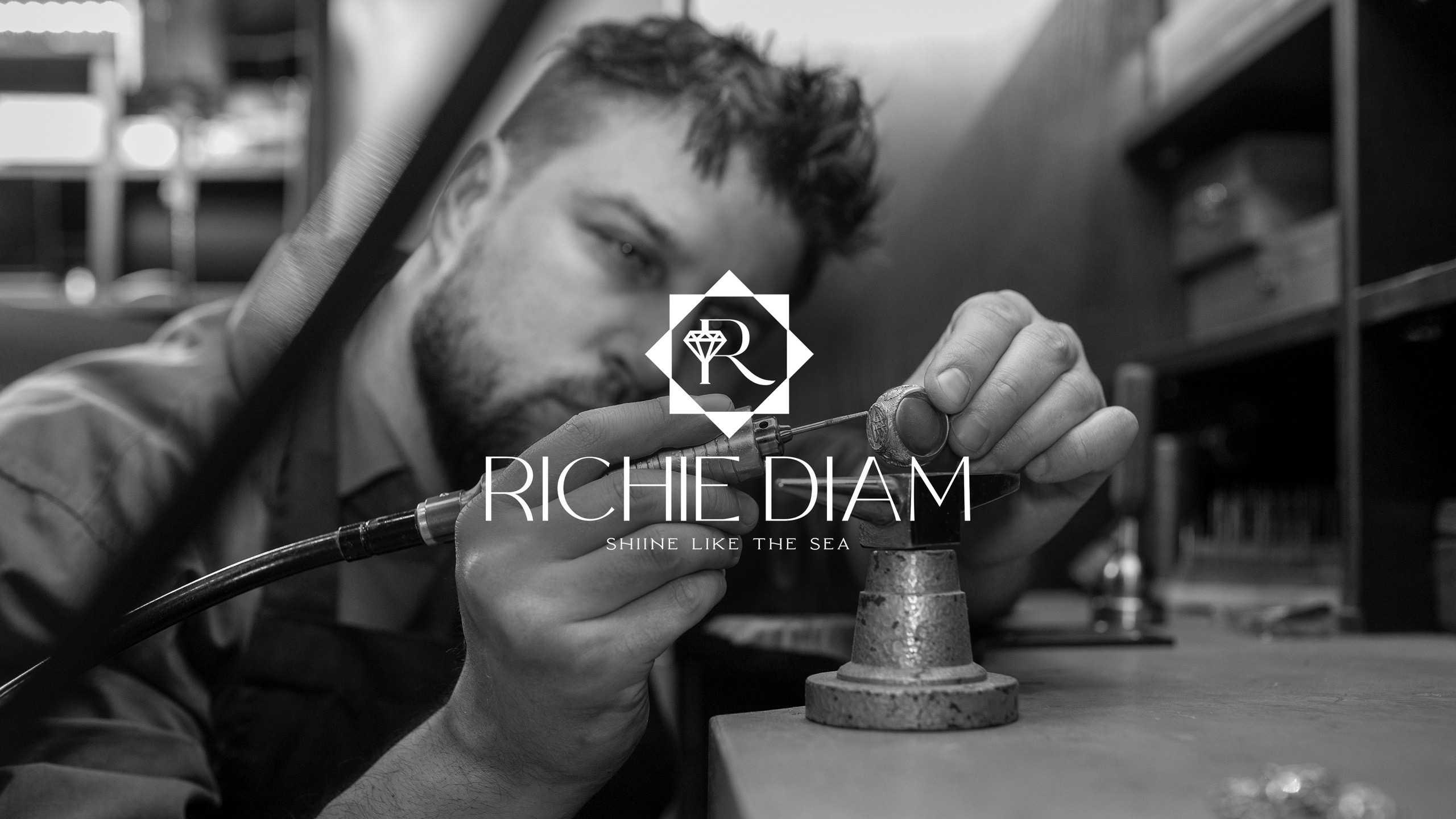
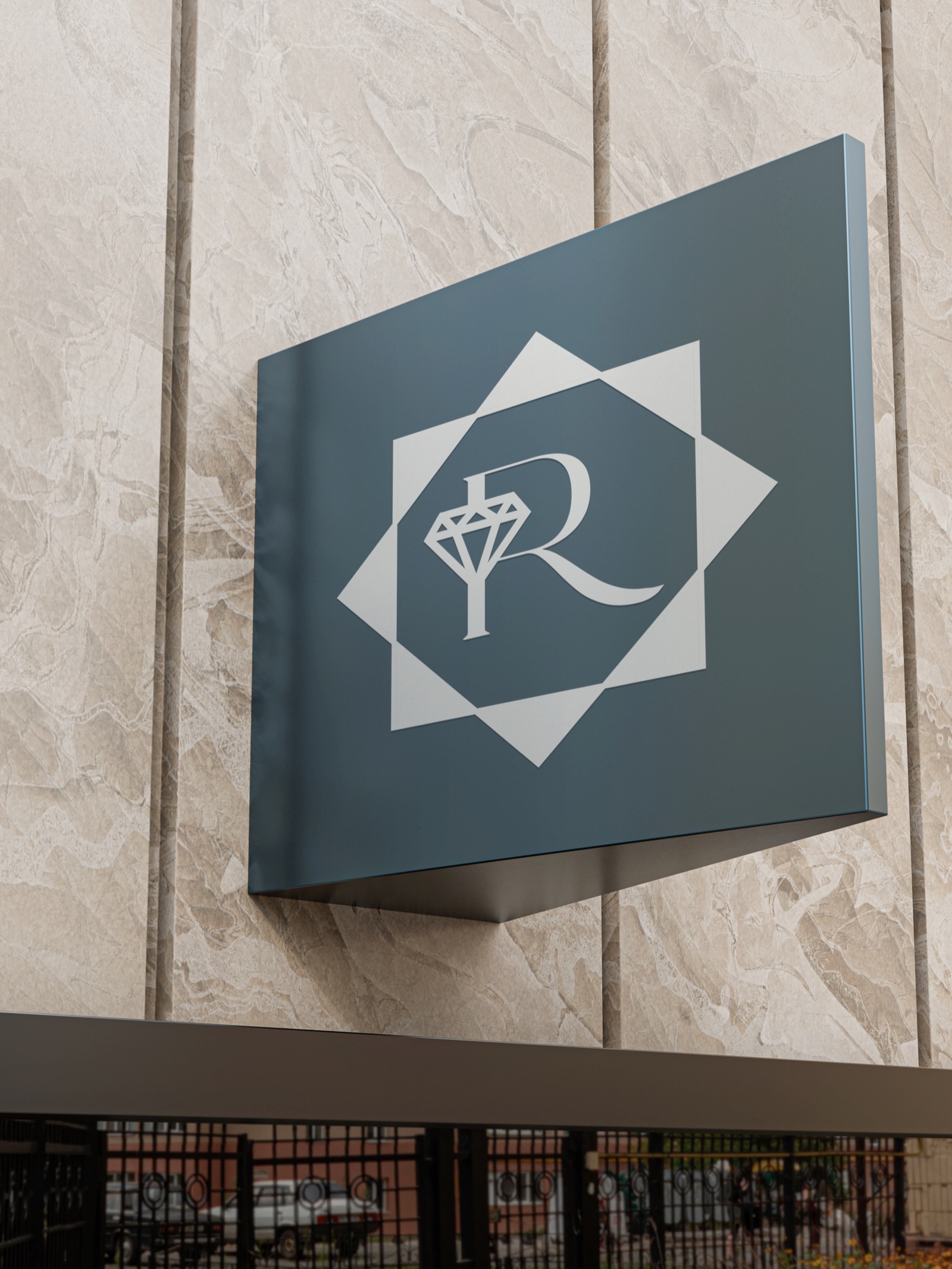
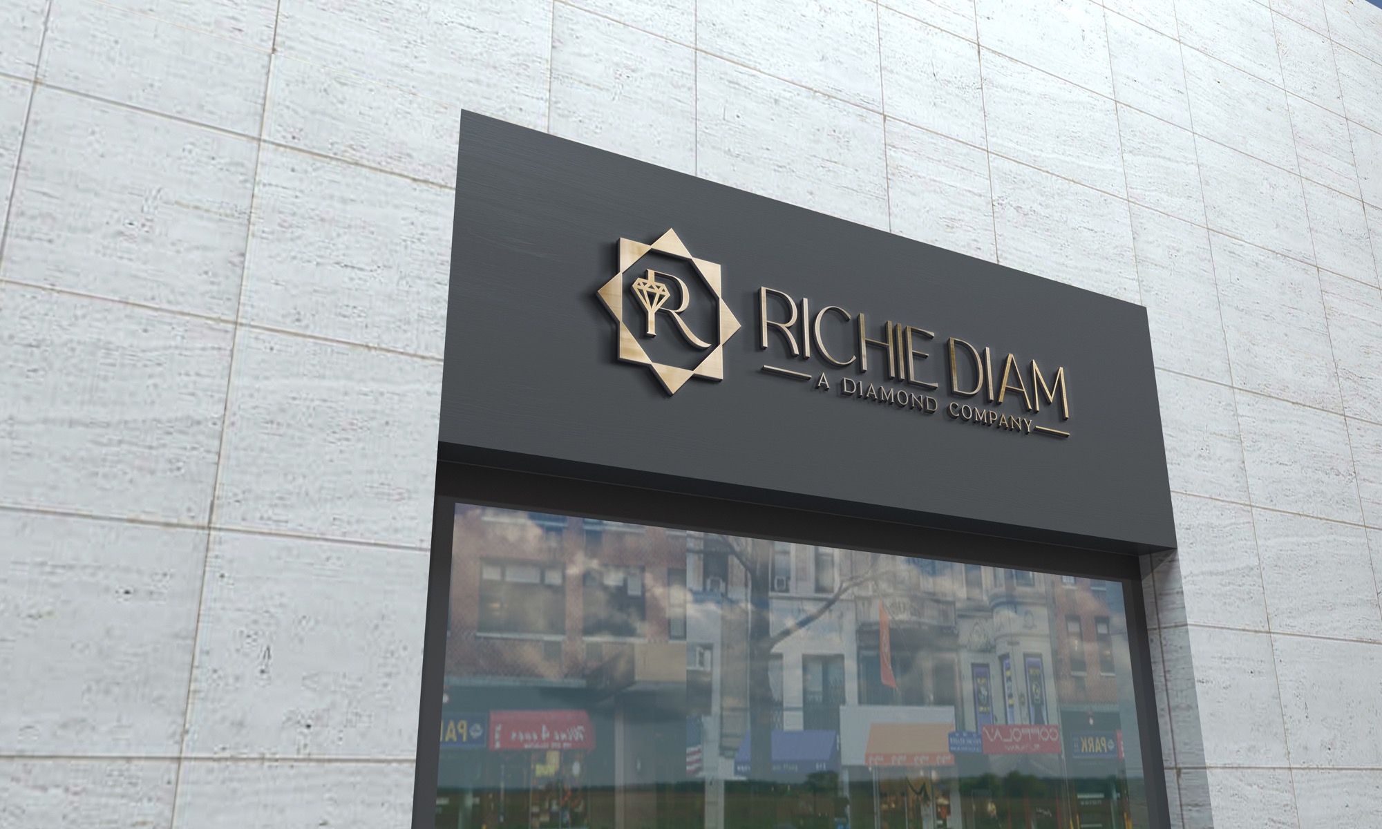
The logo mark is built on a star-octagon geometry, a shape that references the many facets of a cut diamond and carries associations of precision and perfection across multiple cultures. Inside it, the letter R is drawn in the Rollgates Luxury typeface, paired with a small diamond icon above, placing the product literally inside the brand symbol. Every element earns its place.
The primary wordmark uses Rollgates Luxury for "RICHIE DIAM", a refined serif with geometric authority that signals premium positioning without needing any visual decoration to feel luxurious. The secondary font Karim carries the tagline in spaced capitals, creating the breathing room that allows the full mark to feel composed rather than crowded.
Typography in jewelry branding is not about decoration. It is about authority and emotion. The primary font carries the brand name, it needs to command attention and project permanence. The secondary font handles everything else, it needs to be readable, refined, and slightly warmer. Both were chosen to work together, not compete.
A high-contrast serif with fine strokes and strong geometry. Used for "RICHIE DIAM" in the primary wordmark. Communicates heritage, craft, and premium positioning, the kind of typography that belongs on a jewelry counter or a luxury business card. It has enough visual weight to anchor the brand across every touchpoint.
A refined display font that carries the tagline "SHIINE LIKE THE SEA" and supporting brand text. Its generous spacing and clean lines prevent the mark from feeling heavy when wordmark and tagline appear together. Where Rollgates commands, Karim breathes.
Lab grown diamonds are created in a laboratory, not excavated from the earth. They are conflict-free, environmentally conscious, and optically identical to mined stones. The color palette was built to reflect that difference, not the darkness and pressure of a mine, but the clarity and depth of the ocean. Shades of blue that feel alive, honest, and genuinely premium.
Mined diamonds carry a history the industry is still working to reconcile. Lab grown diamonds have no such burden, no mining, no displacement, no environmental cost. The ocean palette was chosen to make that distinction visible. Blue communicates clarity, depth, and nature without a single word of explanation. The buyer who sees this brand immediately understands: this is different. This is clean.
Logo design is tested in context, not on a white background. Every mockup was chosen to show the mark in scenarios the brand would actually encounter, from a shop signboard that buyers walk past on the street, to close-up material presentations that communicate the quality of the craft behind every piece.

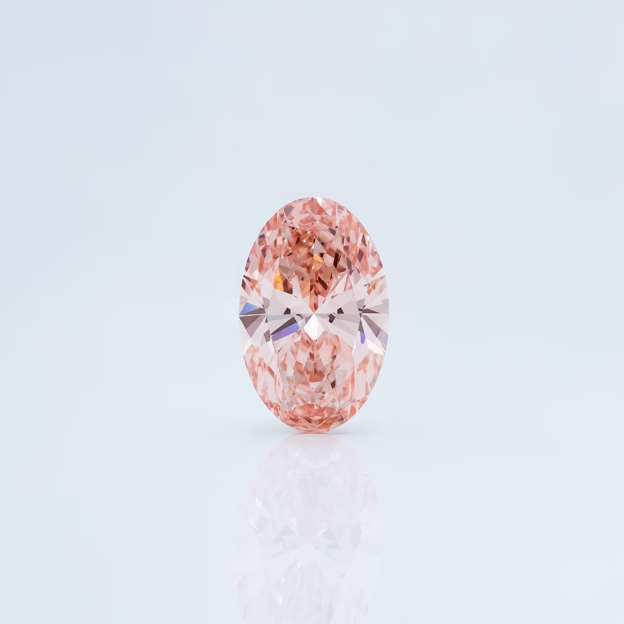
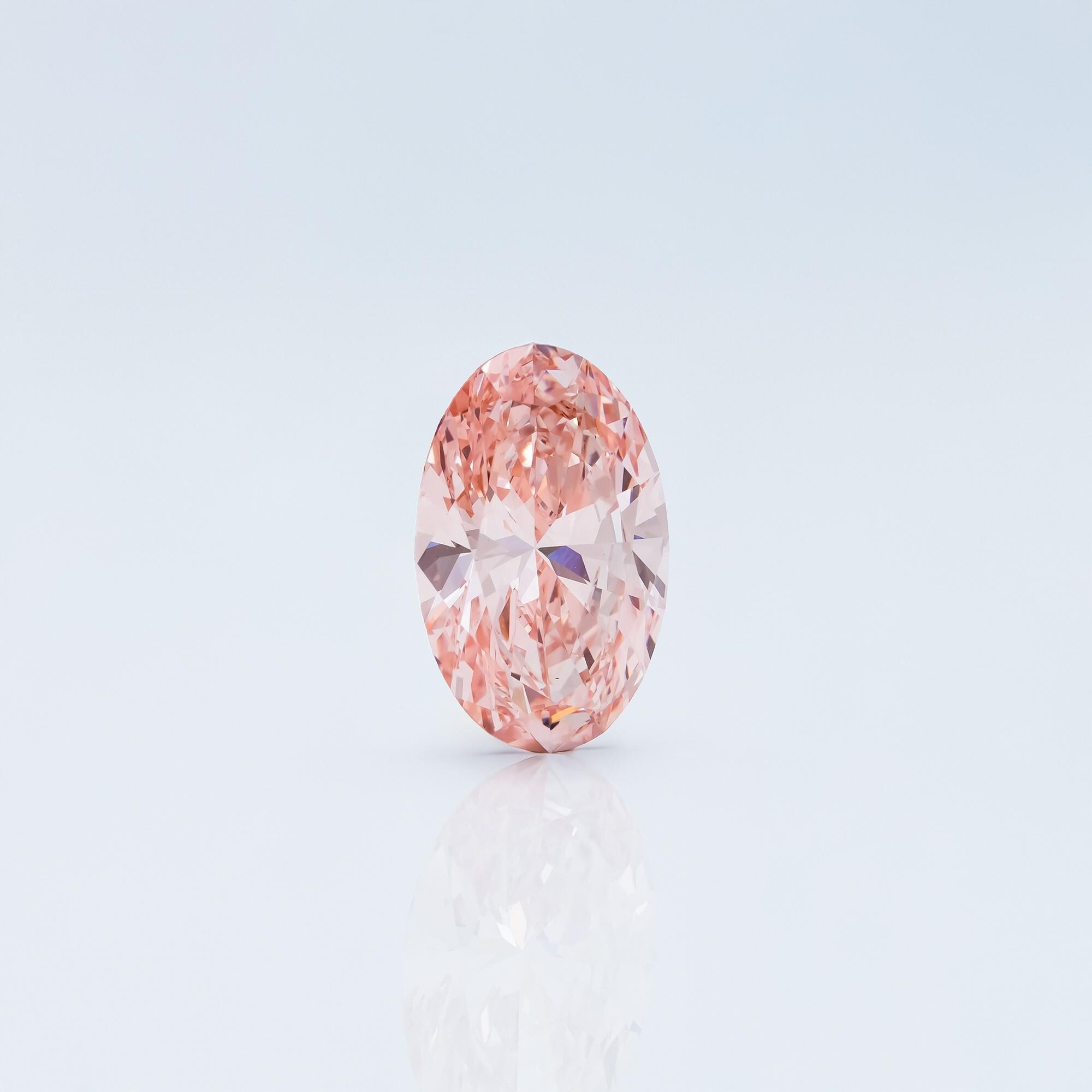
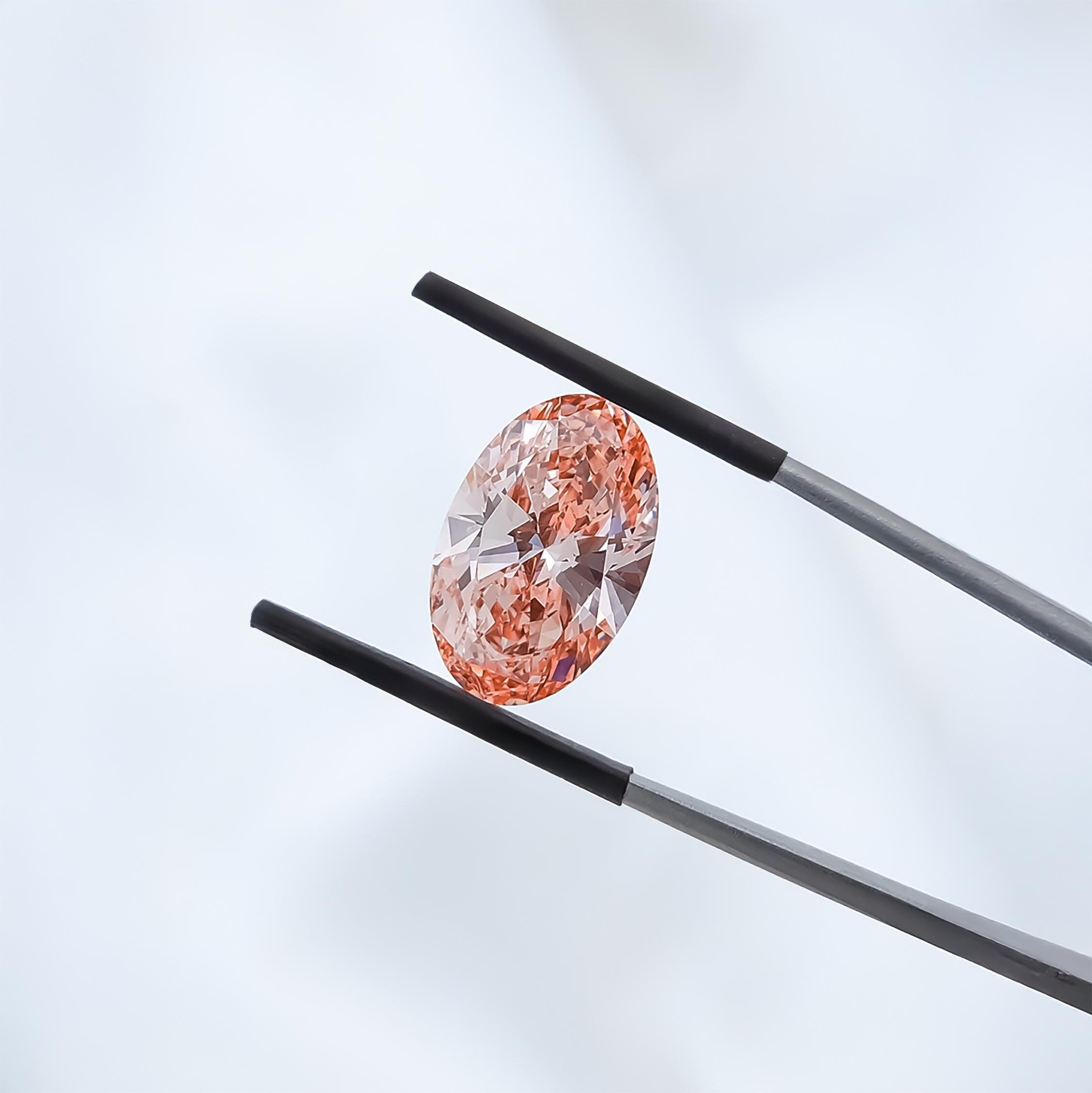
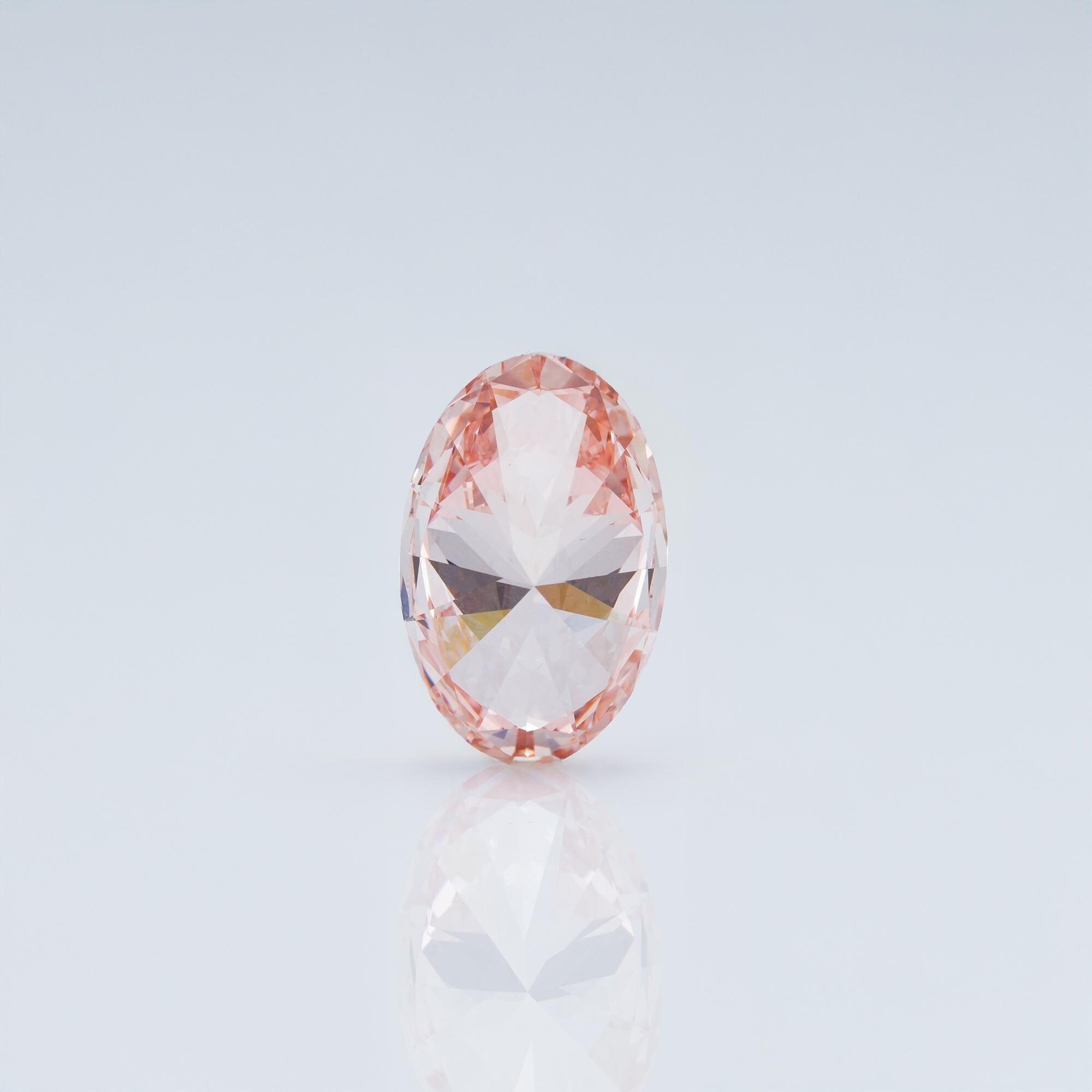
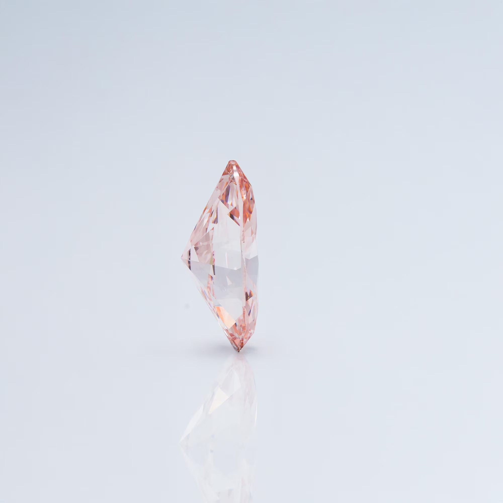
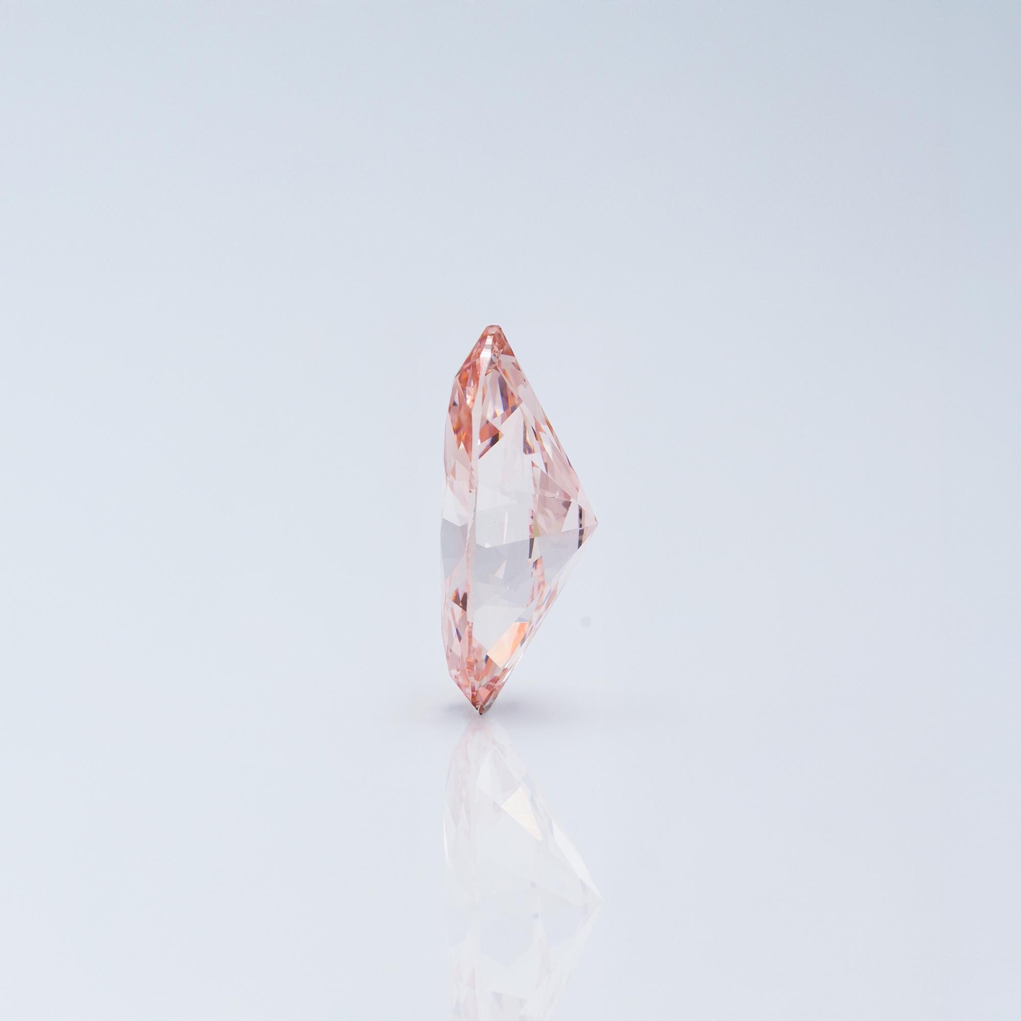
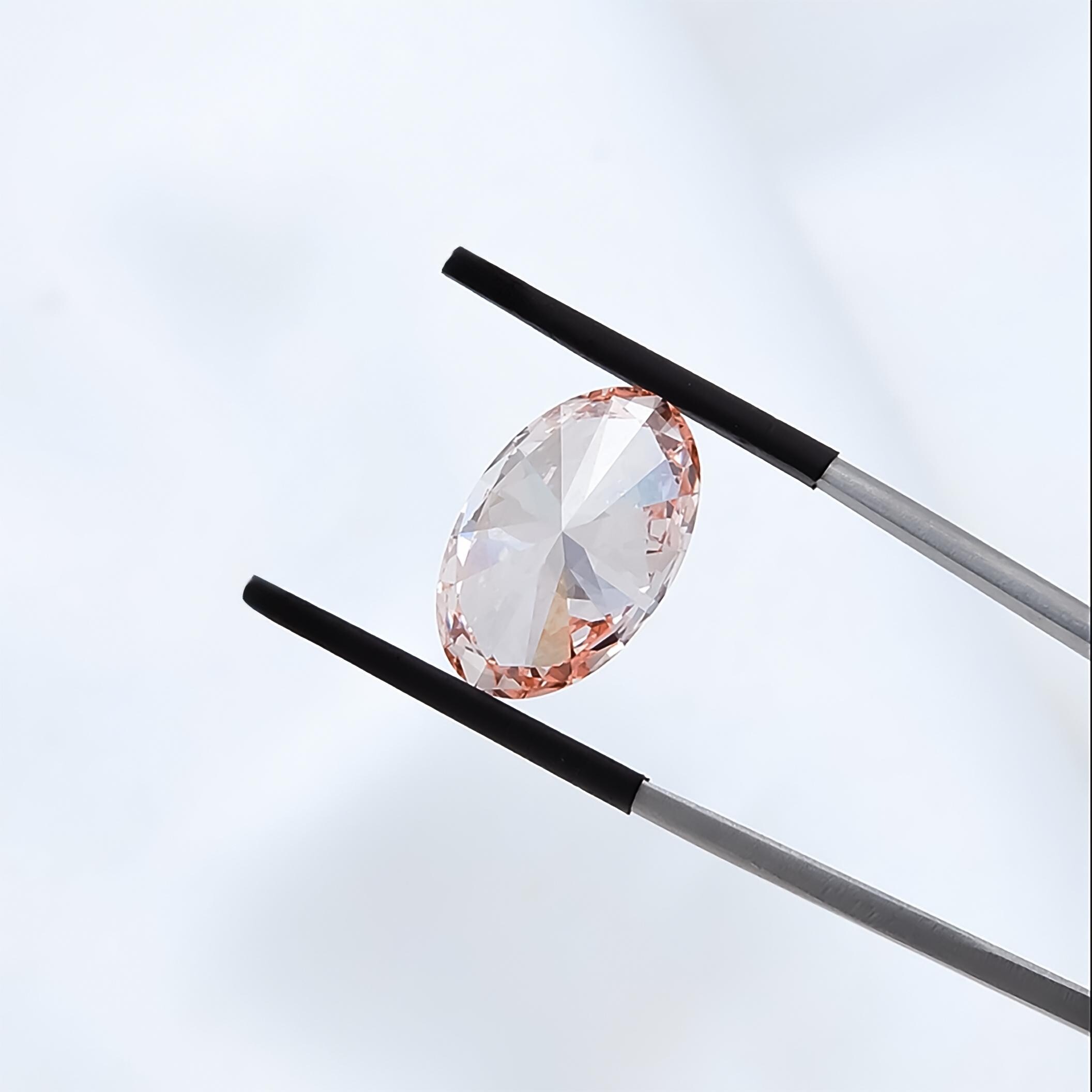
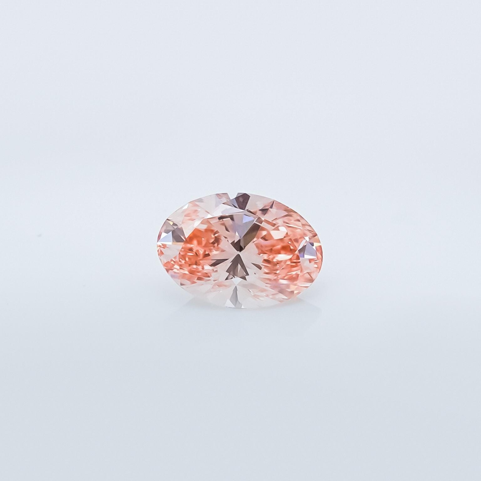
Beyond branding, Indiibot handles diamond photography and videography for Richie Diam. Every stone is captured to show its cut, clarity, and color at its absolute best, close-up macro shots, detailed facet films, and product content built for buyers who make decisions with their eyes. Below: a 3CT Pink Oval Cut Lab Grown Diamond, IGI Certified.
We shot and edited the full Reels library for Richie Diam, close-up product films, lifestyle cuts, and brand campaign videos. Every reel was built for Instagram, engineered to stop a scroll and communicate the premium quality of the stones and the brand behind them.
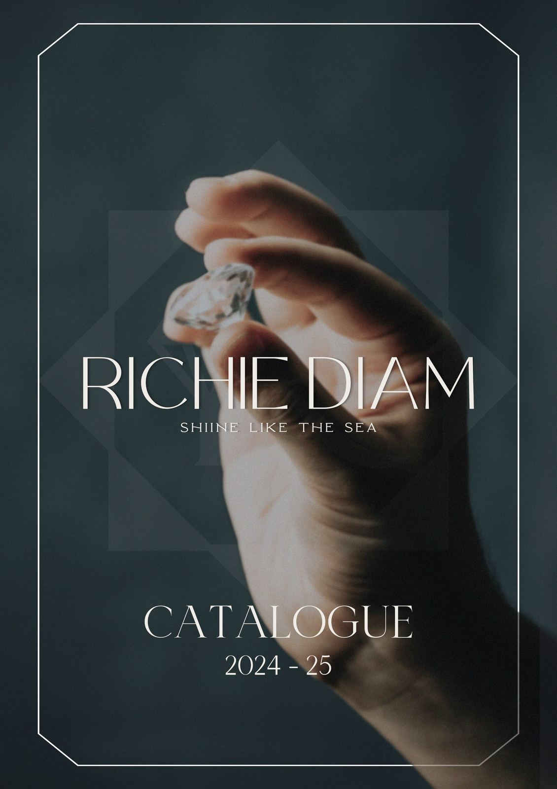
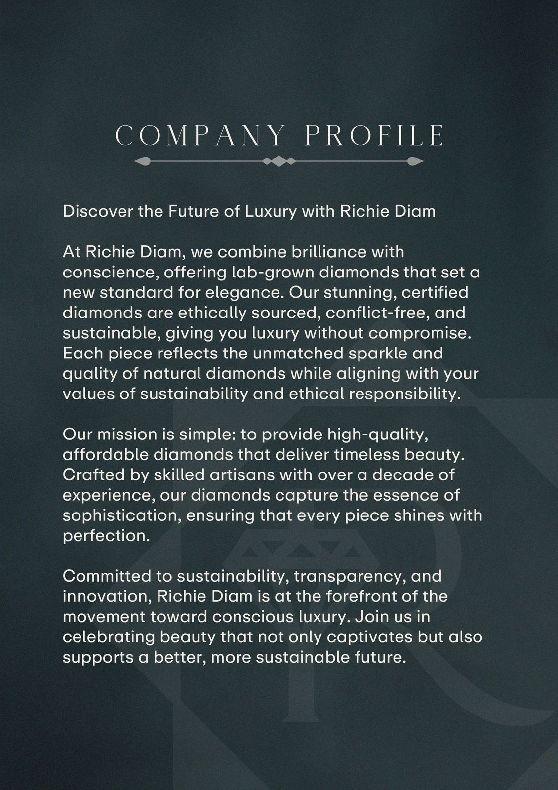
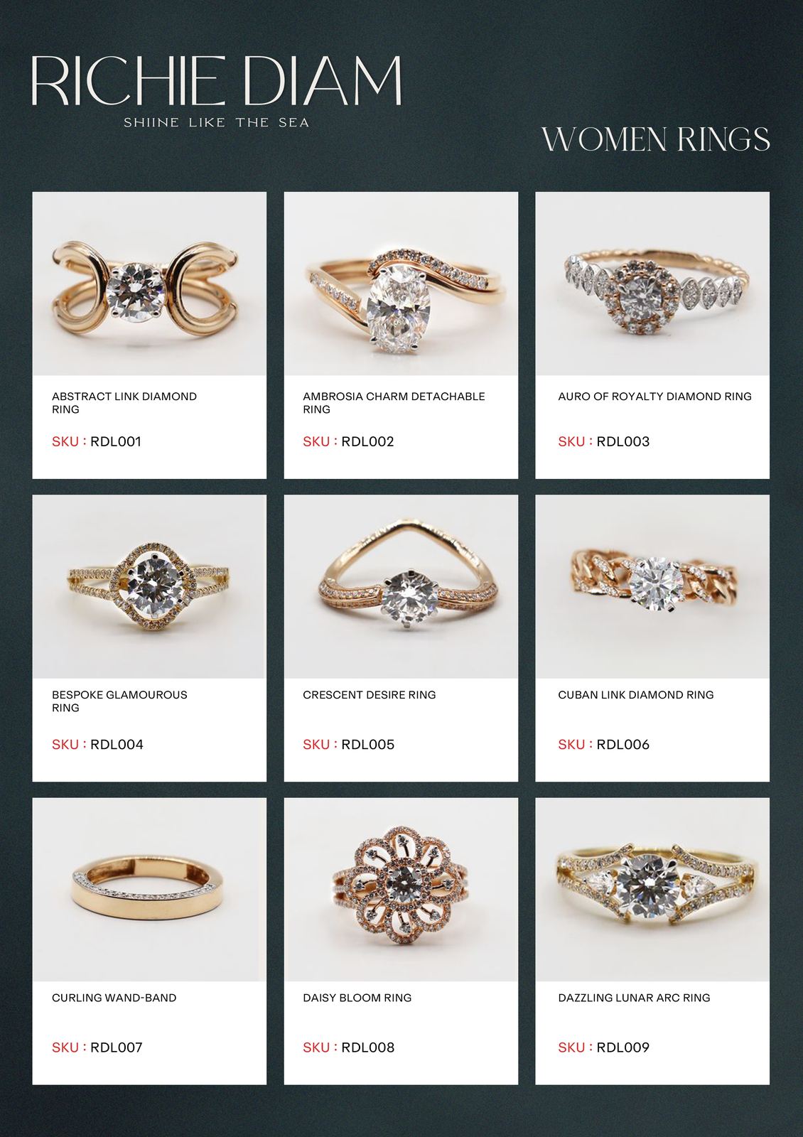
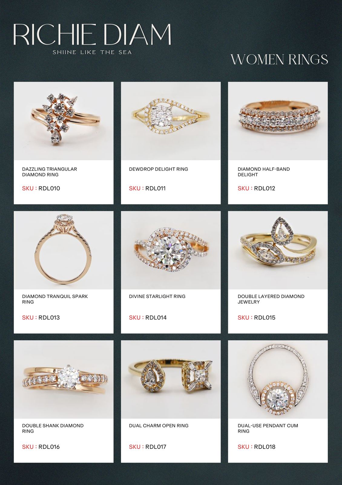
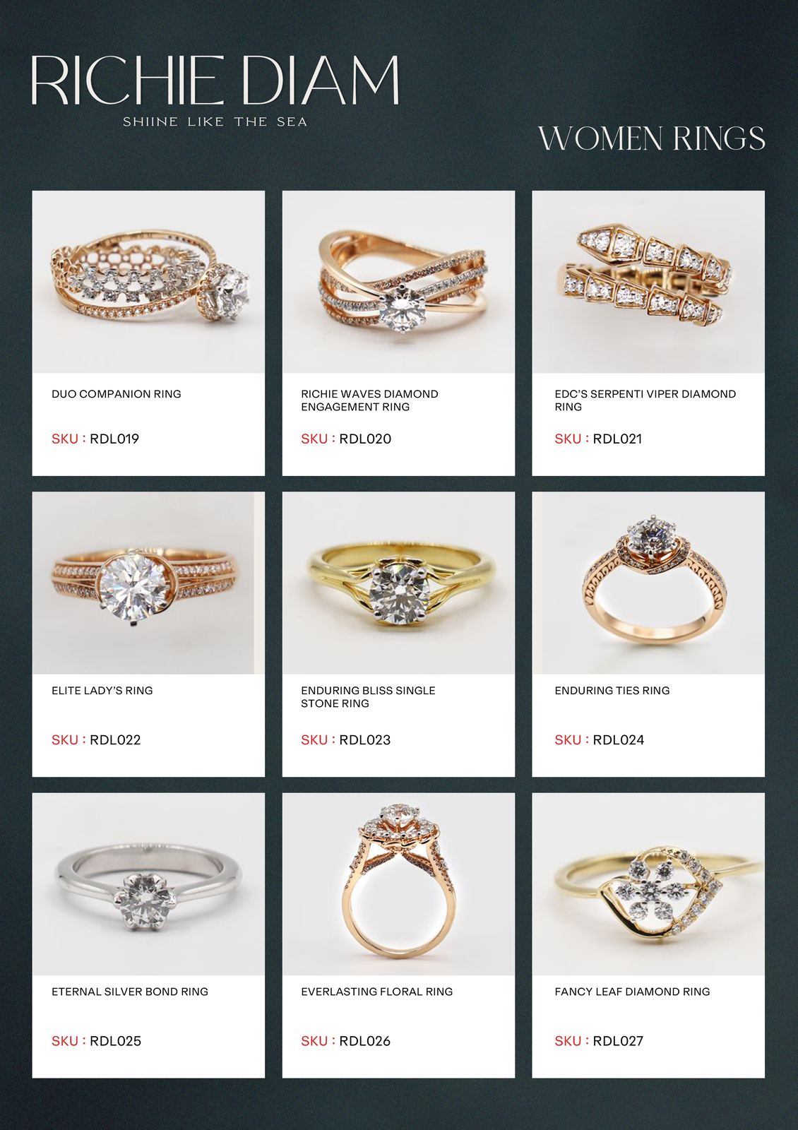
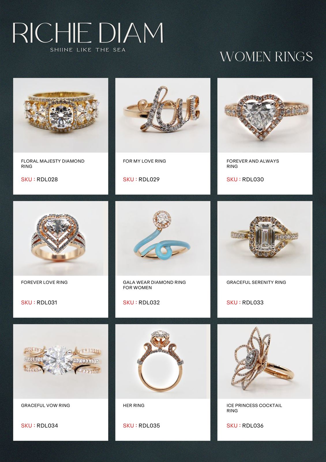
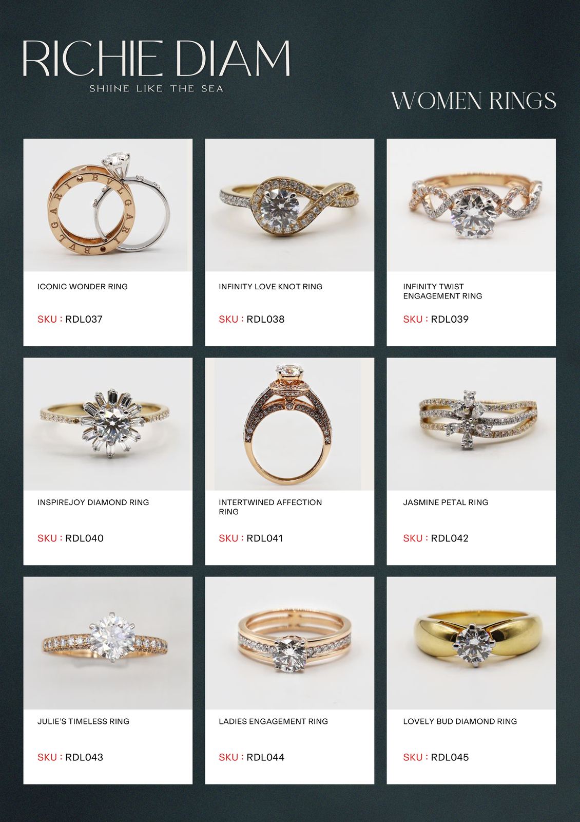
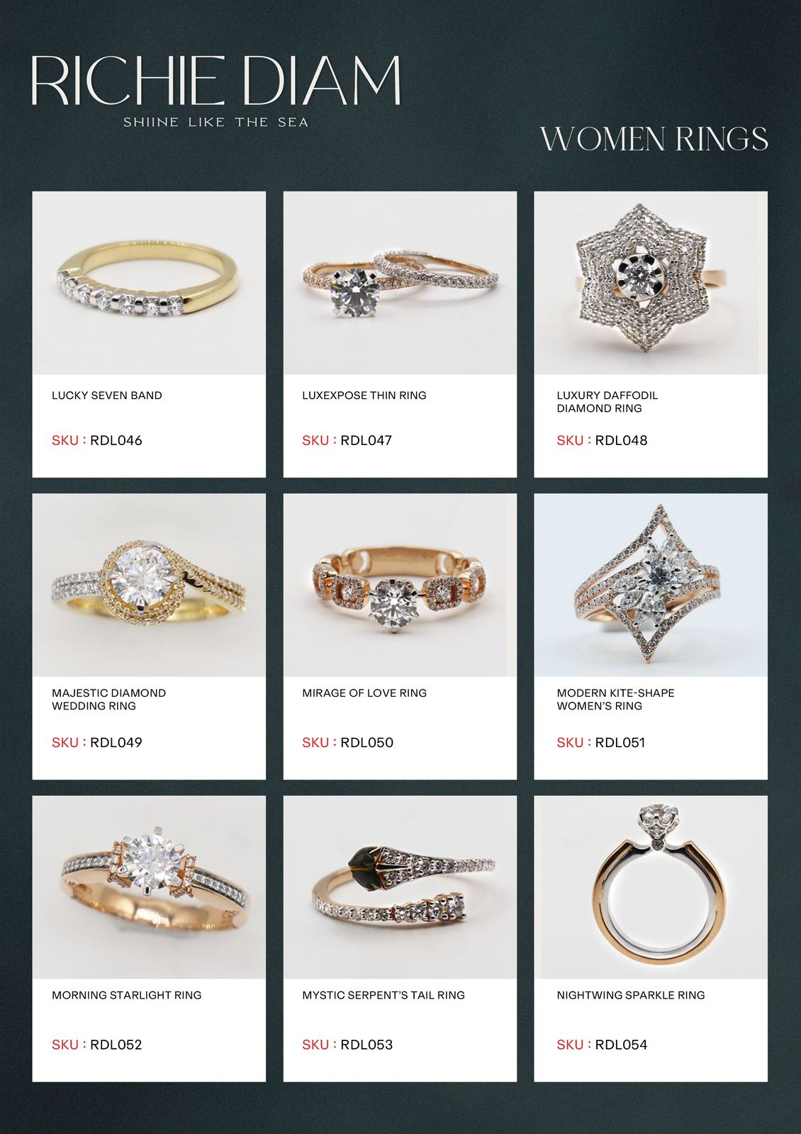
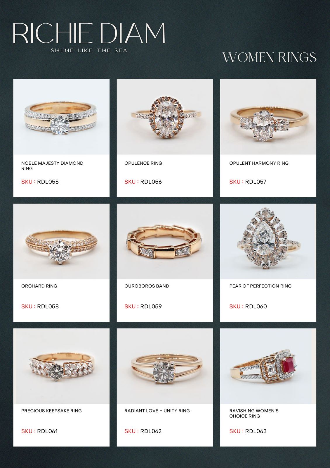
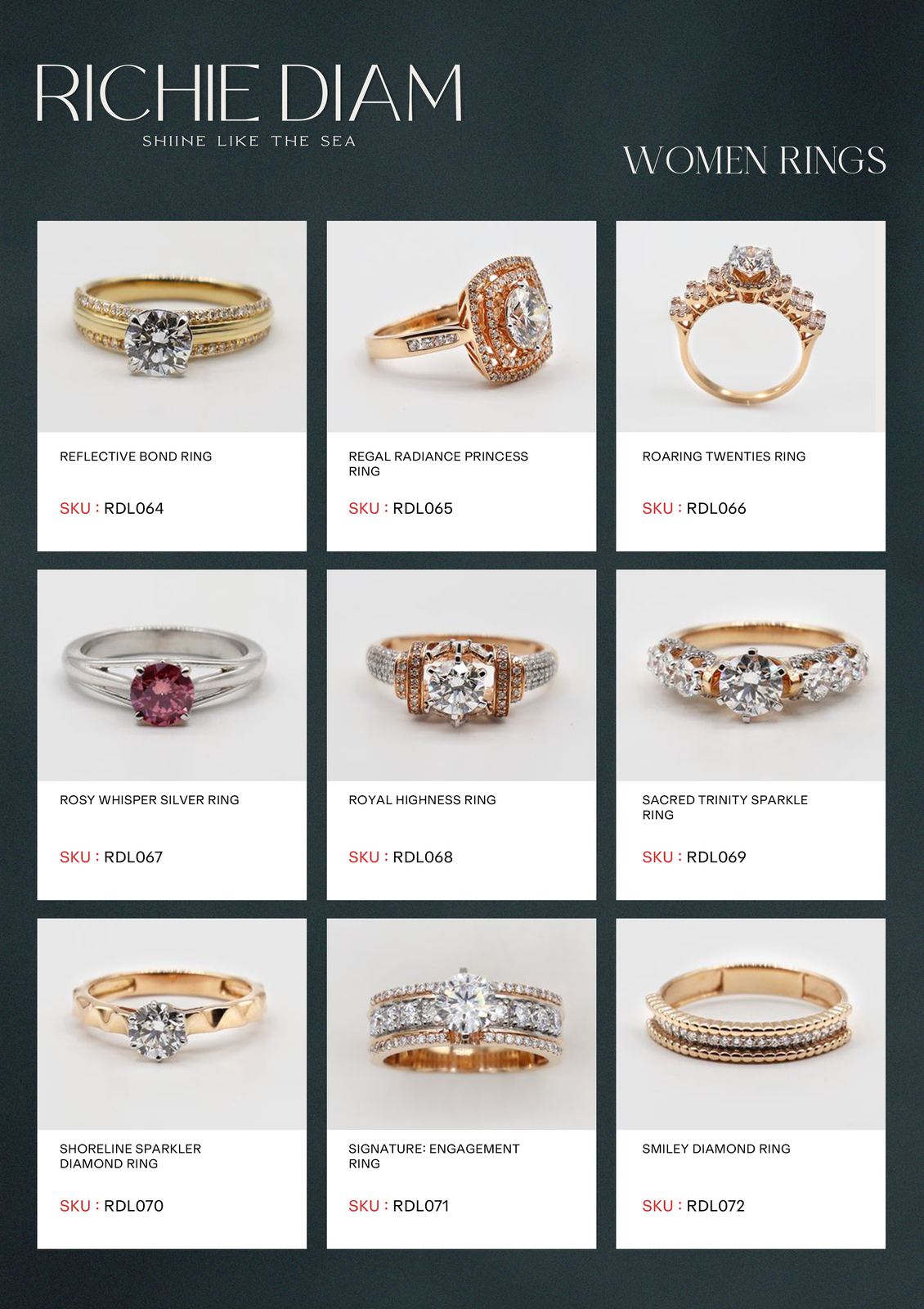
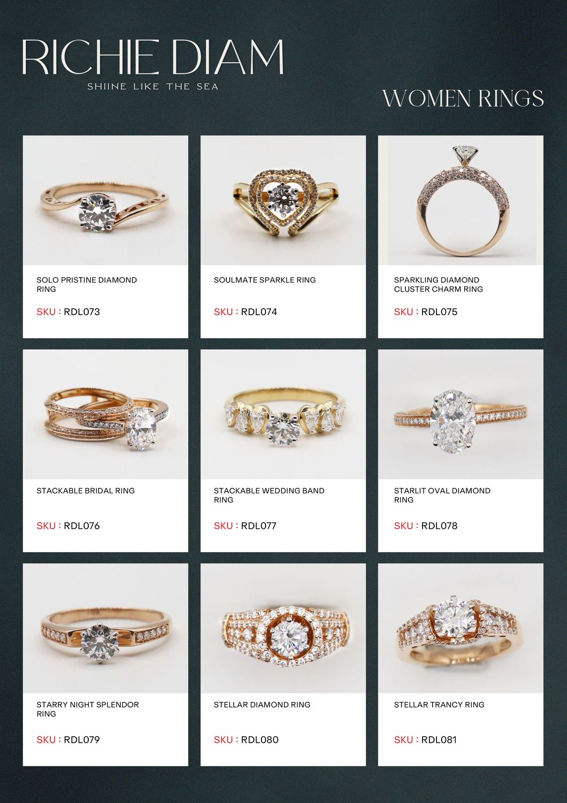
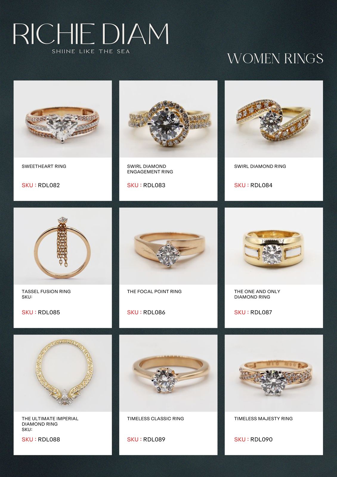
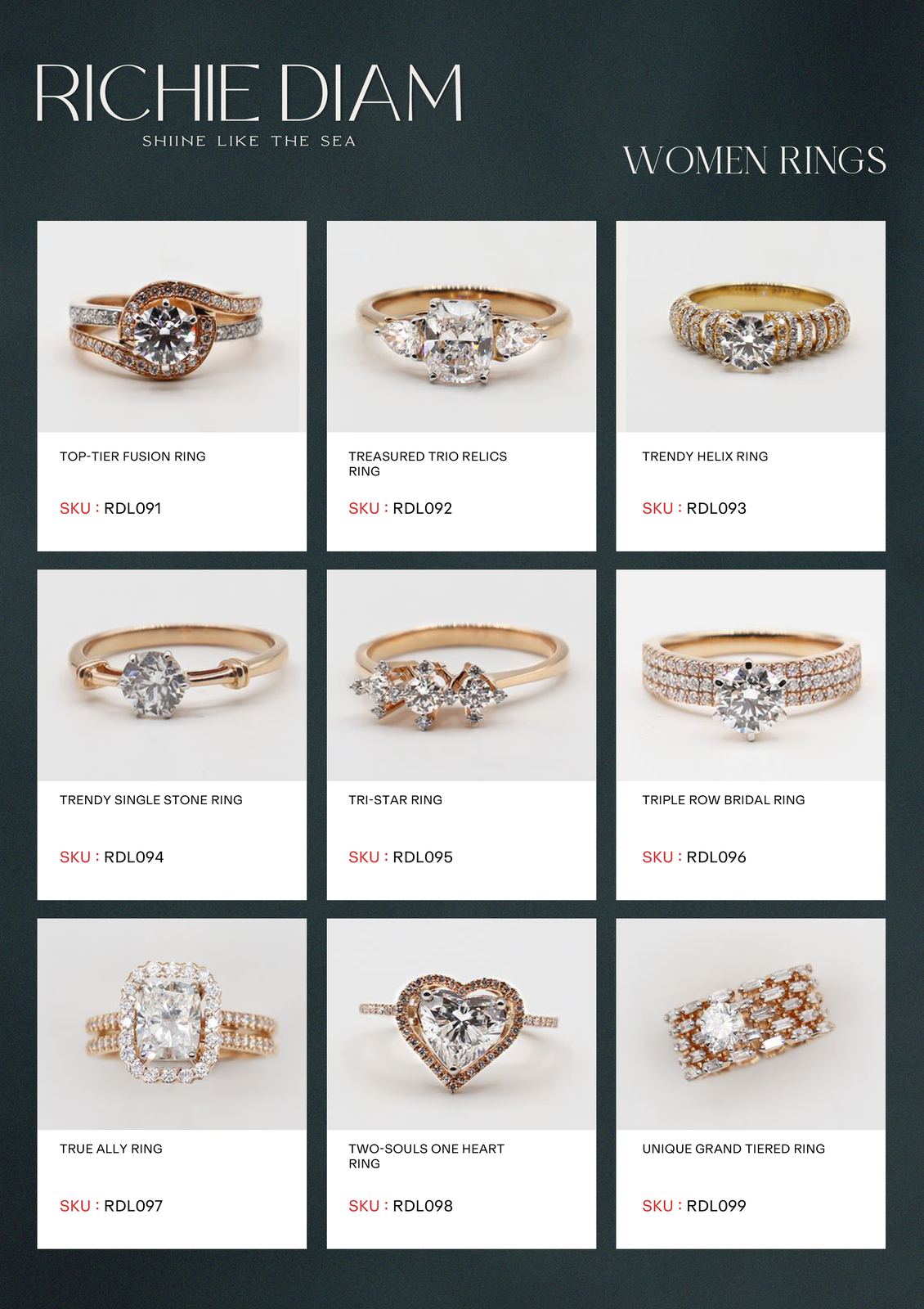
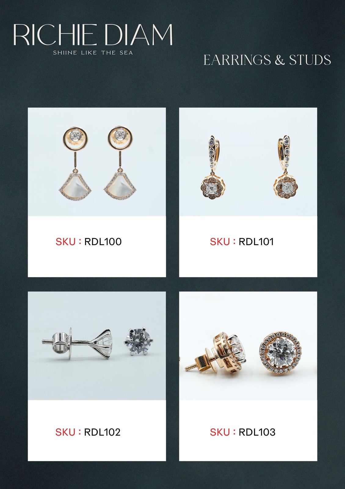
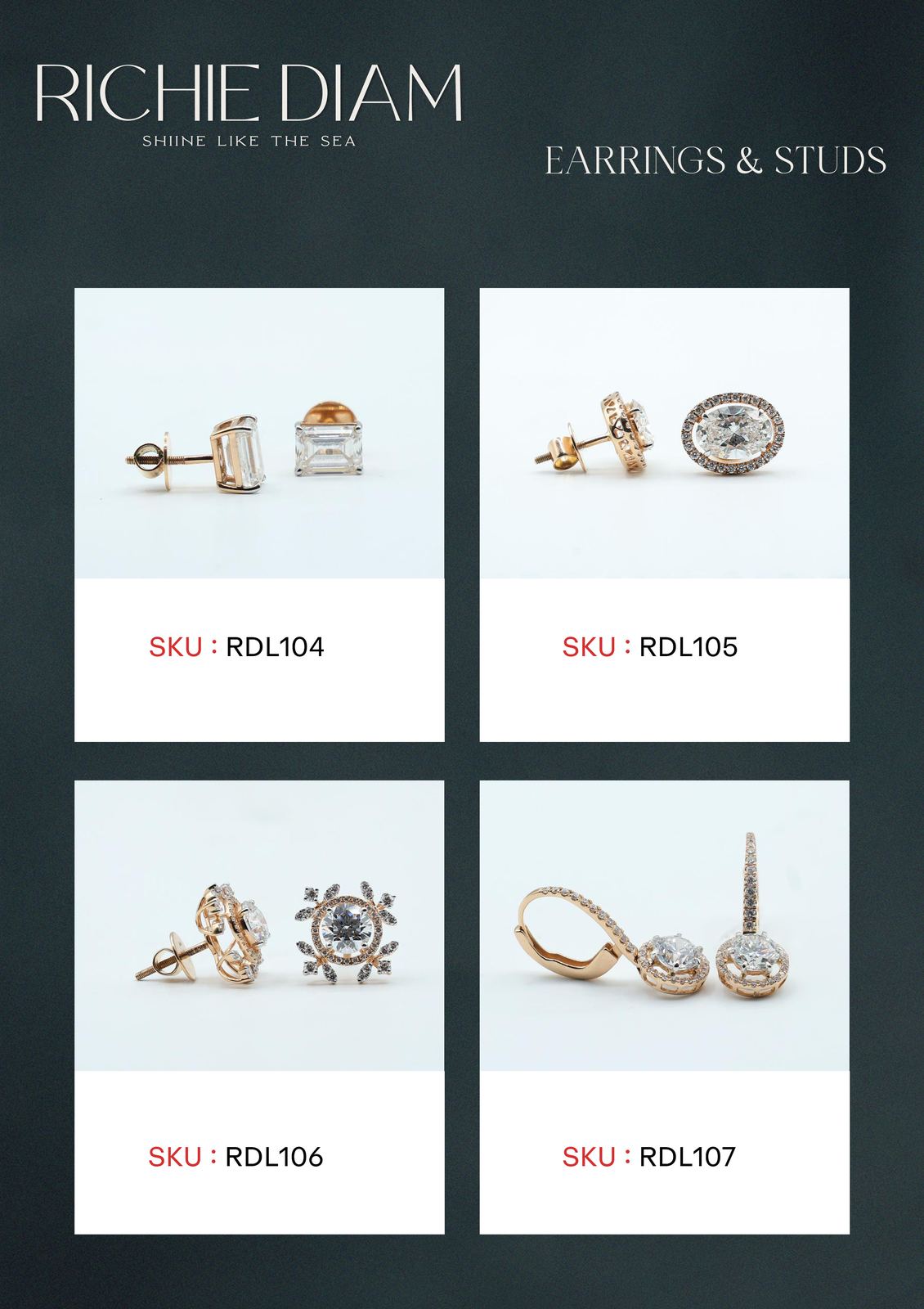
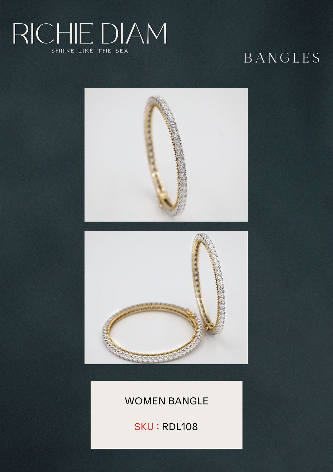
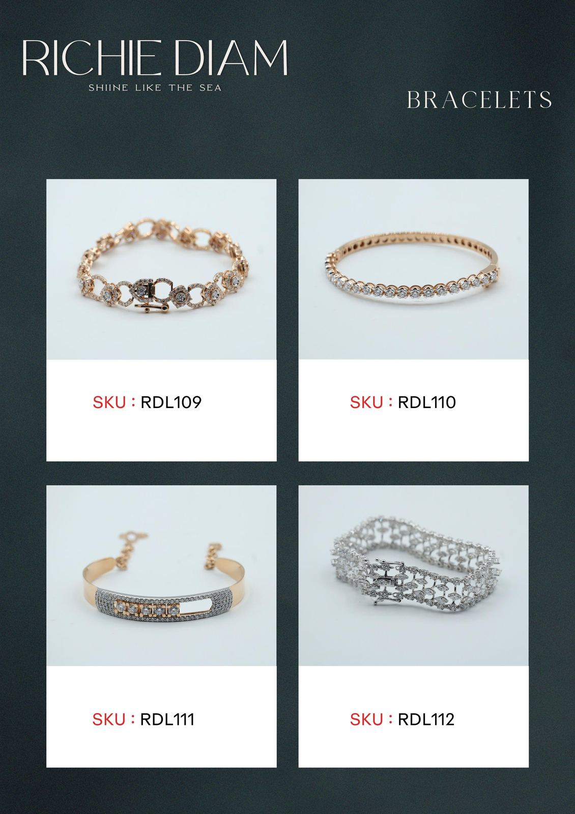
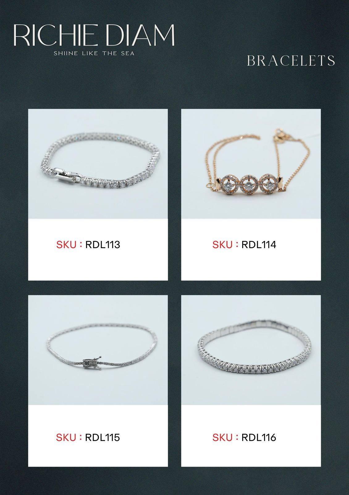
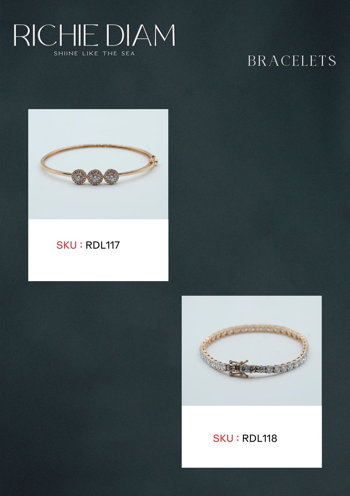
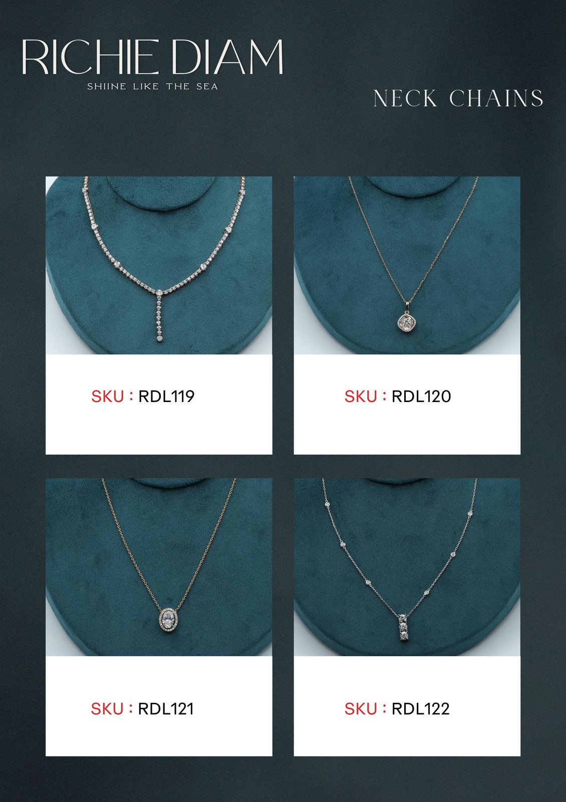
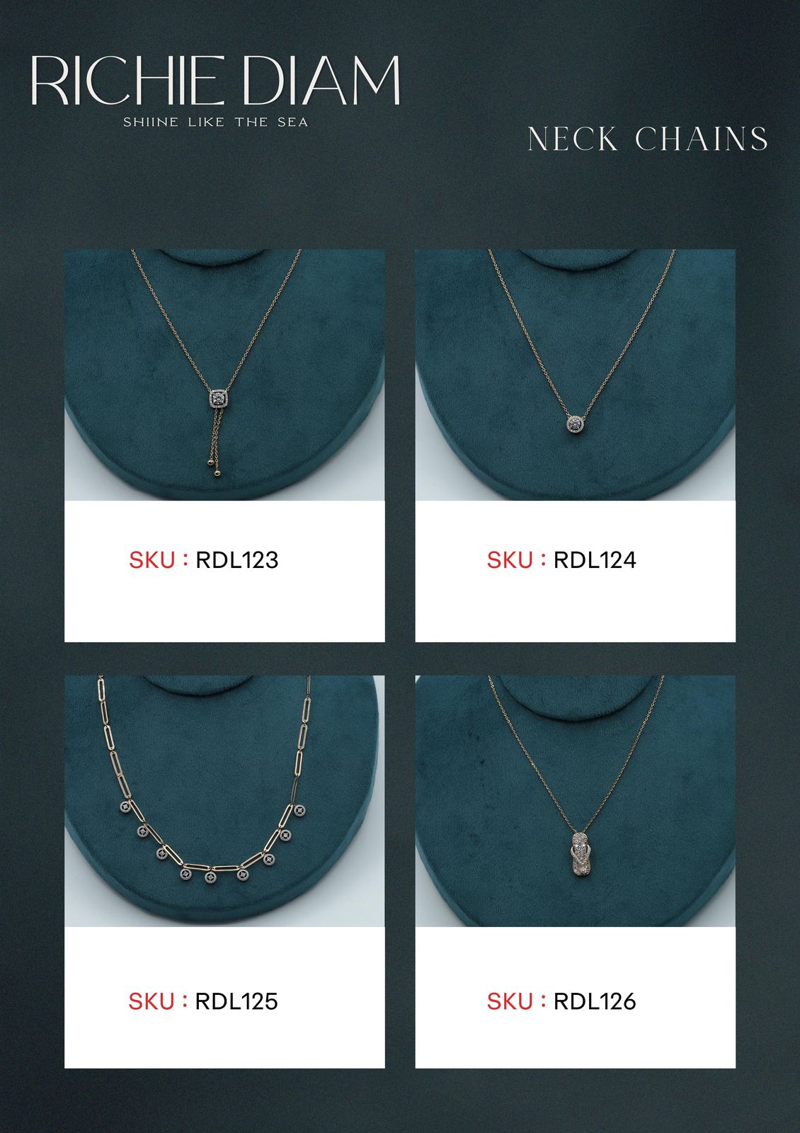
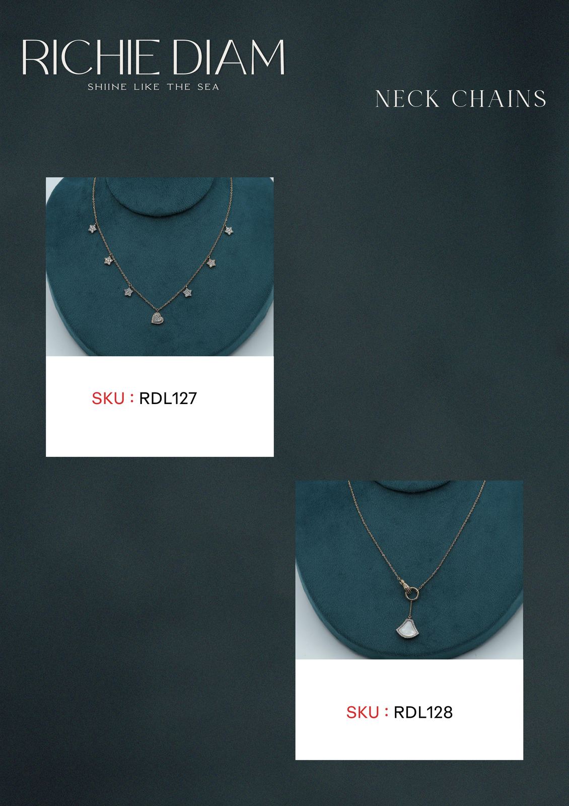
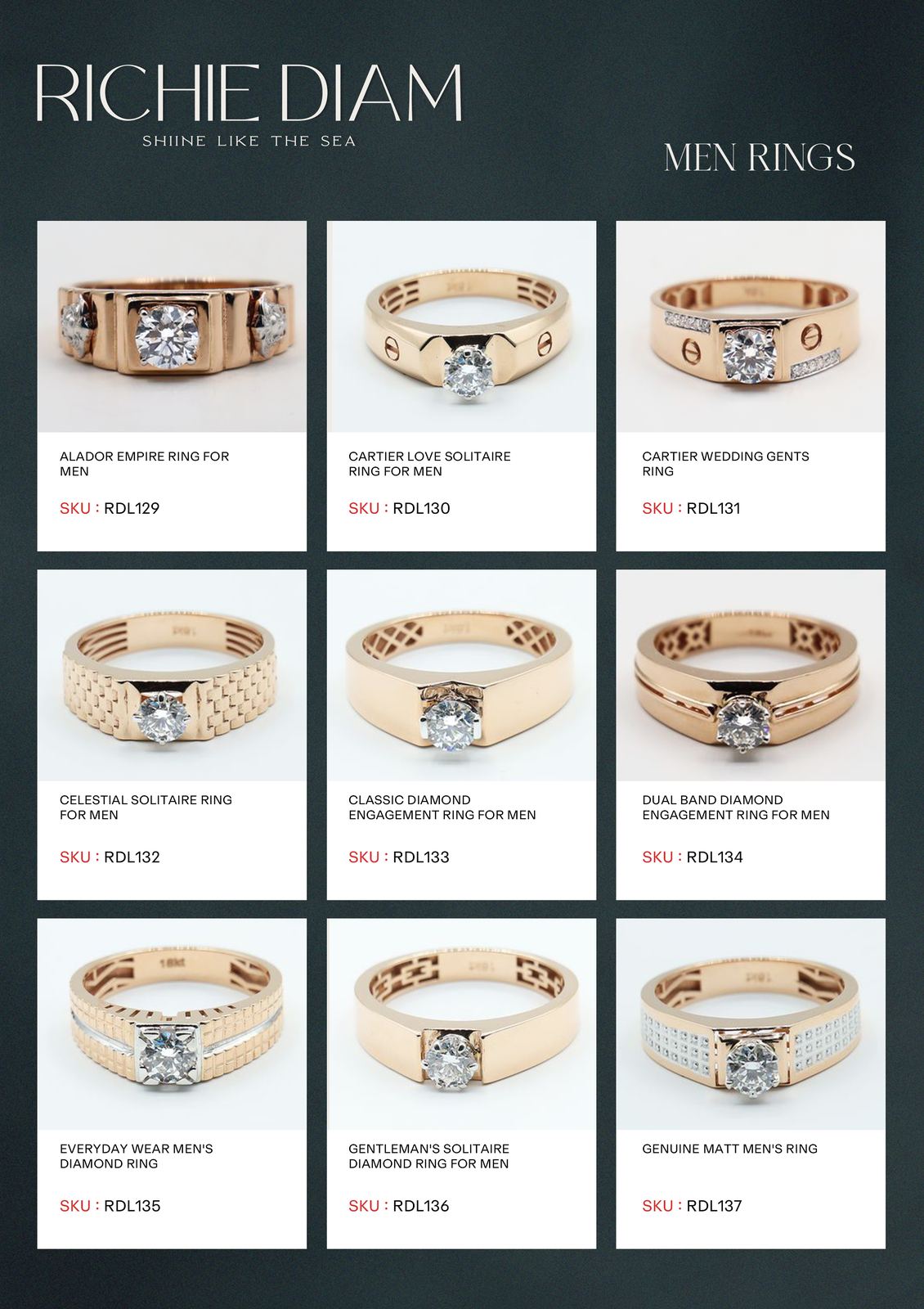
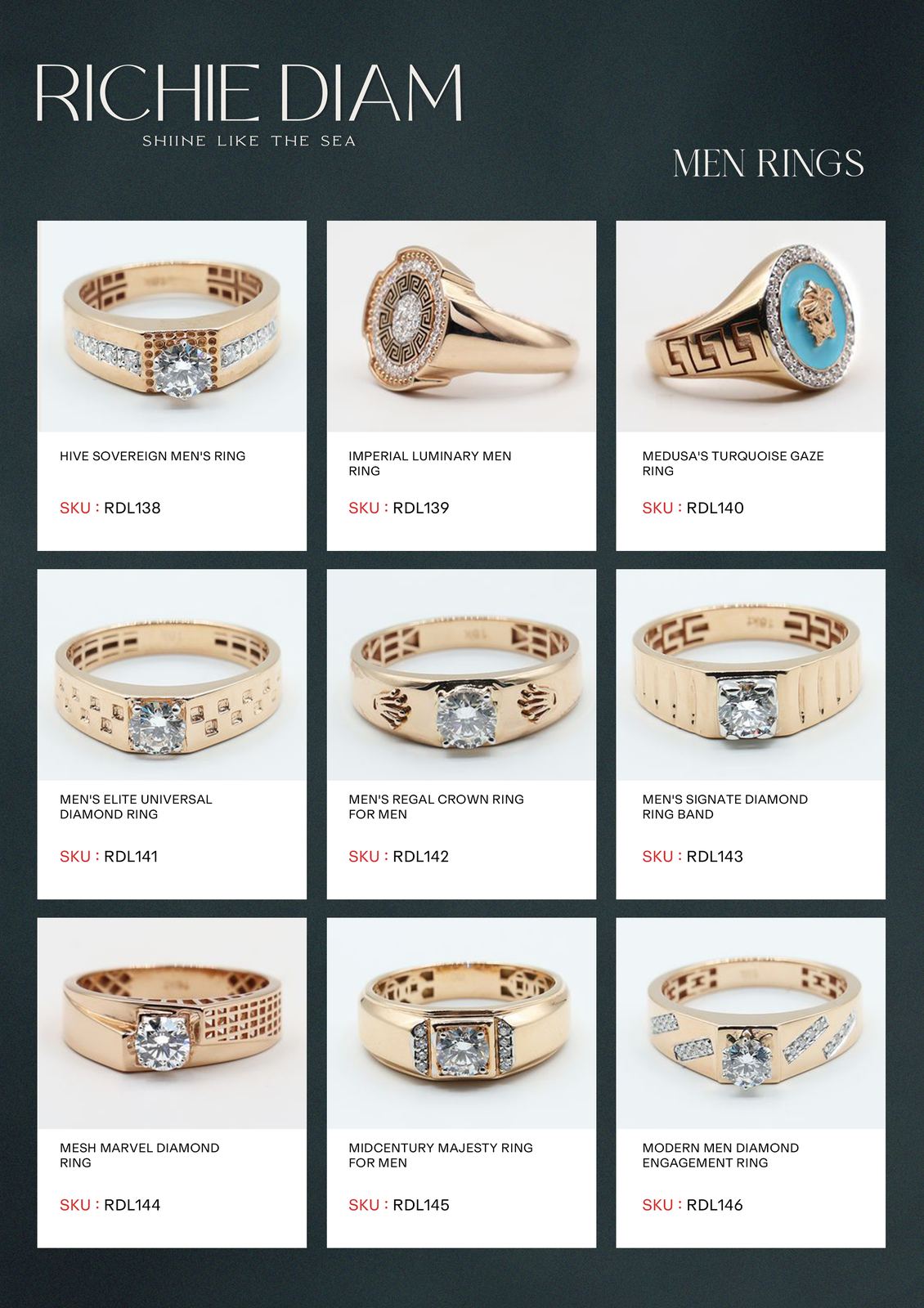
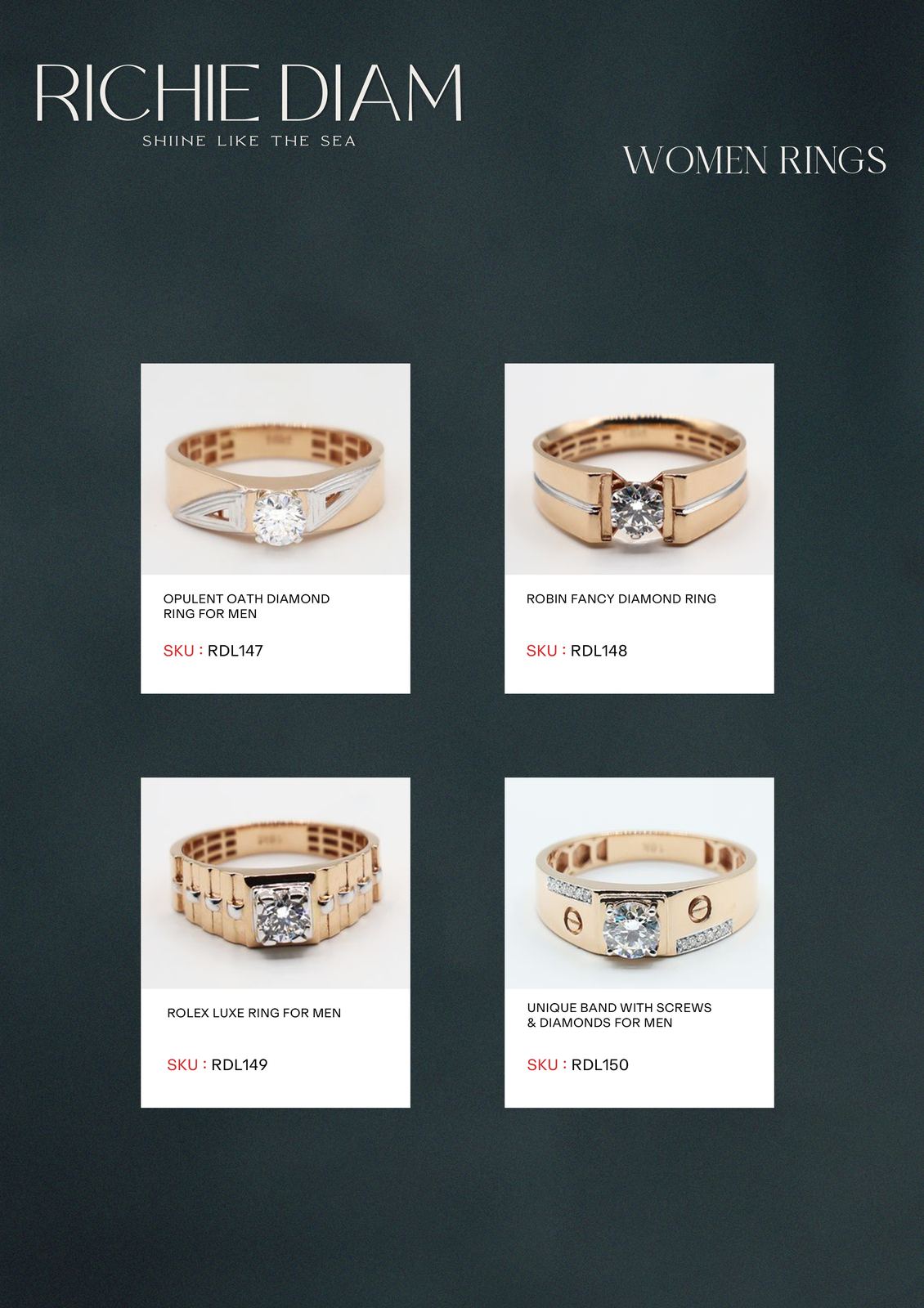
The Richie Diam jewellery catalogue brings the full collection to life, shot and designed to showcase each piece at its finest. From signature diamond cuts to delicate settings, every page was built to communicate the brand's standard: lab grown, ethically sourced, and unmistakably premium.
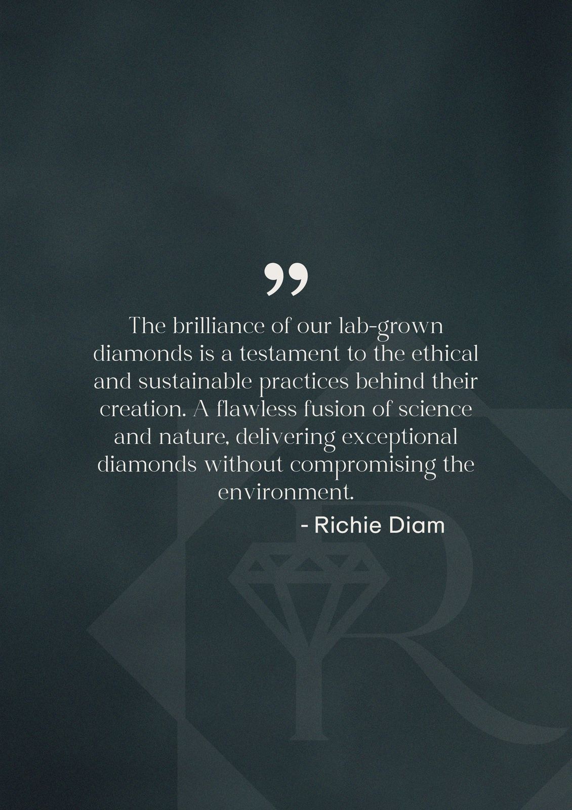
Every element was built to serve a diamond brand that stands for something beyond the stone itself: ethical sourcing, natural clarity, and the feeling that only real luxury delivers.
Lab grown diamonds carry the same brilliance as mined ones, and none of the cost to the planet or the people near the mines. Richie Diam was built to make that truth the brand's greatest strength. The identity does not hide what the product is. It makes what the product is something to be proud of.