
0%
Six layers that decide whether your product feels like thirty thousand or three lakh. Same product. Same quality. Different system.
Brand foundation, identity, packaging, photography, videography and brand emotion, each with a method you can run yourself. Plus the full build sequence of a skincare brand we took from zero.
Three questions, then the guide opens on this page. We read every answer.
Six layers that decide whether your product feels like thirty thousand or three lakh. Same product. Same quality. Different system.
Start here
Premium is not what your product costs to make. It is what a person believes about your product in the two seconds before they read the price.
That belief is built, deliberately, out of six things. Most businesses build one of them, usually a logo, and wonder why the price will not hold. The brands that charge more are not making a better product than you. They are running a complete system while you are running one layer of it.
This guide is that system, in the order you should build it. Every layer has a method you can run yourself, and a list of the mistakes that quietly cost the most.
You cannot skip to the layer you find interesting. Photography on top of a brand with no foundation produces beautiful images that sell nothing, because there is no idea underneath for them to carry. Build in order.
The test that governs everything below
Before a single visual decision, you need a way to tell durable design from loud design. This is the test we use, and it settles most arguments in one minute.
Picture a party. Two people walk in.
The first wears something loud, bright, covered in shine. Every head turns the moment they enter. They own the room. Then, slowly, attention drains away. The louder the entrance, the faster it goes. By the end of the night nobody is looking.
The second wears something minimal and old fashioned. Nothing turns on entry. But attention builds. An hour in, this is the most attractive person in the room, and that impression holds for the rest of the night.
A premium brand must be the second person.
Attention and preference are not the same signal, and they move in opposite directions over time. Loud design is optimised for the impulse buy, which is decided in one viewing. Restrained design is optimised for the considered buy, which is decided over days of looking.
Premium is, by definition, a considered buy. Nobody spends serious money in one glance. They look, they leave, they come back, they show a friend, they look again. Your design is seen many times before any money moves, and design that fatigues loses the sale in exactly that window.
Do not ask whether your design grabs attention. Ask what it looks like on the tenth viewing. Everything in the six layers below is a way of answering that question on purpose.
Because loud is measurable on day one and restraint is not. A bright package lifts first-week numbers, so it gets approved. That default is your opening. In a market where everyone is shouting, restraint is the only differentiator left, and it happens to be the one that survives repeat exposure.
Before layer one
Every buyer in your market is one of three people. You cannot serve all three, and trying to is the single most common reason a premium brand stalls.
| Buyer | What decides the sale | What they ignore |
|---|---|---|
| The brand buyer | Which brand it is. Status, story, who else owns it. | Price. Fine technical detail. |
| The quality buyer | Materials, craft, finish, how long it lasts. | Brand name. Price, within reason. |
| The price buyer | The lowest number on the page. | Brand. Quality. Everything else. |
Build for the first two. Let the third go. A price buyer will leave you the moment somebody quotes ten percent less, and you will have spent your whole brand budget teaching them where to find you.
Write your answer down before you continue: my brand is for the buyer who cares most about ______. Every decision in the next six layers is answered by that sentence.
Layer 1
Before anything visual, you need the document everything else is checked against. Not a logo file. A written decision about what your brand means and how it behaves.
This is what people mean by brand guidelines. A working set runs twelve to forty pages for most brands, but yours can start at four. What matters is that it exists in writing, so that six months from now your designer, your photographer and your intern all make the same decision without asking you.
Layer 2
Your logo is roughly ten percent of your identity. The other ninety percent is the colour, the type, the spacing and the rules for using them, and that is the part that makes a brand recognisable from across a room.
Increase the empty space around your product and your logo by roughly thirty percent across everything you publish. Costs nothing, changes how expensive the brand reads immediately. Crowding is the visual signature of a business that is anxious to sell.
Layer 3
Packaging is the only part of your brand a customer touches. Weight, texture, resistance and sound do work that no image can do, and they do it before the product is even visible.
Layer 4
You do not need a studio. You need control of light, a consistent frame, and the discipline to shoot the same way every single time. Consistency does more for perceived value than equipment ever will.
Better lighting control beats a better camera, every time. A current phone with disciplined light produces a more premium image than an expensive camera in bad light. Spend on diffusion, bounce cards and a tripod before you spend on a body.
Layer 5
Video is where a premium brand proves the claim. A photograph can be styled. Movement shows how a thing actually behaves in light, in a hand, on a body, and that is much harder to fake.
Layer 6
The five layers above make a brand look premium. This one makes it mean something. Emotion is what a customer feels about themselves while holding your product, and it is the only layer a competitor cannot copy.
Brands whose emotional and visual expression pull in the same direction grow revenue meaningfully faster than brands where those two things disagree. That gap is not a design problem. It is a decision that was never made.
Remove your logo from your last five posts and hand them to someone who does not know your brand. If they cannot tell the five belong together, you have a design, not an identity. Repeat the test after every campaign.
All six layers in one real build
Willingly is a skincare brand we built at Indiibot from nothing: the name, the products, the packaging, the store, the campaigns. Here is the order it actually happened in, and what you should take from each step for your own brand.
Skincare sells glow, and glow is usually code for whiteness. To deliver it, most formulas lean on harsh agents that damage the skin barrier and leave the customer dependent on the product that is hurting them. We built the brand on the opposite belief: real beauty is healthy skin, not white skin.
Your moveFind the promise your category makes that is not quite honest. Build against it. That is your position, and it will not be available to anyone who has not noticed it.
Every candidate was checked against the philosophy, the market, trademark availability, and how it sounded said out loud for the first time. Willingly won because it carries intent. It means I chose this for myself, rather than somebody sold it to me. The tagline, Where Pure Meets Proven, holds the entire positioning in four words.
Your moveReject far more names than you like. A name that carries your idea does years of work for free. A name that does not has to be explained forever.
Skincare splits into two camps. One sells natural ingredients and attacks chemicals. The other sells clinical actives and dismisses herbs. Both are partly right. Salicylic acid genuinely works. Turmeric genuinely works. So we refused to pick, and fused them. That position was standing empty because everyone was busy fighting.
Your moveFind the binary your category argues about. If both sides are partly right, the fused position is open and nobody is defending it.
Skincare shelves default to bright, high-saturation, attention-grabbing colour. We chose a calm palette built on soft blues with a clean canvas and a dark anchor. It does not win the shelf in the first second. It wins the customer by the tenth look. This is the party test applied to a real product range.
Your moveLook at your ten nearest competitors together. Whatever they are all doing is the thing you should consider not doing.
Every product was lab tested, and the range was designed as one coherent system of eight products where each answers a specific skin concern, rather than a pile of launches. Turmeric to soothe, almond to nourish, chamomile for sensitive skin, vitamin C to brighten without bleaching.
Your moveAuthority is verifiable or it is noise. Test it, certify it, document it. And build a range where each product has a job, because a coherent system reads as expertise and a random catalogue reads as guessing.
A sans-serif wordmark with the optical quality of water: fluid, adaptable, neither masculine nor feminine. Custom letterform adjustments give it a signature without decoration. A premium buyer reads it as premium. A minimalist reads it as minimal. It passes through different filters and lands right every time.
Your moveDesign the mark for the widest range of people who must all read it correctly, not for the version that looks most impressive in a presentation.
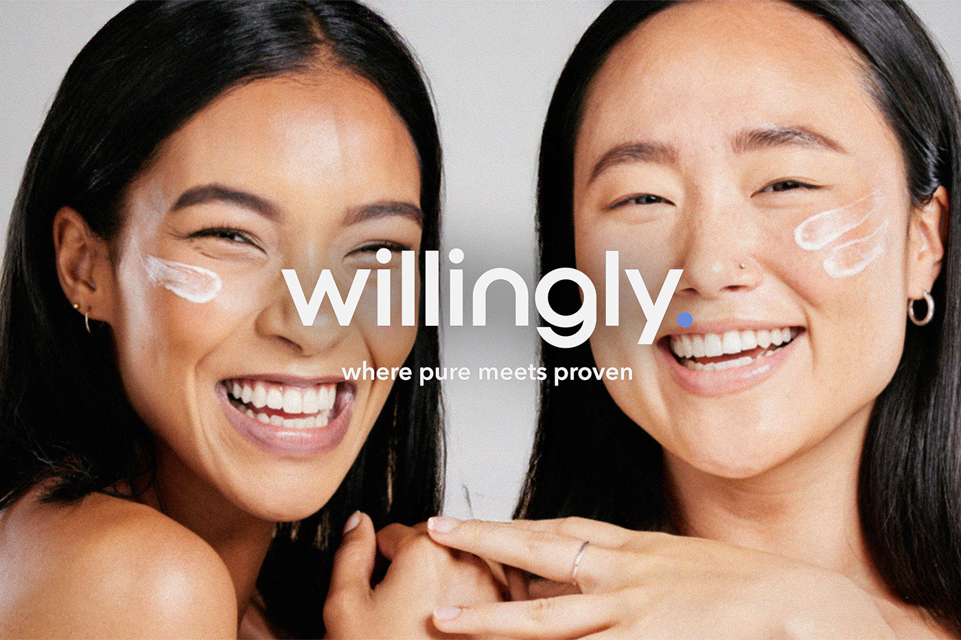
Tubes, bottles and pumps all needed to feel expensive in the hand, photograph well on both white and lifestyle backgrounds, and say minimal premium in a single glance. One consistent system of typography, colour blocking and texture across every format, so every product is unmistakably the same brand.
Your moveDesign the system, not the box. The test is whether a new product added next year still looks like it belongs without a redesign.
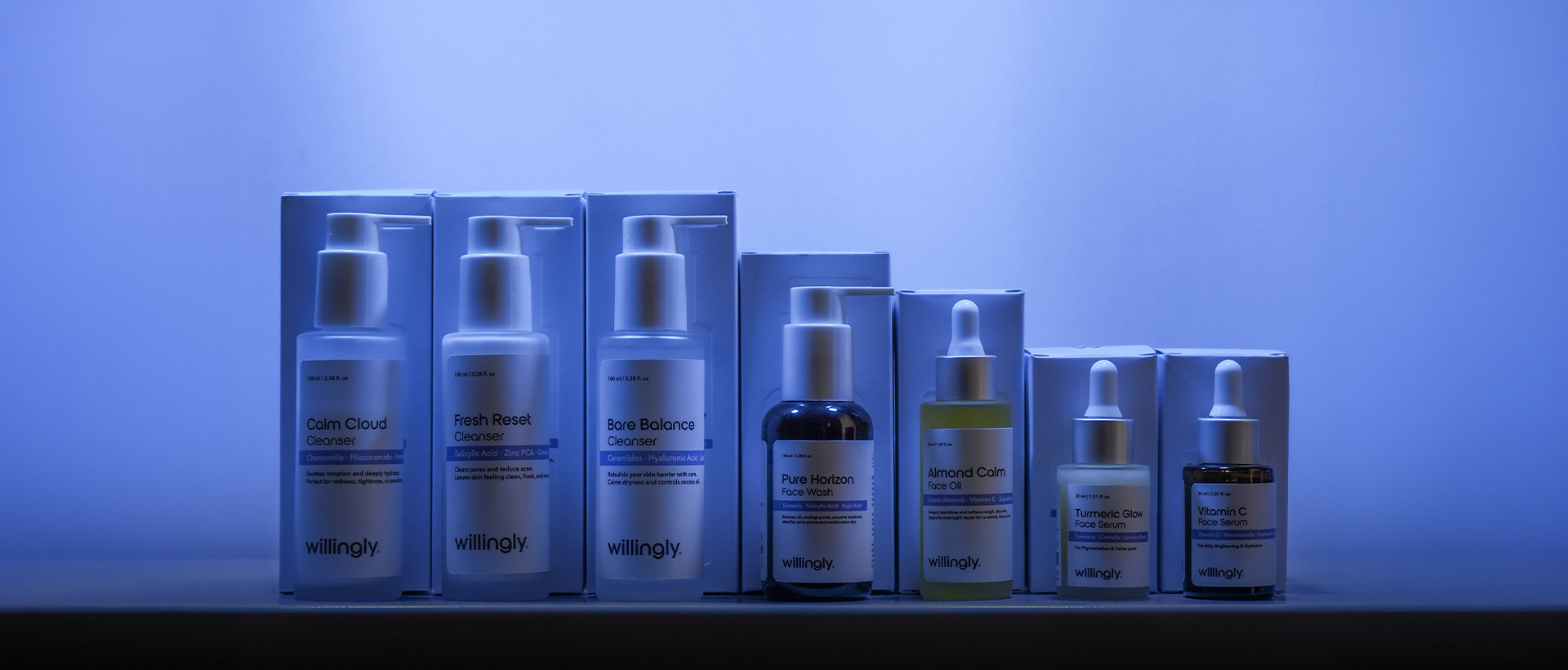
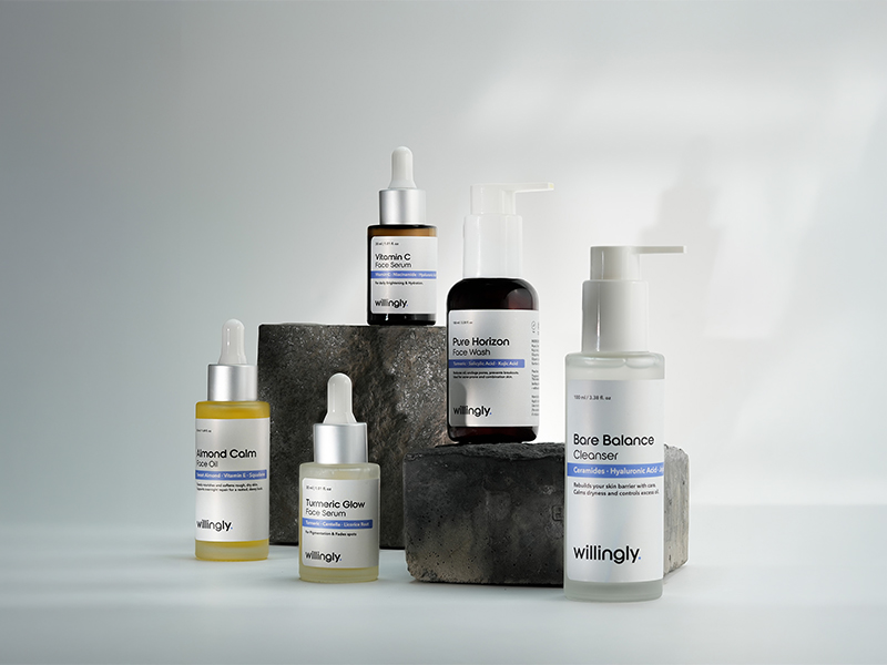
The brief was one sentence: make lab-formulated skincare feel like it came from a botanical garden. Clean backgrounds, natural texture, botanical props, intentional light. Those images then became the foundation of the website, the marketplace listings, the social feed and every ad. Shot once, used everywhere.
Your moveWrite your photography brief as one sentence that contains a tension. A brief with no tension in it produces images with nothing to say.
Structured around the actual buying journey rather than the company: ingredient transparency, skin-type guides, visible before and after proof, and reviews integrated where the doubt happens. Same minimal premium language as the packaging, and mobile first, because that is where skincare is actually bought.
Your moveList the five reasons someone does not buy. Your website is those five answers in order. Everything else on it is decoration.
Partnerships were briefed with genuine scripts built on the brand's actual position, so the creator explained something true rather than reading a promotional line. Reach you rent disappears the day you stop paying. Authority built through credible voices saying something real keeps working.
Your moveGive creators the argument, not the ad copy. If the script could be read by a creator for any competitor, it is doing nothing for you.
Education that genuinely teaches ingredients. Proof through real skin journeys. Brand feeling through aesthetic frames that stop the scroll. Every post serves one of those three jobs, which keeps the feed cohesive while still moving people from awareness to purchase.
Your movePick three content pillars and refuse everything outside them. A feed that does three things well reads as a brand. A feed that does nine reads as noise.
Eight products, one brand built end to end by a single team. Not because any one layer was extraordinary, but because all six pointed at the same decision, in this order, without a shortcut.
Notice that the logo appears at step six. Most founders start there. By the time we designed the mark, the position, the name, the refusal, the palette logic and the proof were already settled, so the logo had something to be the signature of. That sequencing is most of the work.
The rule
A brand is what people say about your business when you are not in the room. That is not built by a launch. It is built by repeating one promise, in one voice, with one look, long after you personally are bored of it.
Most brands change their message roughly at the point their audience is beginning to remember it. The founder has seen it a thousand times. The customer has seen it twice. Those are completely different experiences of the same campaign, and confusing them is the most expensive mistake in this document.
Cheap makes you cry every time. Expensive makes you cry once.Sasta roye baar baar, mehenga roye ek baar
Six layers is a real amount of work, and it costs real time and money. It is also the only version of this that holds a price. Build it once, properly, and stop rebuilding it every quarter.
Do this now
Eighteen checks, three per layer. Tick honestly. Whichever layer has the most gaps is what you fix first, regardless of which one you find most interesting.
Layer 1 · Foundation
Layer 2 · Identity
Layer 3 · Packaging
Layer 4 · Photography
Layer 5 · Videography
Layer 6 · Emotion
Checked 0 of 18. Your weakest layer is where to start.
If you want it built for you
Indiibot is a 360 brand and marketing studio. Naming, brand guidelines, identity, packaging, product and concept photography, videography, websites, SEO and marketing, all under one roof, with nothing outsourced.
If you have read this far and would rather have it done properly than done twice, send a message and tell us which layer is weakest. That is usually where the conversation should start.

The Premium Brand System · Field Guide 01
Published by Brandognito, a project of Indiibot Technology LLP.
Written for founders who were told premium requires a premium budget.